Assignment 05 Commentary
The Chartjunk Debate
Key Arguments:
- Graphical embellishments can represent information redundantly in useful way.
- Nothing that supports the chart’s message in a meaningful way is junk.
- Graphical embellishments support the effectiveness of a data visualization in engaging the interest of the reader, drawing the reader’s attention to particular items and making the message more memorable.
I sometimes have the feeling that when visualizing the data through diagram drawing, no matter how reasonable the diagram I draw seems to me, it’s just my subjective thoughts. How can I know whether the audience can receive the information I try hard to express when presenting this to them? How can I make sure they grasp the same idea and feeling behind the drawing despite of their different experience and backgrounds with me? How can I balance between junk information and suitable decoration to attract people’s attention at their first glance but not to make them overwhelmed with redundant information. I don’t think there exists any rule or principle to guide any artist or designer on what graphical embellishment can support the effectiveness of a data visualization. But the principle is for sure that anything that does not deliver the message is considered to be chart junk.
Envisioning Information-Layering and Separation
Key Arguments:
- Confusion and clutter are failures of design
- The technique of layering and separation is reducing noise and enriching the content of displays.
- Layering and separation of date can be achieved by subtraction of weight.
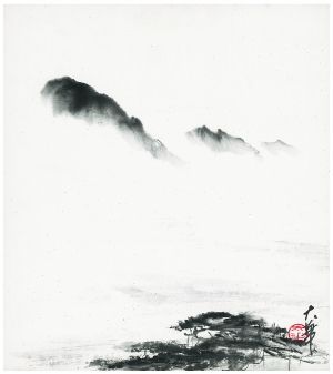
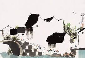
This chapter reminds me of the readings on GIS, The importance and trend of layering date in an organized way might also explain how to build a successful GIS. A good example of GIS should separate different layers of data clearly, then bring up levels of information together and show their respective values to compare against the others without creating a mess. And Tufte talked about how Chinese and Japanese calligraphy take use of blank space in drawing. In my opinion, the enchanting part of traditional Chinese landscape painting lies in how the reduction of information (using blank space) can actually revoke more thoughts in audiences’ mind.
Envisioning Information-Color and Information
Key Arguments:
1.Color can be an useful and elementary tool to illustrate information. It is being used in information design to label, measure, represent or imitate reality and to enliven or decorate. 2.Resulting from colors’ properties of being subtle and exacting, and uncertainties that generates during the process of translating perceived color into data, the translations from color to information could be noisy and idiosyncratic. 3.Ambiguity or confusion in seeing a data display can be diminished by multiplicity and appropriate choice of design technique. 4.Colors and design are always on the move simultaneously.
This chapter is more focused on how color affect the convey of information aesthetically. Color is ideally a powerful tool to exaggerate the details and information in diagrams, but it can also diminish the simplicity and clearance of diagrams. Maybe that’s the reason why design students always use the “safe color palette”, which is to fill in the background with color in low saturation, and only highlight the most information in brighter color.( At least this is what I’m doing). And if this principle can’t save me out of the dilemma of how to match different colors, I might just reduce my color palette simply into black and white. Instead of using variation of colors that might cause ambiguity and misunderstanding, I would use different hatch patterns or line weights to reserve the information.