Cartographies of Time + Spatial Humanities
Cartographies of Time
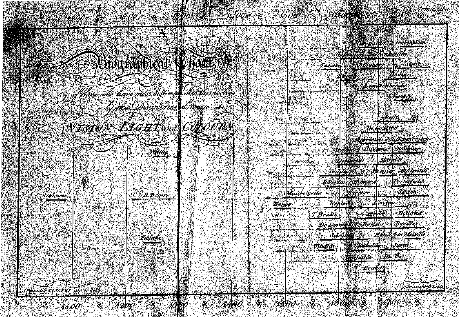
Joseph Priestly’s simple, yet informative timeline (pictured above) explores the times that certain prominent scientists lived. The timeline lies on the top and bottom and shows a span of around 800 years with the scientists depicted as horizontal lines in the middle. This type of timeline is able to visually show when lives of the scientists overlapped, and thus how scientific progress of the time was related. However, as the authors note, its main shortcoming (and the shortcoming of any timeline of this sort) is that “historical narrative is not linear.”
Because it’s so simple, it surprises me that it was the first of its kind when it was published, and described as a “watershed” by Grafton and Rosenburg. I think this type of timeline would be great for showing interrelationships between contemporary scientists, but perhaps having additional information, such as which scientific discoveries occurred when, would greatly help this type of timeline.
The Potential of Spatial Humanities
The biggest advantage of GIS is its power for geographic analysis and ability to handle large amounts of geographical data (the likes of which hadn’t been achieved by that point). However, similar to the point made by Joanna Drucker, we cannot display the world objectively; instead, this technological design implicitly carries bias inherited from the priviliges of its designers. The shortcoming of GIS, and what critics of GIS mention, is that the technology isn’t able to handle the complexity of our modern world and appropriately display it.