Reading Responses
Katherine Hayles, “How We Read: Close, Hyper, Machine”
I agreed with all of Hayle’s points, but think she missed one key element of reading on a digital platform: the strategy of layout. For example, reading a text is easier to retain because the reader can recall the page section, location of the spread (L or R page), and their location in the book based on the fore-edge. That said, I appreciated all of the technical references she included to talk about the analogy between hyperattention : hyperreading :: deep attention : close reading. Describing hyperreading as multilocal context but context poor led to this notion, “The more the emphasis falls on pattern (as in machine reading), the more likely it is that context must be supplied from outside (by a human interpreter) to connect pattern with meaning” which provides a good platform for art and scholarly practice.
Jeffrey M. Binder, “Alien Reading: Text Mining, Language Standardization, and the Humanities”
I also really enjoyed this essay, through its technical trail of topic modeling –> latent semantic indexing (LSI) –> latent dirichlet allocation (LDA). Binder ends the essay with a call to action for how to engage with these simplistic interfaces with active engagement, questioning how it is used. He also includes several computational text-based artworks. I particularly liked the reference to deformance (modified versions of text to explore their autopoietic capabilities) and digital caricatures (thinking of computation as a caricature of thinking).
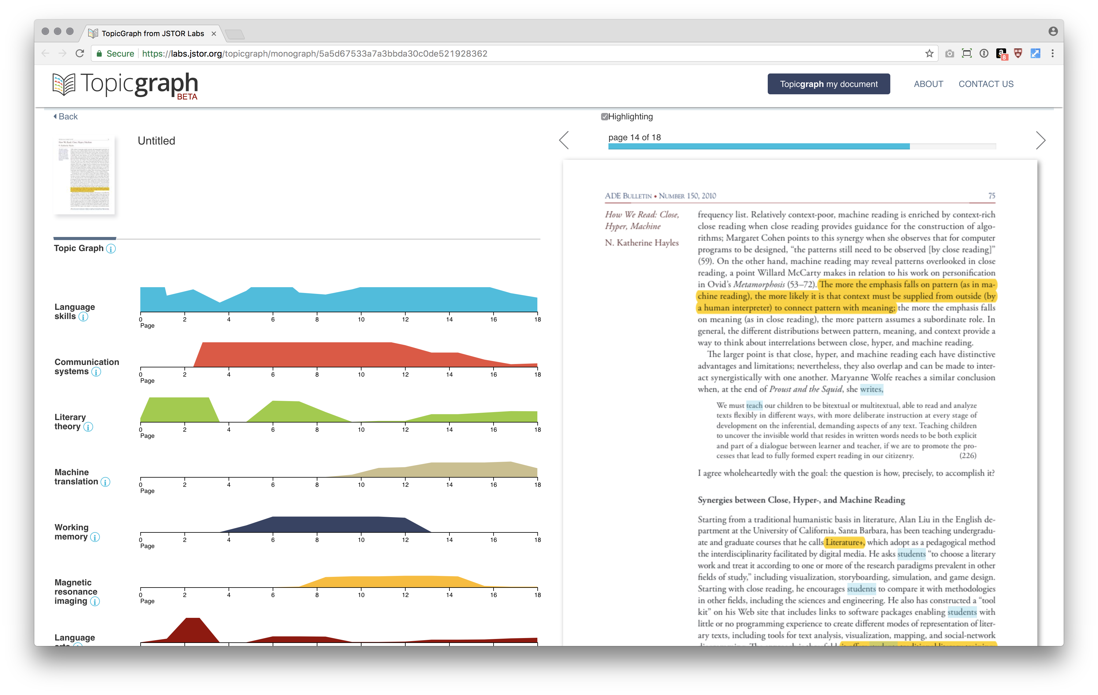
Text as Data Mini-Project
At a glance, it is quite simple to use JSTOR Lab’s TopicGraph to analyze Katherine Hayles’s “How We Read” t. By uploading the PDF, it took about 5 minutes to receive an email that the document was ready. The key phrases and topics are listed in order of frequency. According to this tool, Language Skills was the most relevant topic, used throughout the essay, while Machinery was the least. As you hover over the scales, you see the page number. Clicking leads to that section of the PDF, where you can see the terms (color-coded according to topic) highlighted in the text. This was very useful because you can begin to decipher which terms cause the NLP to assign the various topics. However, I wish this hover would include more context about the term (maybe a pull quote? Frequency of use?) rather than just revealing the page number. You can also click on the information icon next to each topic to see related terms, but this seemed as adequate as a thesaurus, rather than showing true relationships between other ideaologies. Overall, TopicGraph is very easy to use, intuitive and visually pleasing UI, and good at determining key ideas from the text.