Commentary
Color and Information
Tufte’s guiding principle for using color in displays is to “first do no harm.” I really like this because it emphasizes the idea that colors should only be used if they’re needed to make a point, not to make something look pretty at the risk of detracting from the information or even masking it. Tufte does explain that colors can make seemingly complicated things more understanble, as Oliver Byrne’s 1847 edition of Euclid’s Geometry did.
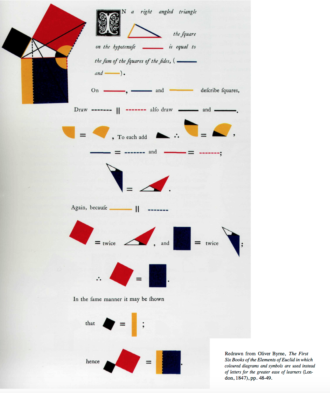 My favorite example of this is when Tufte looks at the drawing for his proofs, particularly the Pythagorean theorem (which is my favorite proof of all time) which use shapes and colors instead of angle names. Byrne used primary colors and black which as Tufte said:
provides maximum
“differentiation (no four colors differ more). This yellow, broken with
orange, is darkened in value, sharpening the definition of its edge against
white paper; and the blue is relatively light (on a value scale of blues),
reinforcing its distance from black. In the diagrams, the least-used color
is black, and it is carefully avoided for large, solid elements — adding to
the overall coherence of the proofs by muting unnecessary contrasts.
Spacious leading of type assists integration of text and figure, and also
unifies the page by creating lines of type (instead of the solid masses
usually formed by bodies of straight text) similar in visual presence to
the geometric lines and shapes.”
My favorite example of this is when Tufte looks at the drawing for his proofs, particularly the Pythagorean theorem (which is my favorite proof of all time) which use shapes and colors instead of angle names. Byrne used primary colors and black which as Tufte said:
provides maximum
“differentiation (no four colors differ more). This yellow, broken with
orange, is darkened in value, sharpening the definition of its edge against
white paper; and the blue is relatively light (on a value scale of blues),
reinforcing its distance from black. In the diagrams, the least-used color
is black, and it is carefully avoided for large, solid elements — adding to
the overall coherence of the proofs by muting unnecessary contrasts.
Spacious leading of type assists integration of text and figure, and also
unifies the page by creating lines of type (instead of the solid masses
usually formed by bodies of straight text) similar in visual presence to
the geometric lines and shapes.”
The Chartjunk Debate
It was interesting to read Few’s opinion of Tufte’s ideas immedietly after reading Tufte’s. I’d have to partially agree with Few because in some cases, Tufte’s definition of what is and isn’t chartjunk is too rigid. Sometimes, artistic flair can really bring meaning and attention to data.