Project Updates
-
Final design document
It’s the same link as before, but to be clear:
https://docs.google.com/document/d/1lEJndykw1Wr_g4N2_cUPu8eVtZE7DwDExjlwFbts-V4/edit?usp=sharing
Codes for prototype: Play Music https://drive.google.com/file/d/1PdlKdxVX3Rz0QAtx5unWrljSo_z1TPuI/view?usp=sharing
Detect Objects in ARKit: https://drive.google.com/file/d/1AKfECJPmW3ehu425c1HjO4Z-bruA_Ybl/view?usp=sharing
-
Ternion | Final design document and code
Design Document : https://docs.google.com/document/d/1MV-hDSsaBEPuaIny7yRU5NJbFepxWHoHy-rUTvMI7Ps/edit?usp=sharing
Code: https://github.com/tangert/Digital-Humanities/tree/master/Final%20Project
The specific notebook to look at is “Individual Text Processing”
-
Final Project
We made it!
Our final slides:
https://docs.google.com/presentation/d/1saCZ5pZtQ2B2qKt-yJPtMiM22e3_dAf8eSNpt_XV1aQ/edit?usp=sharing
-
Ternion Draft
Project description
A physical data visualization comparing the texts of Islam, Christianity, and Judaism.
Concept Overview
(core ideas, research questions, audiences, approach,etc.)
The primary inspiration from Ternion came from a very simple question– “how do we compare religion?” We believe that the religions we chose are more similar than they are different so we took the task of analyzing the core texts from each religion to open up a discussion about these similarities. Our approach consisted of analyzing shared context between the three religions we chose: Christianity, Islam, and Judaism.
Our audience is everyone who is religious or is interested enough in religion to take part in our project. We live in a world where many divisions are being placed among different religions, and we wanted to create an interactive way to show people how similar their beliefs could prove to be. By making a physical and not a completely digital approach, we abstracted the underlying technology away, so that users could focus more on the message being conveyed.
The three Abrahamic Religions—Christianity, Islam, and Judaism—all hold the monotheistic belief that there is only one God. The monotheistic root of each religion has for centuries, raised curiosity amongst religious enthusiasts, researchers, and theologists. Making the quest to understand the commonalities and distinctions between the three religions one that is central to understanding humanities.
Misconceptions about religious differences have been the root causation of many global disagreements that have led to wars, isolation, and additional human conflicts. However, amid these misconceptions lie the reality that many of these religions have similarities far beyond what has already been explored. Typical explorations of the commonalities and contrast between religions, mainly the monotheistic religions, have resulted in the creation of Venn-diagrams, table charts, and a myriad of research papers. However, a physical representation of commonalities across the religions has yet to be accomplished. For this project we will display common concepts across the Abrahamic religions through a physical means. In doing so we hope to give individuals the ability to see religion through a different lens and look towards understanding and identifying connections that have yet to be uncovered.
Background Research
(other models/projects you looked at, literature review, etc.)
First, we looked at traditional ways people have visualized religious texts. Most of these include graphs that compare word frequency without consideration for context.
Literature review:
From a computational perspective, our techniques were inspired by previous work done in Natural Language Processing (NLP), a subfield of machine learning focused on using analyzing natural language. Specifically, recent developments in Distributional Semantics– a research area that focuses on understanding semantic similarities in language– have allowed us to see what “context” looks like by visualizing vector representations of words, using an algorithm called Word2Vec.
Scholars have been using other algorithms like LDA (Latent Dirichlet Allocation) to cluster overall topics found in religious texts, but to our knowledge, little work has been done using Word2Vec to visualize how context changes across the religions with shared words. We found that the Abrahamic religions were the perfect candidates to see how common themes- like faith and belief, change context between texts.
Our visualizations were inspired by “traditional” visualizations of Word2Vec that show the spatial relationships between word vectors.
Data collection:
- King James version for Old Testament & New Testament
- Abdullah Yusuf Ali version of the Quran (references needed)’
Project Development
Problem & Hypothesis:
Religion has been something historically used to both unite and divide people. Through our physical interpretation of religious commonalities, we can now provide individuals with a unique medium to discover unique connections across the three religions.
Users will be able to see clear connections across concepts in 3 distinct religions. Users will also be able to observe clear distinctions and make their own interpretations on the ways these religions resemble/contrast one another.
- Started off with wanting a large, physically interactive space with digital visualizations (kinect + projection + spatial design)
- Technical limitations
- Boiling down the main part of the visualization and problem to address
- Choosing a small scale interactive design
- Brainstorming physical visualizations that don’t necessitate an interactive digital component
Enabling Technologies
- Data visualization and data processing
- Natural language processing
- Word2Vec( +diagram /screenshot)
- LDA ( +diagram /screenshot)
- Choice of words (logic behind it → we need to figure it out )
- 3D modeling and design
- Rhino
Journey Map
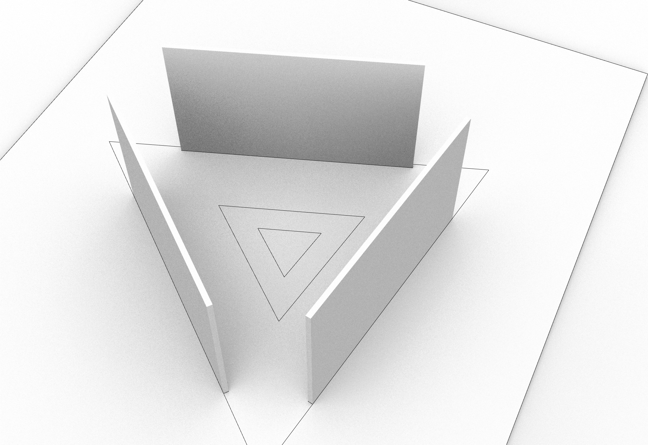
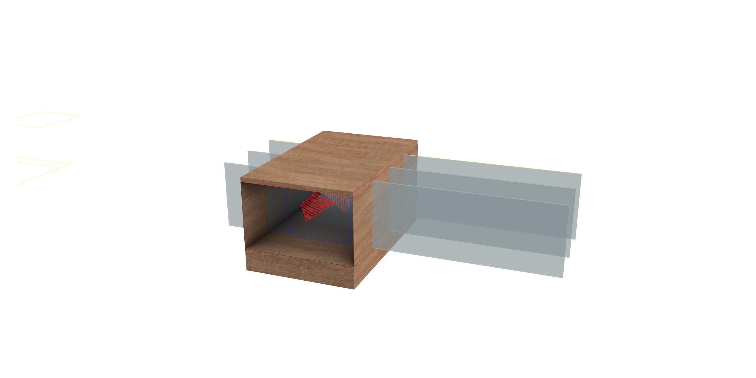
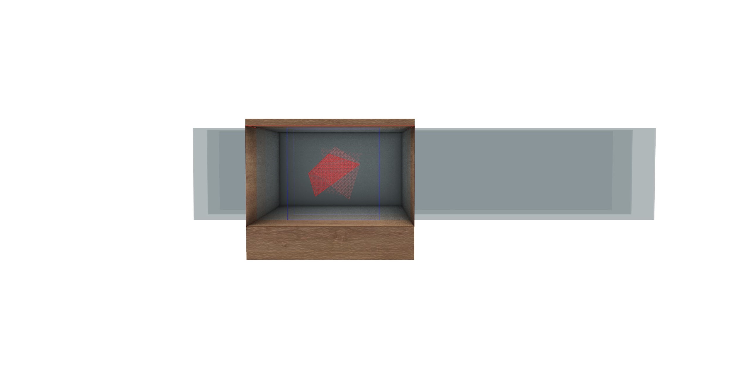
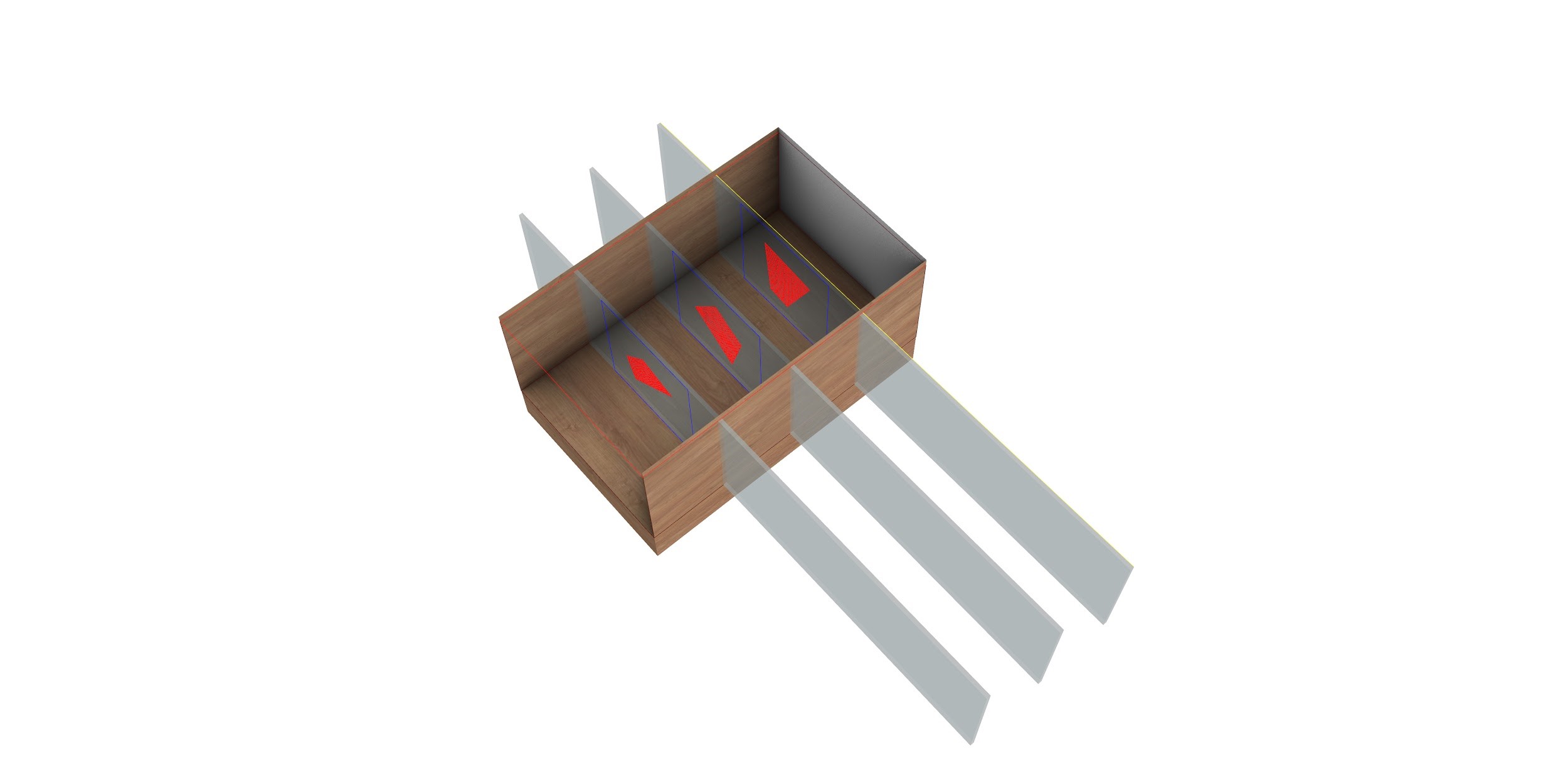
Ternion will be placed at the eye level where the user can look inside the rectangular shape to have a perspective on 3 consecutive transparent lens.
The viewer will be able to see the geometry that the chosen word constitutes with the five close words to it on the word2vec model.
The visual comparison that the viewer is able to constitute in his mind while looking as these shapes extracted will help identify the degree of intersection of the religion at the semantic level and therefore the conceptual connotation to what degree they differ. Dragging the acrylic along the slits will help highlight the different words which will be lit by LED light strips inside.
We chose a grand list of words to process and compare the geometries of. These were:
[‘birth’, ‘trust’, ‘remember’, ‘experience’, ‘dream’, ‘god’, ‘heaven’, ‘hell’, ‘love’, ‘hate’, ‘free’, ‘vision’, ‘believe’, ‘light’, ‘forget’, ‘darkness’, ‘peace’, ‘war’, ‘life’, ‘death’, ‘man’, ‘woman’, ‘child’, ‘eat’]
We decided to focus on having our words focus on a time-related theme, where “believe” is the center panel and represents the present. The surrounding panels represent the past and the future.
Past: remember, forget Present: belief Future: vision, faith
Future Directions
Moving forward, we would like to visit some ideas we had but chose to discard because of their time complexity. These discarded approaches will give the users the power to choose words, texts, and other factors to make the experiences more immersive. We would also like to explore more religious texts and analyze more data to arrive at better conclusions.
Work cited
Word2Vec and NLP papers
-
Design document draft
https://docs.google.com/document/d/1lEJndykw1Wr_g4N2_cUPu8eVtZE7DwDExjlwFbts-V4/edit?usp=sharing
Feel free to add comments. Still need to add some things and make it more cohesive!
-
Ternion Updates
Per last week’s update, we have decided on a final deliverable. We will sketch polygons formed from the distances between words in the religious texts, onto acrylic sheets so that the audience can view comparisons between the texts. Ultimately, taking digital data and transforming it into something physical.
We are testing out two ways to compare the religious texts. First, we are testing out our original plan to determine distances between words and sketch out polygons using just those determined distances. Our second method that we are currently testing, is to examine the concepts that derive from the texts and comparing the texts across concepts.
Next Steps: Decide which method is more accurate and tells the best narration of the texts. Sketch the remaining concepts/words onto the acrylics.
-
Playlist made physical update
We have separately implemented all our goal features! Still working on stiching them together in one app. We screen-recorded a demo, and will hopefully be also demonstrating live in class.
- Scanning object
- Attaching playlist to object
- Making playlist using music in local library
We also have a design model/fleshed-out wireframe now. Link to updated slides: https://docs.google.com/presentation/d/1aH90p7cVEzZVg_yQ1QU22GicTVbb0r679ssGHeGehWw/edit?usp=sharing
-
Museum Augmented Spaces
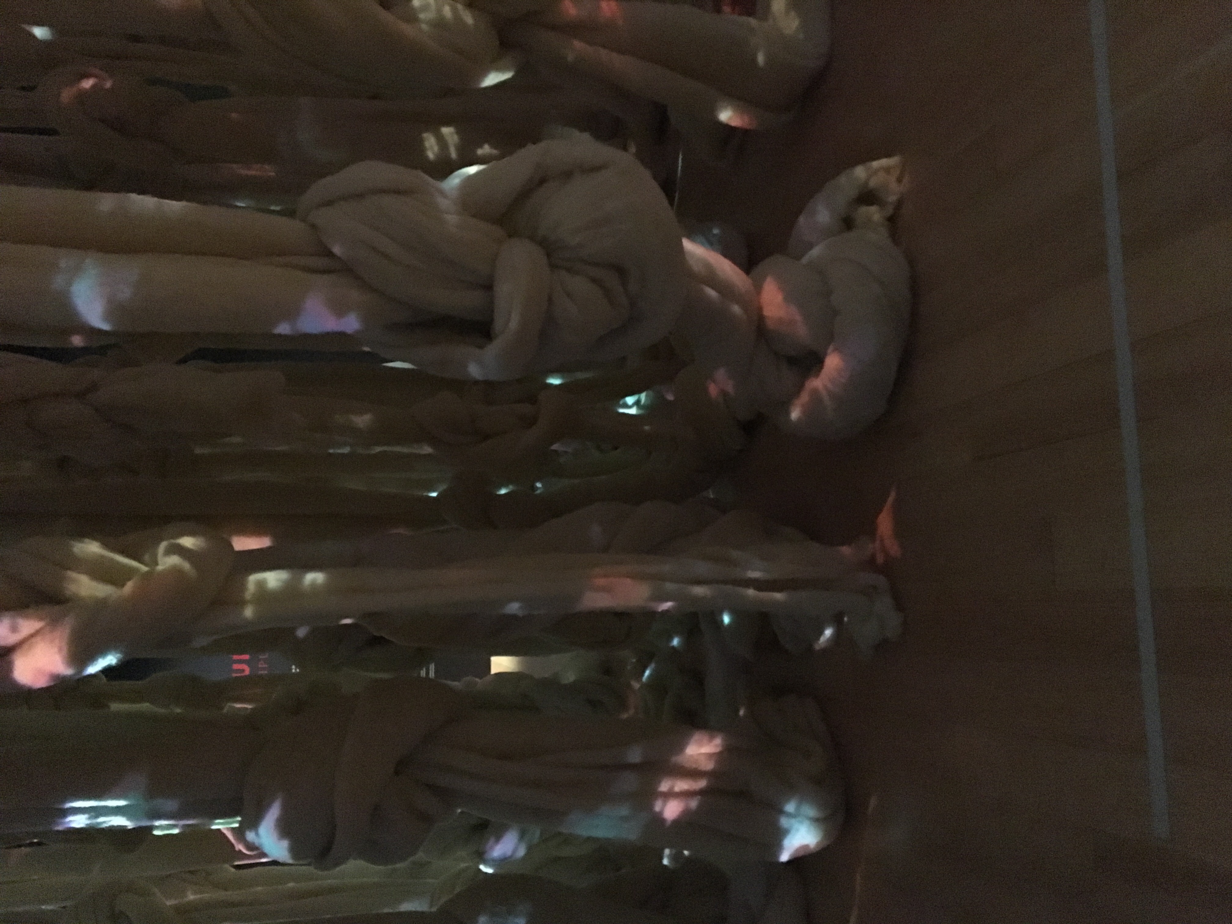
I went to the MFA for this assignment. I was not able to find much augmented spaces with technology. One of these spaces explored quipus from the Andes, which are cords with knots used by those people to record and write history. The way they augmented the space was by having huge quipus hang from the ceiling in the center of a square room with projectors illuminating them which produced some patterns. They had a soothing music coming from inside, probably with speakers in between the cords, one could not go in between them and they had a security guard making sure. They then had the usual written information on the walls of the room.
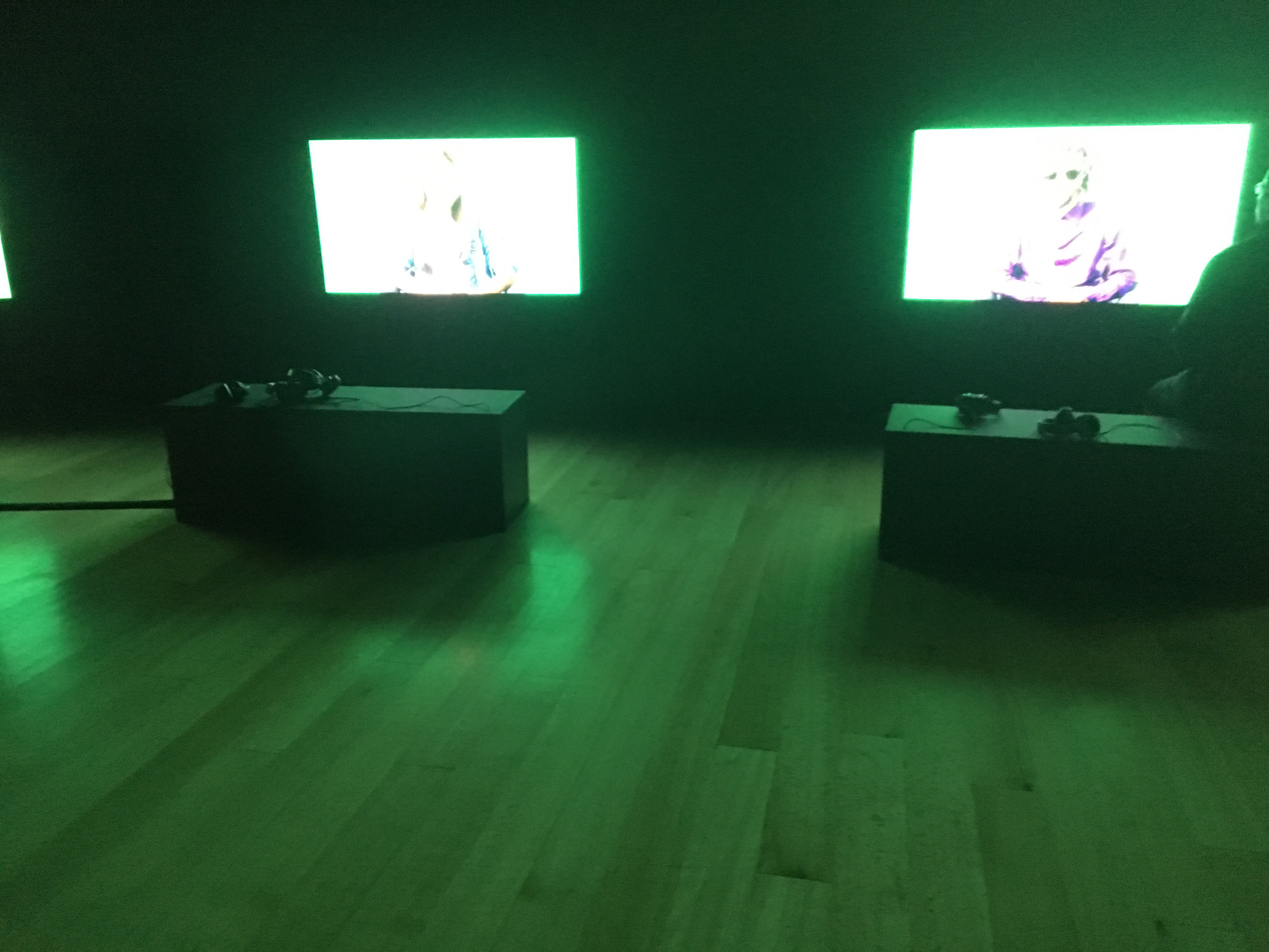
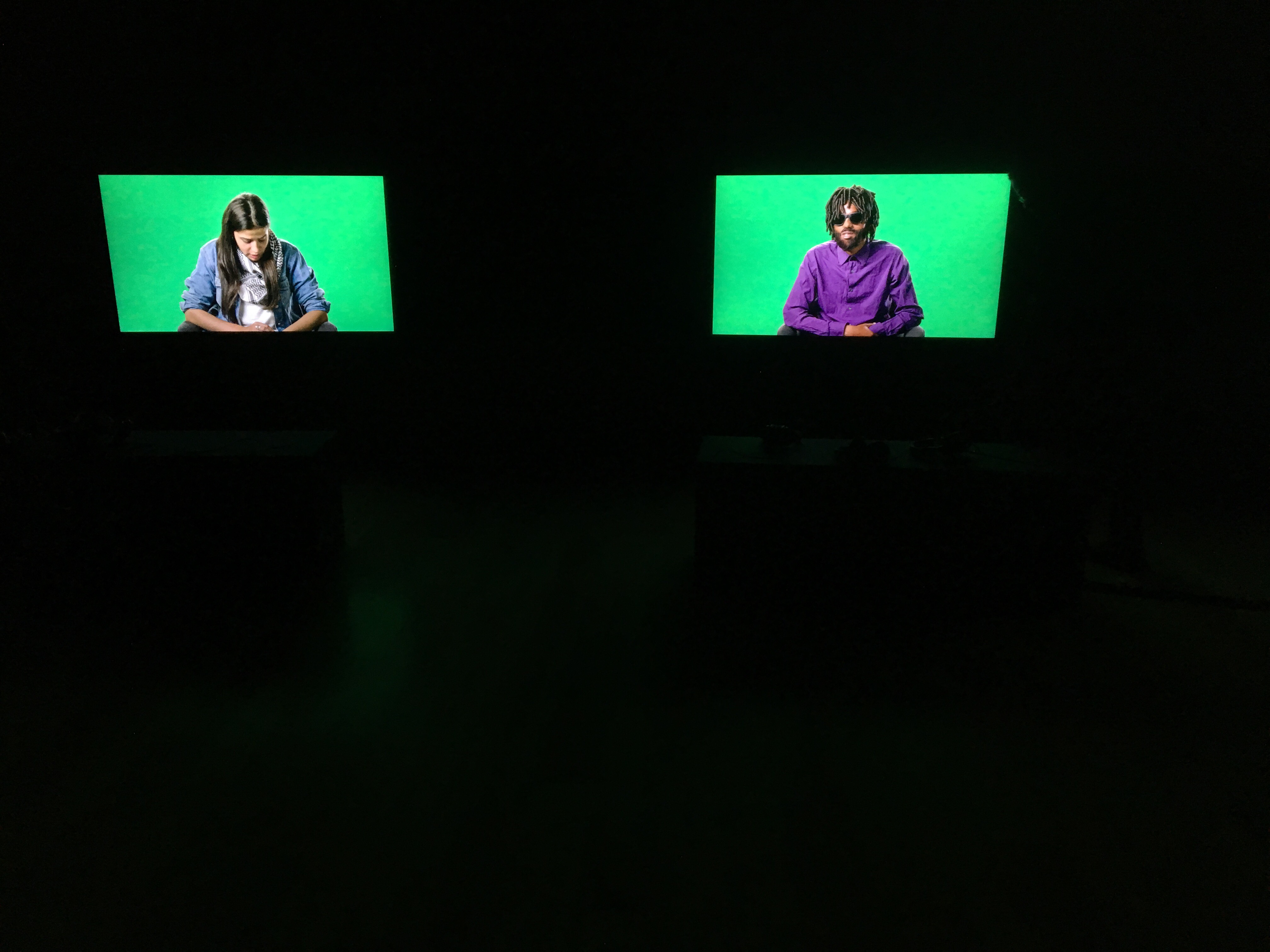
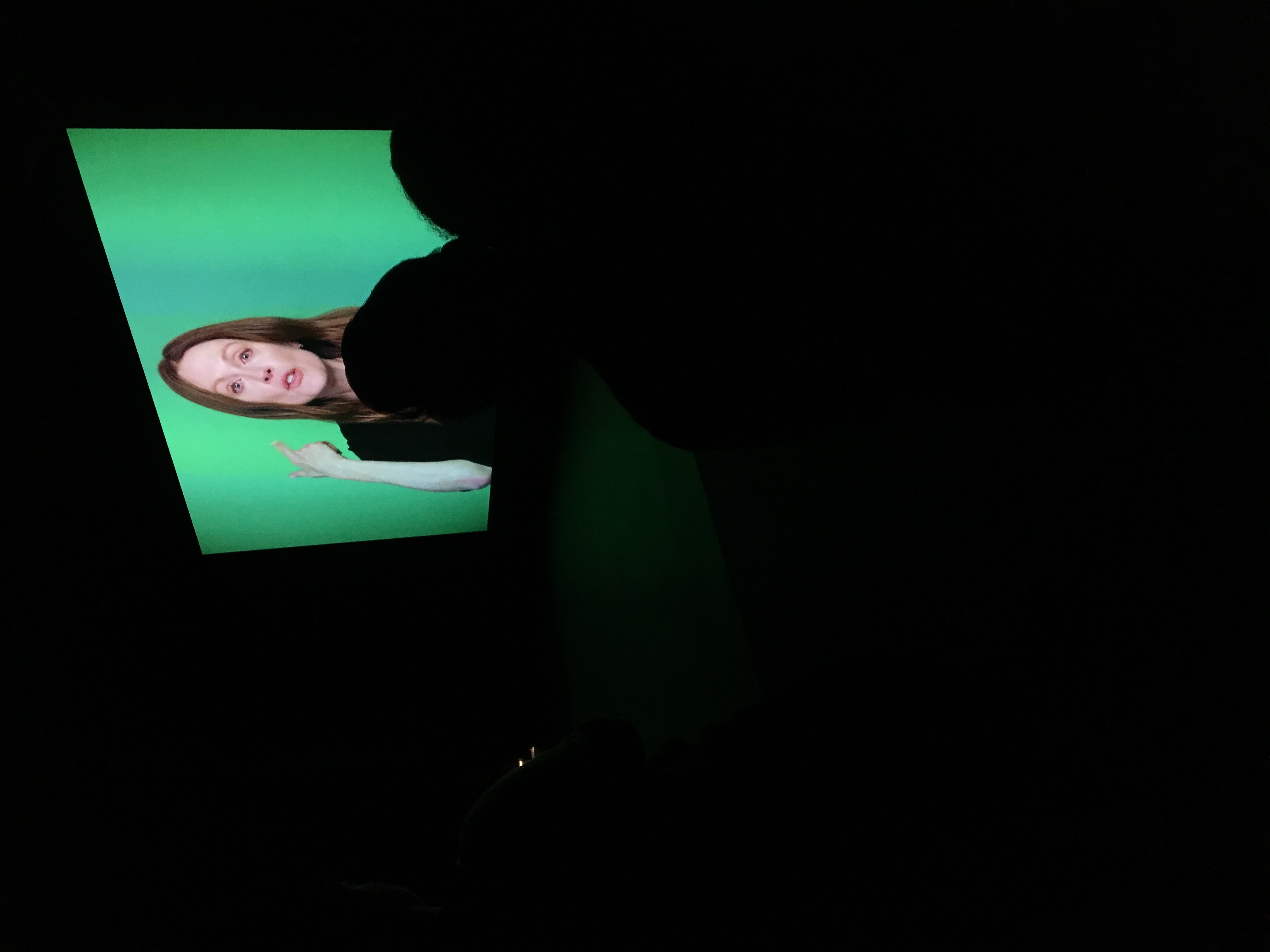
The other augmented space I found was an exhibition called Love Story. This exhibition was about refugees that escaped from their oppressive countries. They had a main room with a large screen showing a video of actors Julianne Moore and Alec Baldwin, who acted out excerpts from the original refugee interviews. There was then a room behind this that had six screens with one bench each in front of it with 3 headphones each. These screens had each of the original interviews and were positioned pretty close to each bench. The creator of this exhibition really wanted to add the sense of immersion there with the headphones and close screen. Although the use of headphones was pretty good to make people more immersed in each interview, no one was cleaning those headphones so I think there could be a better way to facilitate the interactions.
Besides from these two installations I could not really find any other technology using augmented space. Most of the museum consisted of paintings and objects displayed with text printed somewhere next to them.
-
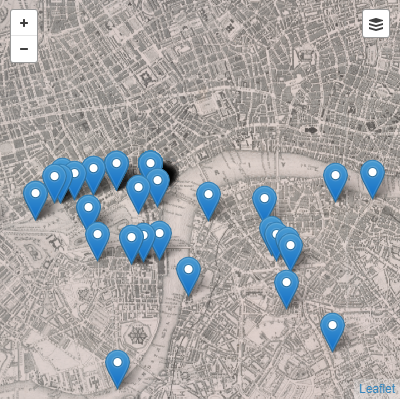
Melville's Travels
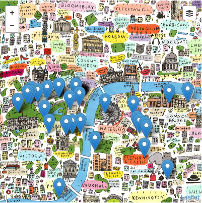
For this project, I used the MapBox API to geo-reference the Melville in London data to a 1849 London Map and a contemporary one(unfortunately was not able to find a free one on Open Street Map so I used a cartoonish one I found on MapWarper, which still illustrates the point). The purpose of this project is to allow users to compare locations Melville was at in 1849 vs where would those locations be now.
The project allows user to move around the map and see data points, change the underlying map layer, and click on data points to see more info regarding that data point.
Below you can see a example picture of how a section of the map may look with the 1849 map.
Then if you hover over the controls on the top right corner you can change the map to be a contemporary one, which would look nicer with a better map but this one will have to do.
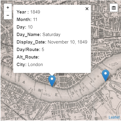
You can also click on points to get a popup with data from that point.
This project required to have map tiles, a tool such as GeoJson.io that can convert excel spreadsheets to a list of feature data points(can be done by yourself since all its doing is formatting it into a json object), the MapBox API, and some javascript,html, and css coding to put it all together.
In terms of limitations of the tools, GeoJson.io had the problem that only 185 spreadsheet data rows may be added at a time, so I had to manually divide the points into 4 files containing 100 points and then adding them. Also it had problems with data points containing no coordinates, so those had to be removed as well, and if coordinates were formatted weirdly(for example some of the data coordinates contained extra commas) it would not accept them either and give you no error message, just no response from the map or the constructed json. Finally, not having access to decent map tiles can make the project complicated since one may end up having to construct their own.
-
Layer Cake
For the UI, the events could be made easier to click. Also, when you click on an event, if another event that seems to be clickable overlaps with the area of the screen containing the events info, then you cannot click it. It would be helpful to have dates next to each event on the event list so users do not need to click on many events to get a sense of time. The map could be divided on the locations of that time to get a sense of place when going through each event. An explanation of what the descriptors(complacent,focused,etc.) mean could also be added.
-
Curation Project
For this project, I filtered the spreadsheet with many words and ultimately decided to use portraits since they had a number not too low or high so I could show something without looking at hundreds of pictures.
Then I divided them between the 16th,17th,18th, and 19th Century collections. I hoped that the purpose of these collections were to allow people to notice differences in how portraits looked and how they have evolved over the centuries. For expanding the project I would try to use more portraits and analyze their similarities and differences to tell a clearer story of the centuries based on portraits.
https://marais633.omeka.net/collections/browse?sort_field=Dublin+Core%2CTitle
-
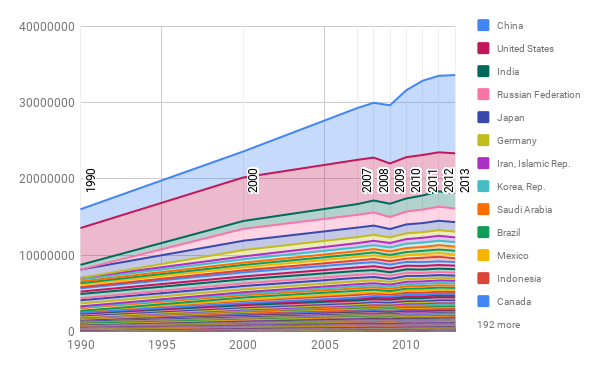
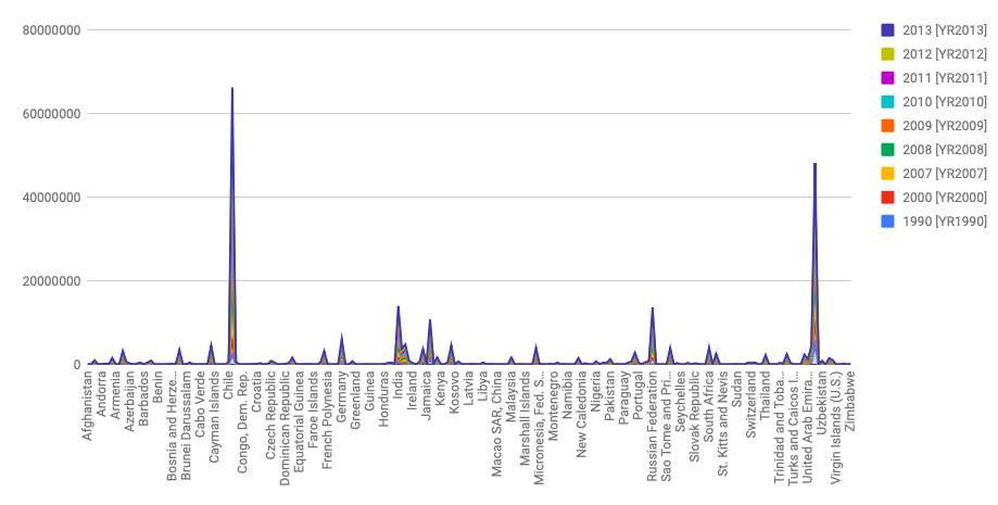
CO2 Graphs
In the below chart, even though since there are so many countries so some of them got hidden, there are 2 countries that stand out from the rest. They are China and the U.S. and one can see that there is quite a difference between their CO2 emissions and that from other countries. Simple graphs like these are used since they are easy to read and do not require much technical background. This graph supports the claim that the U.S. and China release much more CO2 than every other country.
Often people will manipulate the y axis so that large differences will seem small to the average user.In this over exaggerated graph I increased the max value of the CO2 emissions axis, so now the differences in emissions from before look very small unless you pay attention to the axis value. This tricks people that just look at the visualizations for a trend and do not really read the data.
-
Marais Digital Curation Mini Project
For this exhibition, I curated an exhibition of portraits.
Approach Step 1: Translate the text from French to English.
Step 2: Search for the word “portrait” with in the picture description. Findings: Only filtered 24 picture results.
Step 3: Looked for commonality in other fields amongst the 24 portrait photos. Findings: The “Subject: Topics: Vie Quotidienne” field contained “clothing” in most of the portrait photos.
Step 4: Search for the remaining data (not included in the filtered portrait data) for the word “clothing” in the “Subject: Topics: Vie Quotidienne” field. Findings: 27 more photos appeared. Cleaned this new data set for pictures that weren’t portraits. Remaining number of photos: 31.
Goals I chose to look at portraits because portraits are a rarity. During the 16-19th centuries, portraits were mainly reserved for those people of high importance, wealth, power, and virtue. I wanted to display the most powerful people and the state of celebrity culture at the time through portraits. Portraits are the easiest way to display a certain societal significance.
Story My goal is conveyed through this exhibit because the images that I was able to gather included Kings, Emperors, Religious Figures, Warriors, etc. It tells the stories of some of the most influential period during that time period.
How to expand the project to be more useful for a public audience: I would like to connect the stories of those people to the actual Marais neighbrhood and understand the connection (if there were deeper connections/relations that existed).
-
Digital Curation of Le Marais
The Bourgeoisie and the Common People
We chose to look at the differences between rich and poor in 18th and 19th century France, and how that affected the revolutions in 1789 and 1848. The data provided interesting examples of how the different classes spent their time, which we wanted to explore the details of.
After first translating the texts to English with the help of Google, we searched through the data and grouped the images by activity. We ended up with 40 pictures in total, distributed over the categories ‘Childhood’, ‘Everyday Life’, ‘Work’, ‘Leisure’, and ‘Conflict’. Most of the images are illustrations, as photography was rather rare at the time. One notable observation is that there are no pictures with both the tags ‘Burgeoisie’ and ‘Work’, which may either illustrate the small sample size of this exhibition, or indicate that the upper class didn’t really engage with that sort of pastime. We also discovered how different their everyday lives were from each other in all the other areas as well.
If we were to expand the project, we would try to expand the collection of images, clean up the metadata, and create a clearer, chronological narrative. Getting a larger image databast can make for stronger interpretations, and creating a clearer narrative with less superfluous data can make the information more accessible. Ideally, we would also provide a better historical context, to try to establish a better cause and effect-narrative tied into important events.
-
Digital Curation: Parisian Places
While Yichen was scrolling through the Dropbox, she noticed that there were many images of town squares. We decided to make that our focal point.
A quick Wikipedia search showed us that Paris does not regard these as Americans traditionally understand “squares”, but rather call them “places”.
However, the French use of the word, “square”, presents some small problems in interpretation because native speakers of English use the same word to mean a notable urban crossroads (like Times Square in New York City) or an urban roundabout (like Trafalgar Square in London), where neither grass nor trees nor flowers are present. Such a public space would be called a place in Paris: as in Place de l’Étoile or Place des Vosges or Place de Clichy. The French use of the word “place”, —— where, in the USA, the UK, Canada, etc., an English-speaker would use the word “square”, —— follows the pattern established in other European languages: the Spanish use the cognate, “plaza” (like Madrid’s Plaza Mayor); the Germans use “platz” (Berlin’s Potsdamer Platz); the Italians use “piazza” (Rome’s Piazza Navona); etc.
So, in summary, the French have “squares” that might (or, more likely, might not) be called “squares” in English, and they use the word “place” to denote what an anglophone would almost certainly call a “square”.
We decided to make collections highlighting 4 of these “places”.
1) Places des Vosges
2) Couvent des Célestins
3) Jardin Turc
4) Place de l’Hôtel-de-Ville
We can see through the pieces that all kinds of events – celebrations, music performances, gathering of both the middle class and bourgeoisie – happened in these public outdoor spaces throughout the history of the city.
Our goal is to showcase how theses public places changed over time and how people used them changed over time (and how they stayed the same).
It is interesting to compare these spaces to large public areas that we are familiar with, such as the Boston Commons or Central Park in NYC.
-
Sorting Hat Project Updates
We have begun processing data from our survey and created some basic statistical analyses of it, but we are looking to come up with more advanced analyses and to get more data from smaller majors. We’ve also created some wireframe mockups of what we’d like the site to look like. We now have access to CSVs of MIT’s major satisfaction, and we are looking into getting the correct formating for the alumni data. A presentation about our updates can be found here: https://docs.google.com/presentation/d/1DFJch9lMO8ZJTKtysGTK8CpToYrmB4IAqs8MZL7iqnQ/edit?usp=sharing
-
Playlist made physical update
We managed to figure how to scan & attach things to 3D objects! Hopefully we can demo in class.
-
Sorting Hat Update 11/06
We have sent out our survey, but would like more responses.
-
Progress: we did stuff!
https://docs.google.com/presentation/d/1aH90p7cVEzZVg_yQ1QU22GicTVbb0r679ssGHeGehWw/edit?usp=sharing
informal presentation on what we’ve done
-
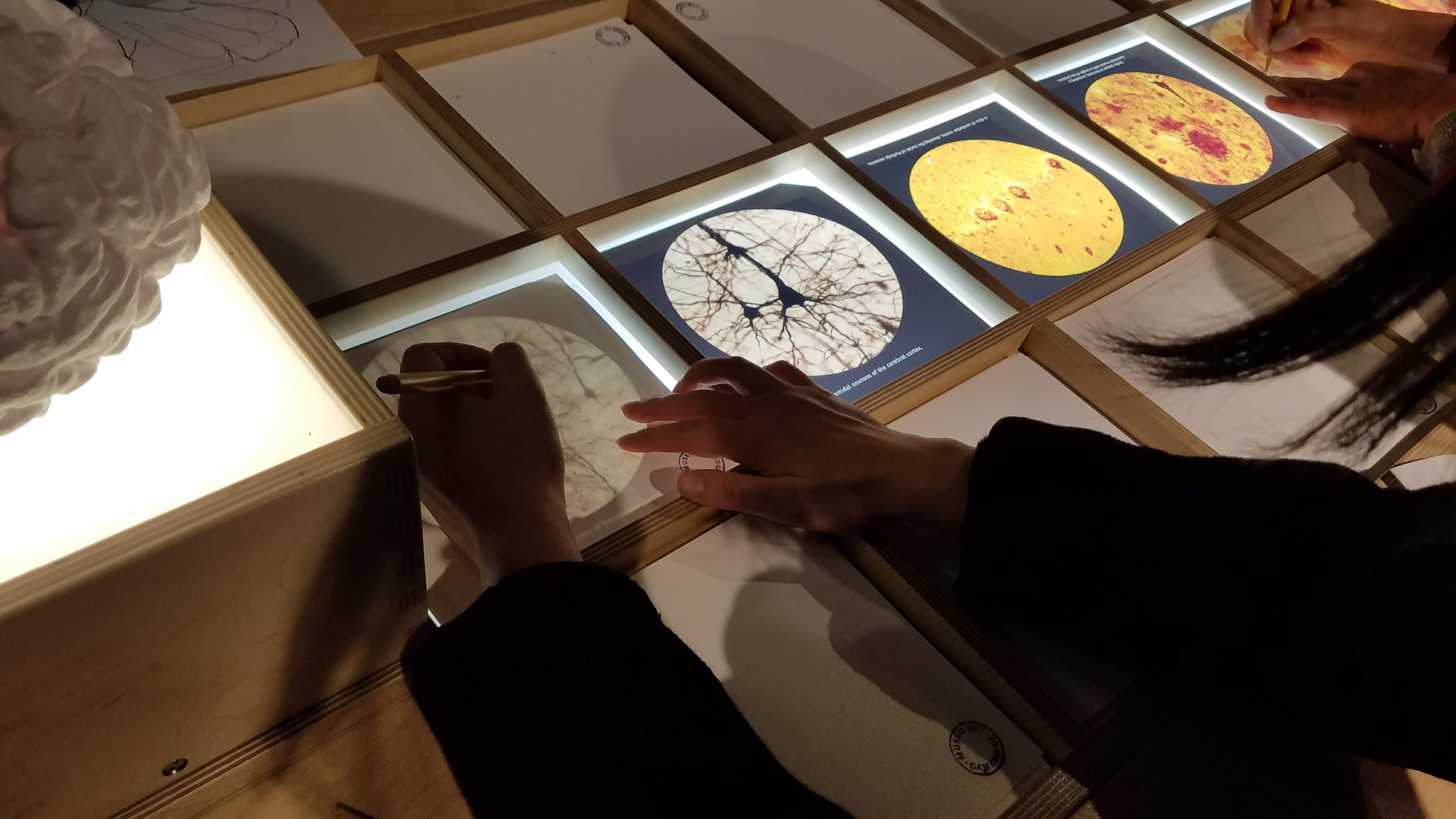
Ethnographies of Public Spaces
Harvard Art Museum
I chose to visit the Harvard Art Museums. This museum is visited mainly by Harvard students, tourists, and residents in the surrounding Cambridge area. On my visit, I observed mainly adults (tourists) viewing the galleries. Of the 5 floors that had a gallery or exhibit of some sort, only 3 of the floors had a gallery that was accompanied with a tech component. The first technology I observed was immediate upon entry into the museum. To my right was a wall that displayed about 20 small television screens with artwork being shown on them. As I toured the rest of the museum, I found myself getting bored due to the lack of interaction occurring. Most of the exhibits were created to manifest an independent and siloed experience for museum-goers. It wasn’t until I reached the final exhibit on the 5th floor that I experienced interaction through the exhibit in a technical way. The 5th floor of the museum contains the Lightbox Gallery which is stated to be a “collaborative space for digital projects.” Inside of the exhibit was a piece of work known as the “Great Salt”. This gives portrays a sonic interpretation of the story of the Great Salt and allows viewers to interact with the display via the thumb pianos connected to the 40 electronic synthesizers that make up this display. I observed users become increasingly fascinated with the perceived complexities of such a rare depiction of historical narrative. Yet, very few visitors who interacted with the display actually read what it was about. And so while the interaction occurred, a knowledge gap still existed because users had no idea what it all meant.


-
Boston Public Library Ethnography
We saw almost every demographic in the library; in particular, we saw a lot of young adults and older working on either the library’s computers or their own.
There are numerous screens near the entrance that tell you a lot of information - what events will be happening, new books, etc. These are also, in theory, touchscreen and interactive, but we found them to be heavily glitchy. On the one screen that worked, there was a catalog of the library’s digitized collection. We didn’t see anyone besides ourselves using it. We presume this is partially due to the glitchiness and also due to the lack of clarity of what exactly it is.
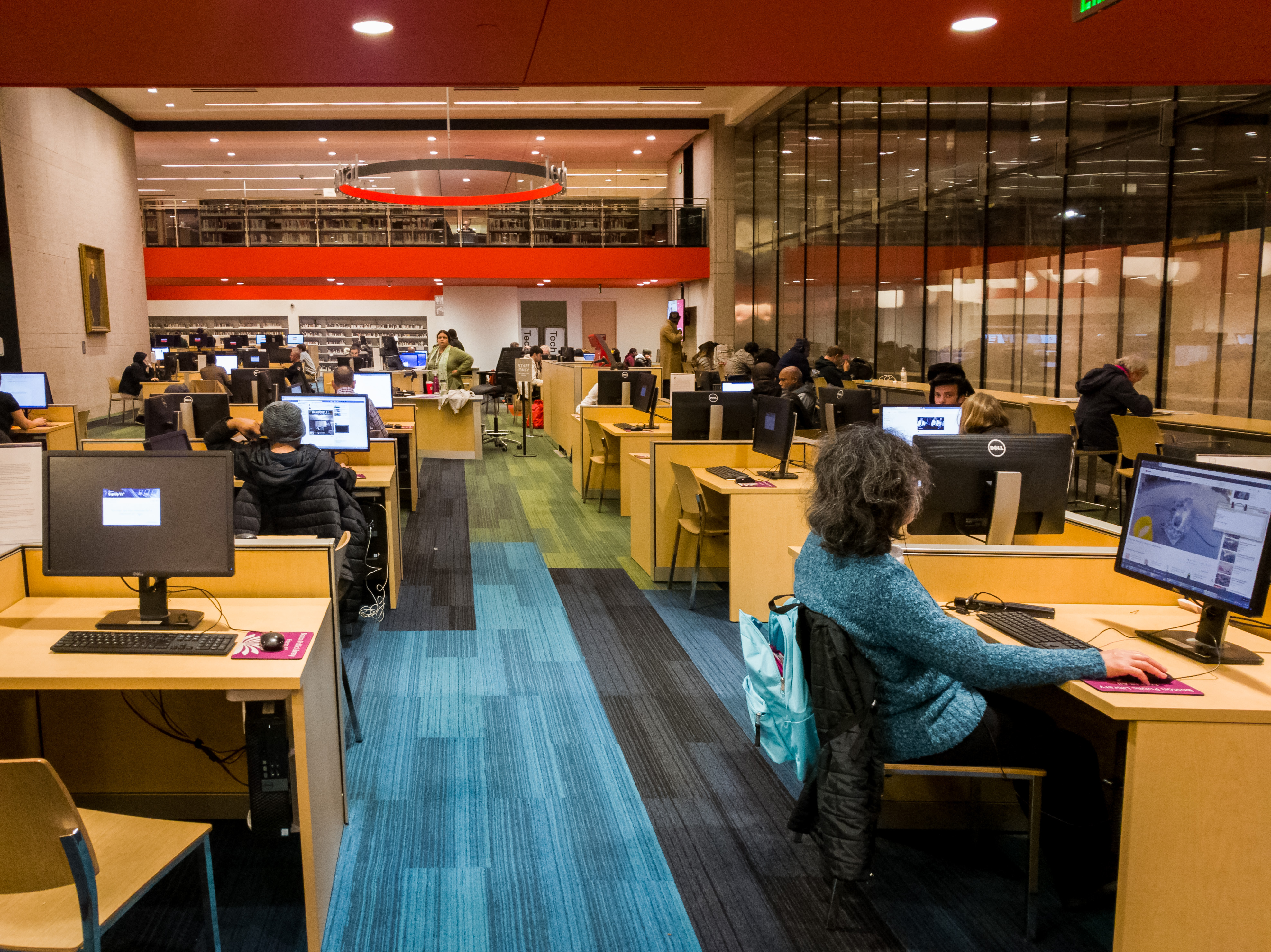
There are also computers (macs and windows) that are accessible to anyone with a BPL card, as well as some computers that are reservable for 15 minute time frames without a BPL card. Many visitors were using these, and it seemed more people were using the computers in the library than the physical books.
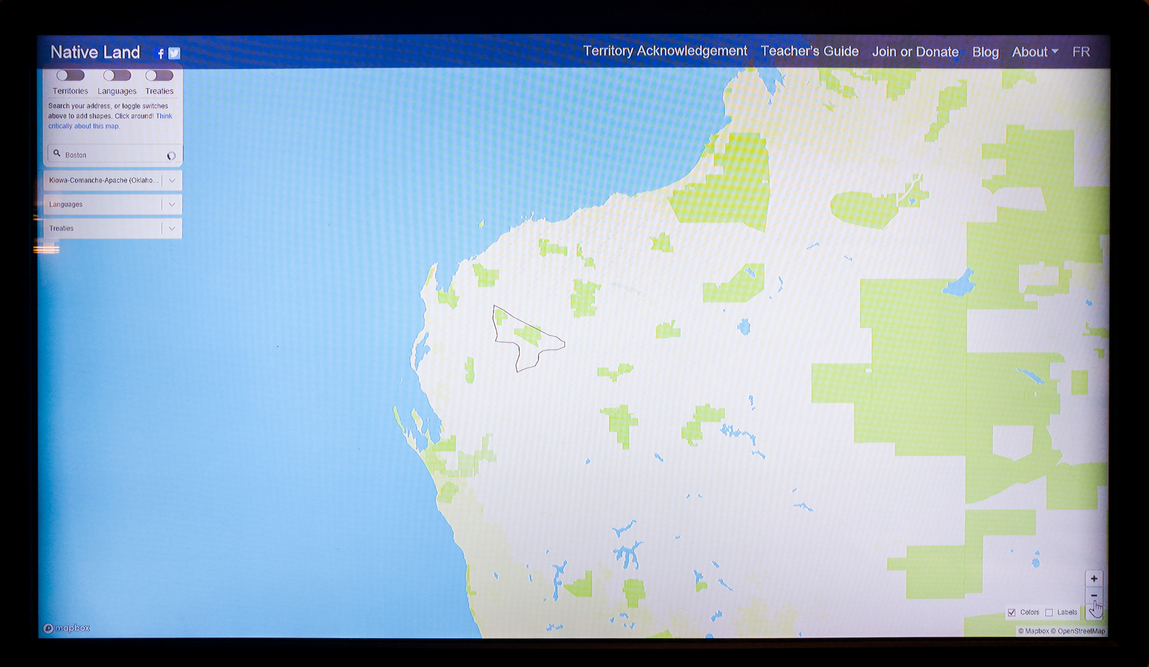
In the older section of the library, there is also a small exhibit on maps which involves an interactive map of what Native American tribes were on what land in the United States using Mapbox. It allowed you to (in theory) look up your own address to figure out what tribes used to live there. It was unfortunately glitchy and therefore unused, partially from the touch screen and partially from the interface. It was also placed near the back of the exhibit, and it was difficult to tell what it was supposed to be for a while. Simply a smoother UI would help increase participation.
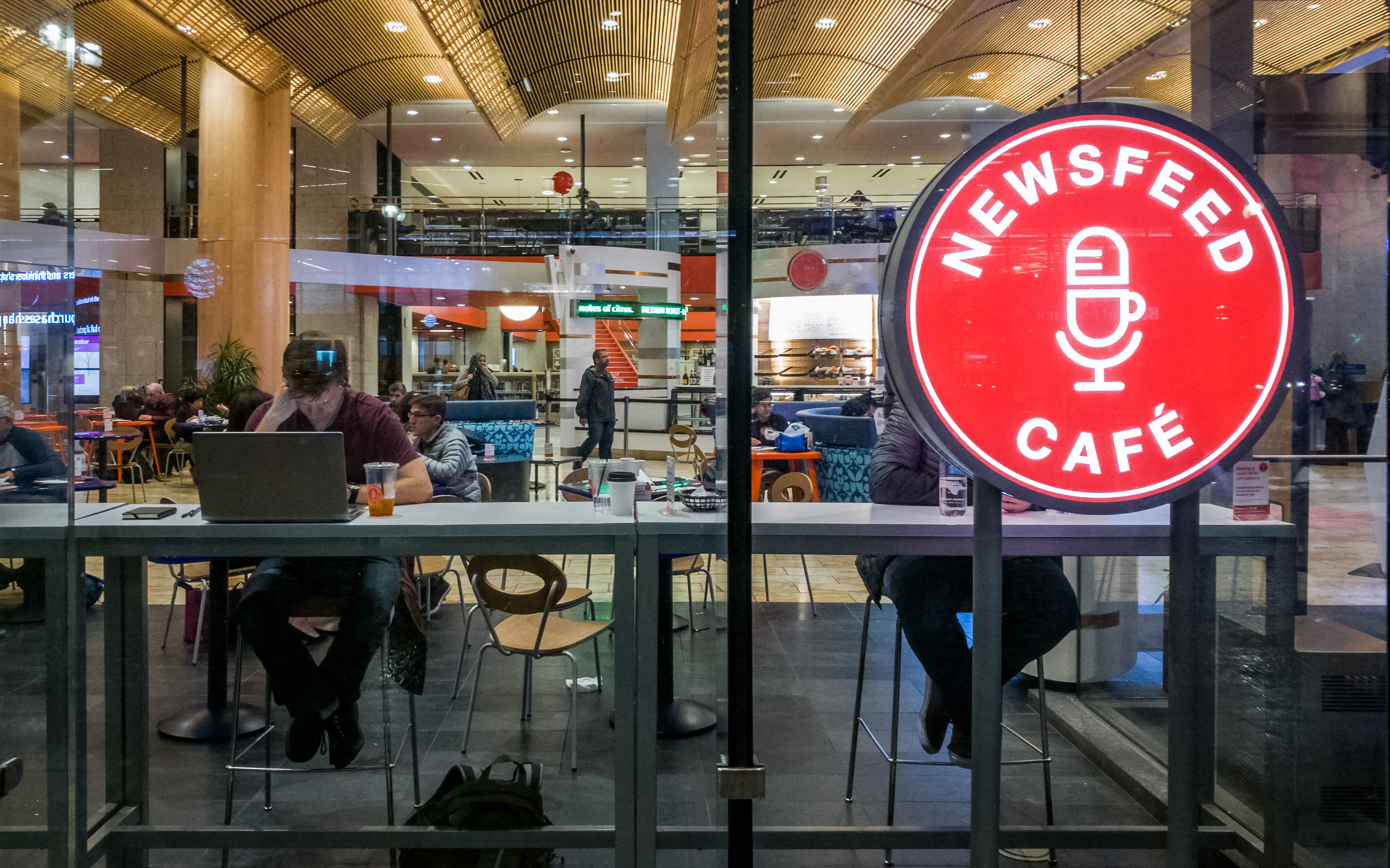
Within the cafe, near the radio news broadcasting area, there are a number of news tickers that were rather large and mostly ignored. it seems to be an excessive number of news tickers to serve the same basic purpose, so they could be cut down and potentially slow down the rate of the ticker so that people actually look at it. It would also be interesting if the ticker displayed information related to the library rather than just random news.
Most people use this space to do computer work or independent reading. However, if you go at night, it’s not uncommon to see homeless people sleeping on the property (not inside though).
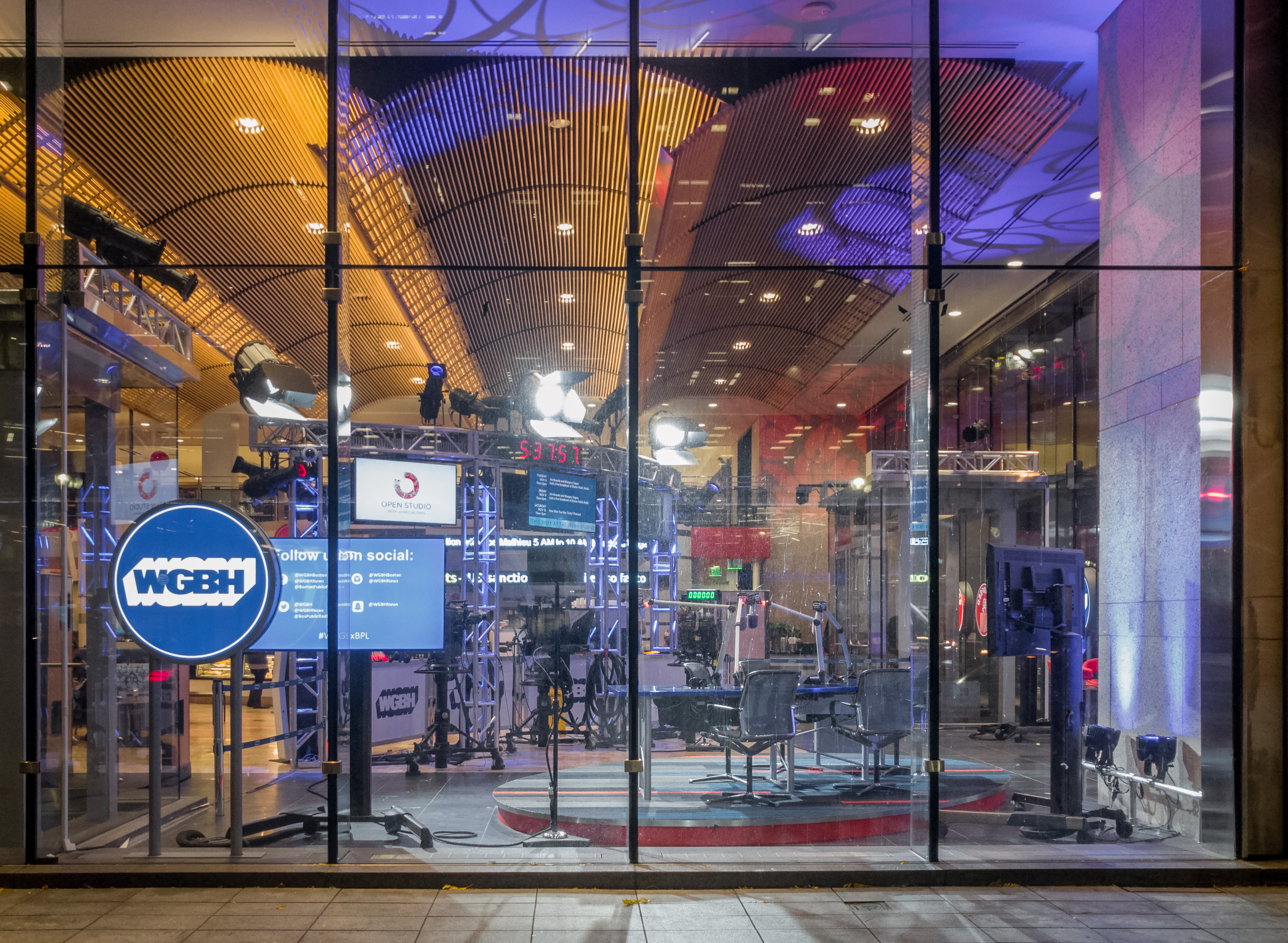
There is also a section of the library that seems to be used to record radio news broadcasts, within the cafe section. We don’t believe that the BPL is advertised as having such a space, so you could say it’s unexpected - especially considering libraries are usually seen as places that are supposed to be quiet.
As libraries are generally designed for individual use, the technologies are mostly focused on presenting information and providing services to individuals rather than creating a shared experience. From personal library experience, when you check out books, the librarians record your name/date of return inside the book, and it can be cool to see who has used this book before you. Implementing a similar mechanic, which does not force interaction, but simply indicates the existence of a common bond, could be interesting, such as creating a method for people to add books to their book list, and having that be public information.
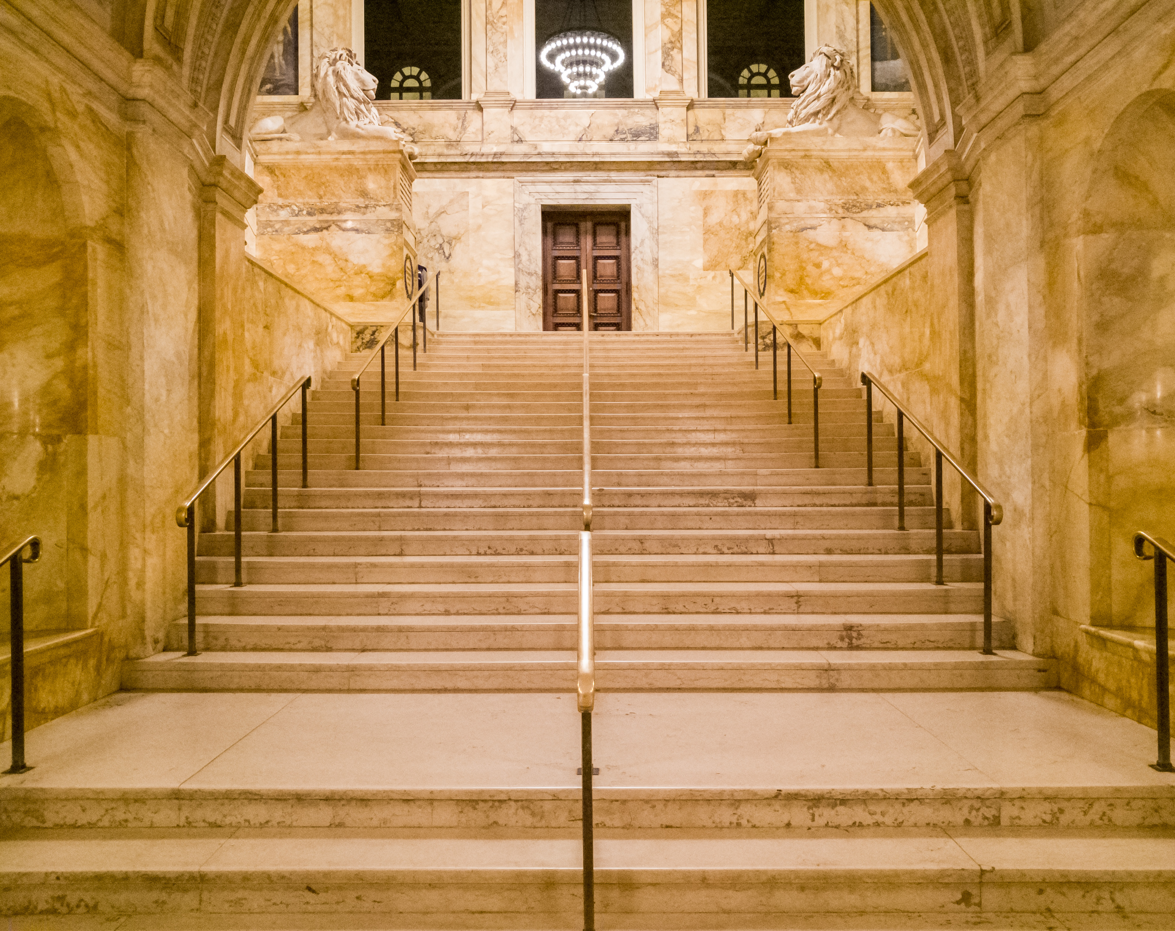
From far away the BPL can be seen as both a monolithic and beautiful structure with brownish-grey stone making up its exterior. However, when you go closer, the relationship between interior and exterior is blurred slightly - where there would normally be a wall, there are glass panes all along the front. This makes the library a lot more welcoming than if the plain architecture had been extended down to the ground level and you were only greeting with stone as you approached. The way it is now, you have a full view of the entrance area, and can see many different people utilizing the space in their own way. The older area of the library has an entirely different aesthetic, with its fairly grand entrance and stairs. These different appearances also give them different functions-the older area is for sightseeing as well as work, while people mostly just work in the modern area.
-
Ethnographies of Public Spaces
The MIT Museum
Who?
We visited the MIT museum on Sunday morning. From our observations, most of the visitors were tourists. Some of them went to the museum as part of the experience of visiting MIT. There were also a lot of older adults and children visiting the museum, but we didn’t see many students while we were there.
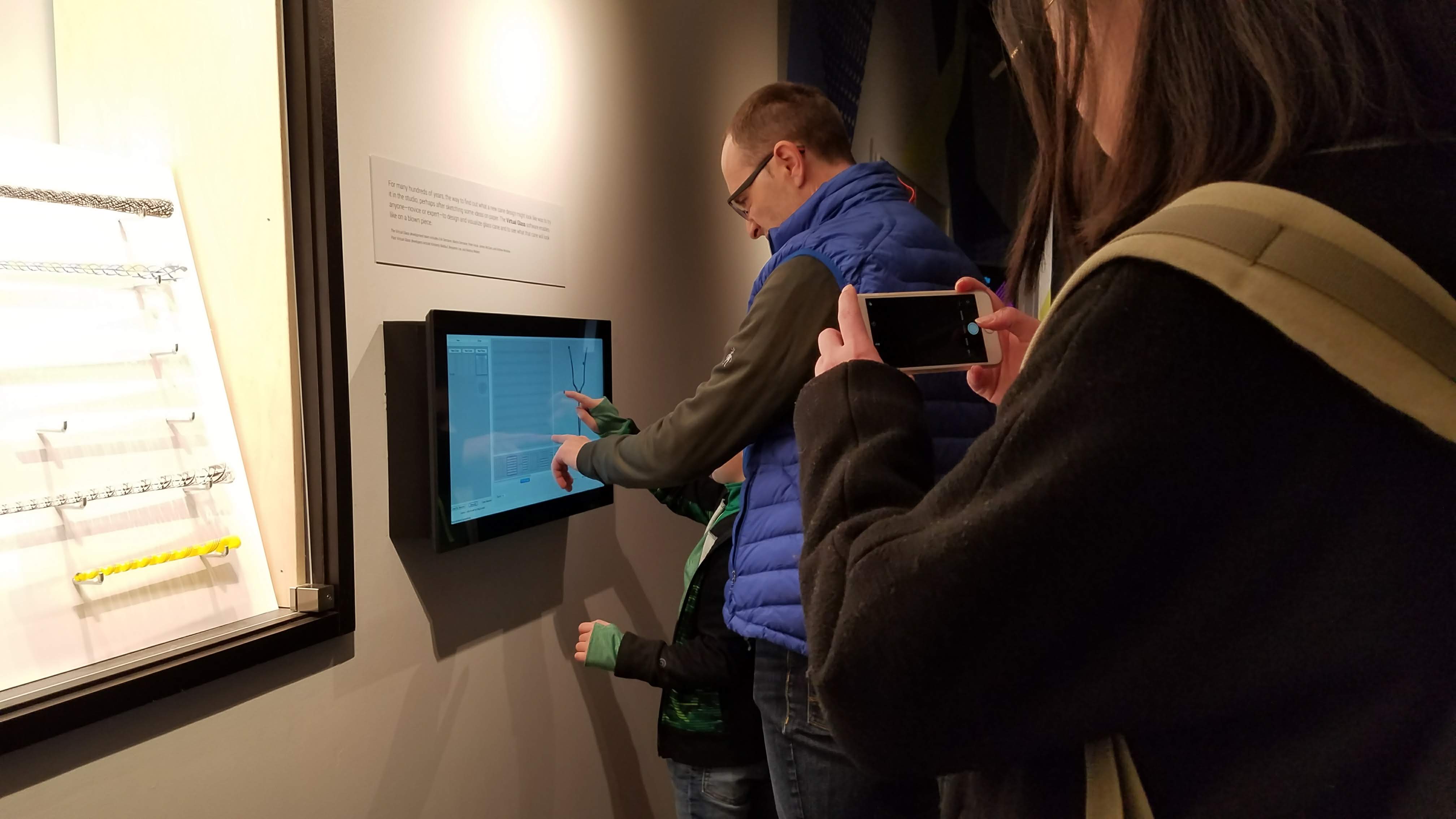
A parent/guardian helps a child use a touchscreen that accompanies the glassblowing display.
Yichen joins a table with a child, their parent/guardian, a museum worker, and an adult.
Technologies
Projectors were widely used for both exhibitions and ornamental display. Not a lot of people were watching the videos, so perhaps running them at an infinite loop is not the best way to display them. Maybe having some sort of “play” button would increase interaction.
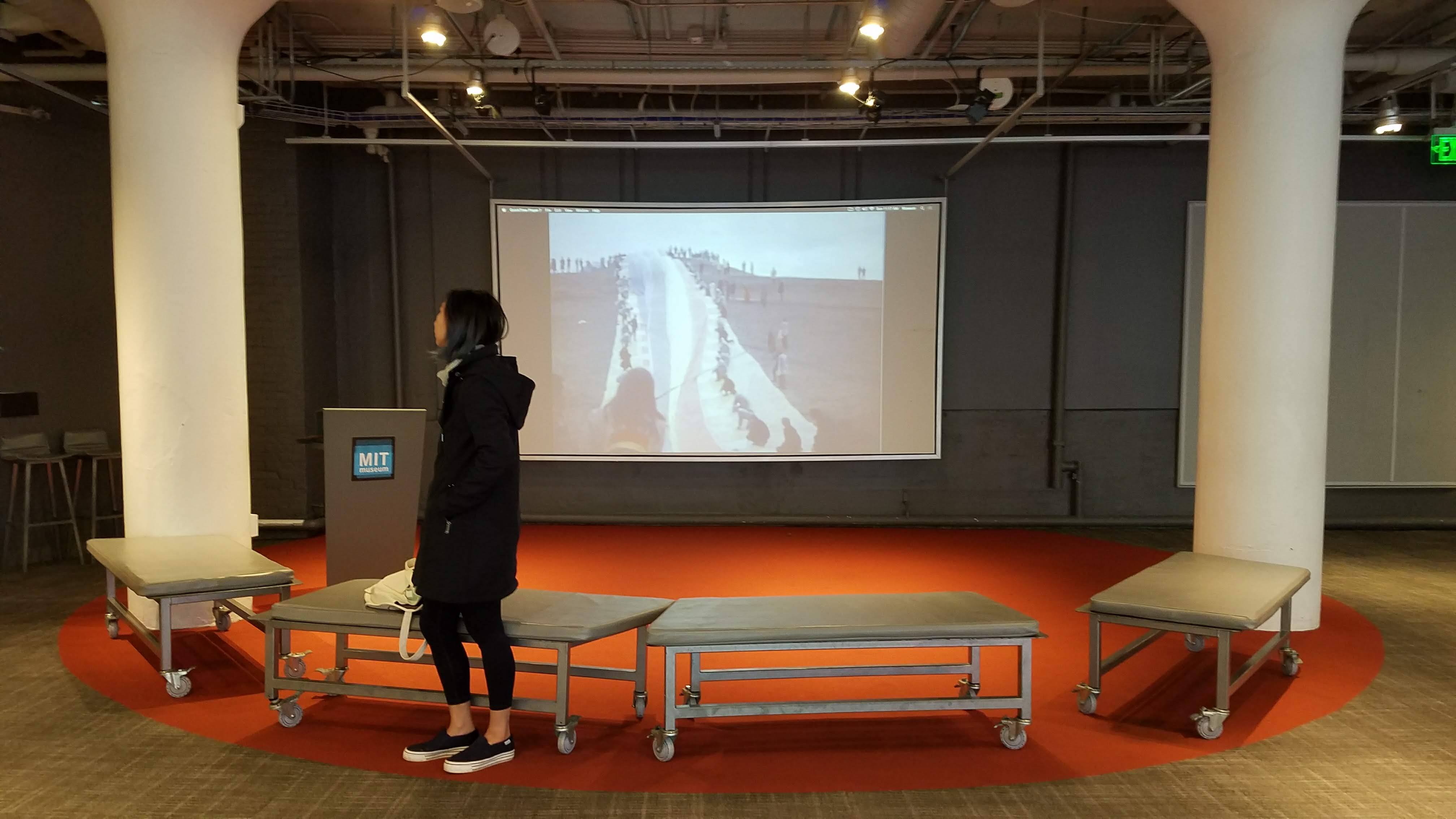
A large projector showing a video about an art installation goes largely ignored.
Various touch screens were installed. Some of them were connected to other devices such as earphones, so it was an auditory and visual experience. Contents shown on the touch screens ranged from 3D models that allowed zooming-in/out, panning, rotating, interactive drawings, interactive infographics, surveys, and so on.Some screens appeared to be touch-screens but were actually not. Just a screen display with no context made it hard to tell.
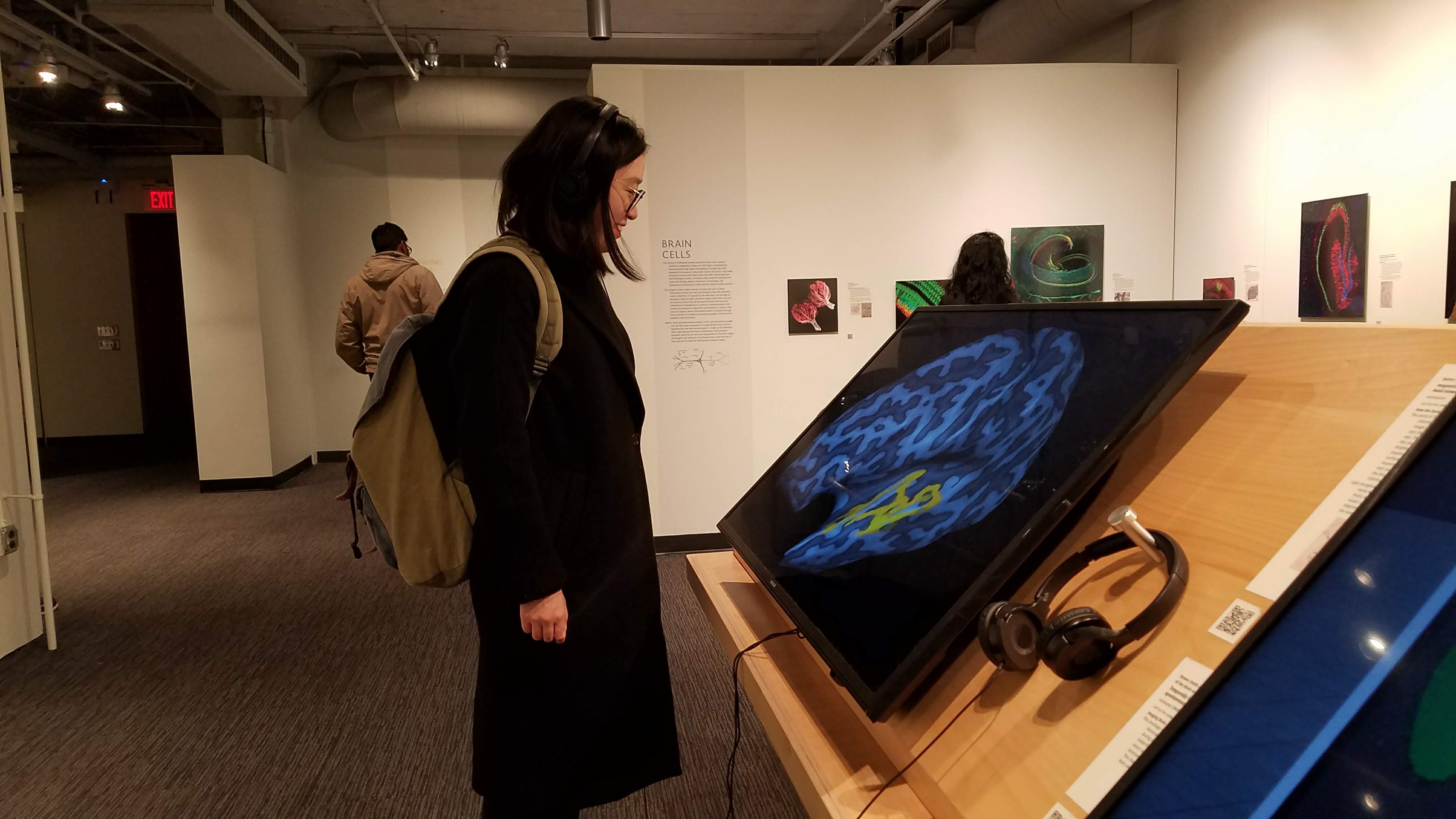
Yichen watches different areas of the brain be activated according to the pitch of a sound that plays in her headphones
Interactive art installations that sense proximity, sound, movement. It was a bit unclear how to interact with the art. A sign demonstrating or explaining how would be helpful, but also might might be too leading? It’s a fine line between allowing the viewer to engage with the art organically, and explaining what to do. Some art was positioned in a way that the visitors were forced to interact with them (such as the staircase leading to the second floor that senses movement and plays music). Some art could be triggered with pedals. In the “Gestural Engineering” exhibition almost all the artworks required viewers to either rotate some handle or step on some pedal to trigger the movement. For the beans installation, it was also a bit unclear whether you could touch and rotate the gear. Again, the fine line between organic engagement and the need for clearer signs indicating what you can and cannot touch came into play. Walls of visual displays were accompanied with books laid out on benches meant to supplement the brain exhibition.
Unexpected uses
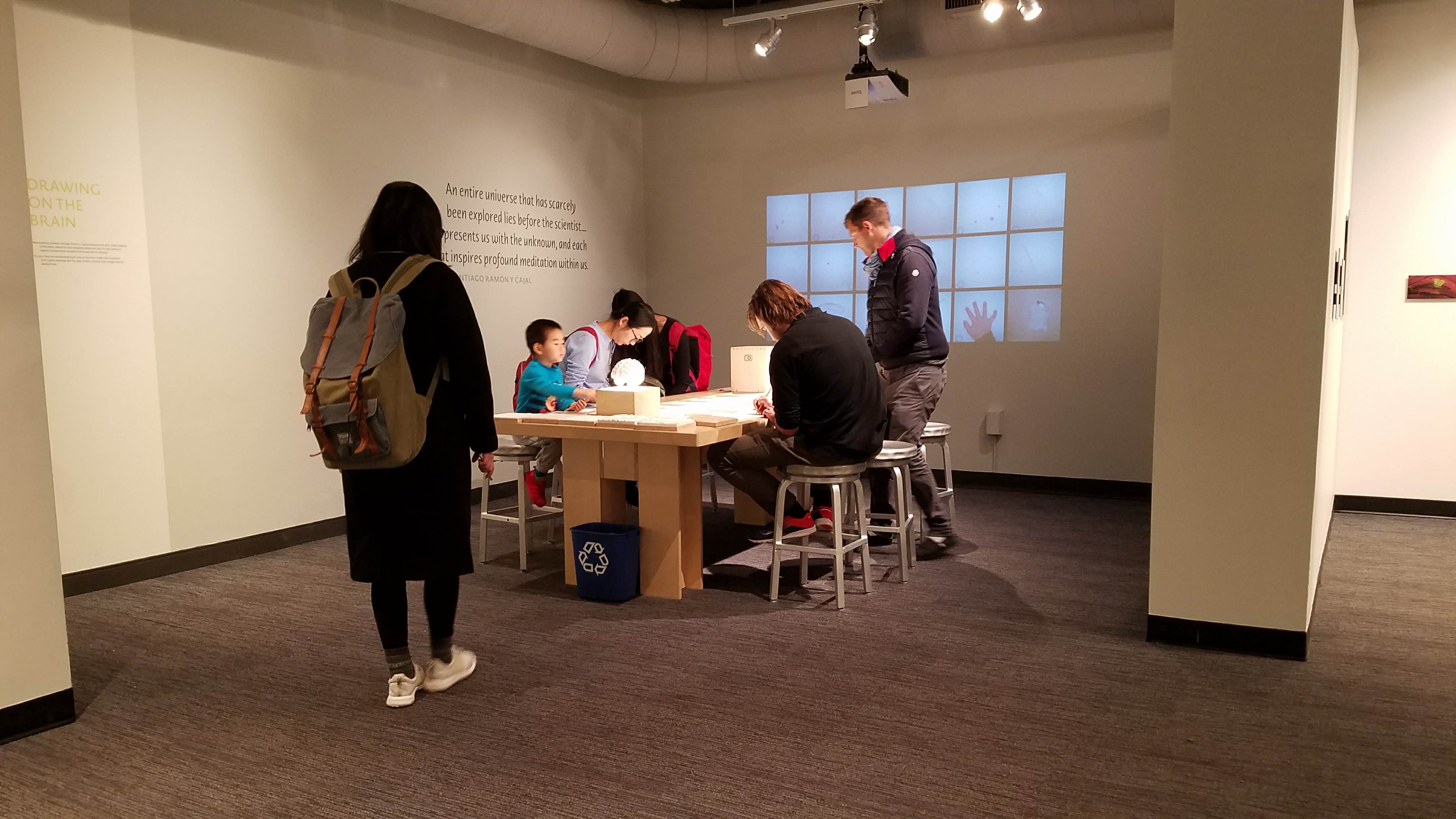
What we didn’t expect was to see many kids in the museum. We believe it is partially because most of the exhibitions had some interactive features, which are especially attractive to kids. Specifically, the “Beautiful Brain” exhibition contained a makerspace where the kids could make drawings of brain on a large table. It included some touchable models of the brain that were meant for blind people, but could be something playful for kids, as well.
Yichen traces nerve endings in the brain
Frustrations and alienations
There were not many places to “hang out”, where one could sit or gather or quietly observe exhibits - it felt more like something you had to keep moving through since everything was meant for standing/walking. The layout of first floor space was particularly alienating, with most of the exhibits smushed in one corner, leaving a a very large empty space in the middle of the room with nothing in it. There is no clear direction or obvious flow of how one should move through the open space. The second floor, however, is clearer in this respect because it follows more of an enclosed pathway and there is a clear direction and progression. There is also a frustrating inconsistency in the placard displays - across the whole museum it seemed like there were constantly new forms/formats of placards appearing, which made the entire museum feel not cohesive. Sometimes, displays were not accompanied by a placard/description at all, leaving the viewer with no information about what they are looking at. These frustrations could probably be helped with just some minor additions in signage and placards that provide visitors with more information on exhibits and how to traverse the space.
Large empty space on first floor
Display without any information/context
Relationship of the interior & exterior
The interior of the first floor meshes with the outdoors via large floor-to-ceiling windows that offer an abundance of daylight and clear view of the adjacent sidewalk. Likewise, passerbys outside can see into the museum, welcoming them in by allowing them to see inside and also by a happy yellow sign sporting “MIT Museum”. The location of the museum is on a busy local street very close to campus which also encourages visitors. The workers at the front desk are proactive and welcoming. Past them, leading to the second floor, an interactive staircase plays harmonious chimes with every step, engaging visitors immediately.
-
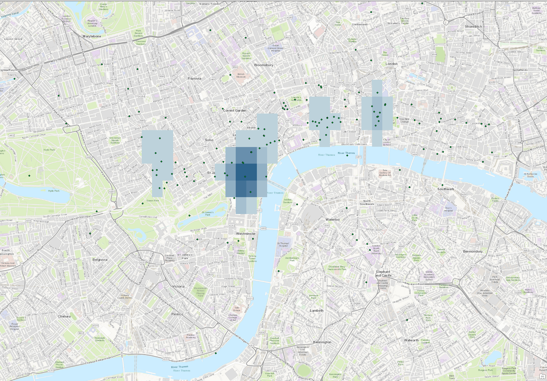
Travelling London with Melville
When looking at the Melville in London data, our group wanted to tell a story, of what exactly Melville was thinking as he moved between places in London. We decided to create an interactive animation of Melville’s journey throughout London. There is a slider that indicates the event number and the date at the top of the screen. It automatically moves through the points every 4 seconds to the next event in chronological order, refocusing the screen to where the marker has moved to. There is also a box at the bottom that indicates a location description that Melville or outside commentators wrote (Melville’s commentary is in quotation marks). This helps tell the story of Melville’s path across time. We also left markers on each point that were translucent so that the more opaque colors would indicate the places he visited often. They are also colored red for his first trip in November and blue for his second trip in December.
To clean the data to a legible state for Mapbox, we went through each line individually and either assigned it coordinates if we could find them or compressed its information to the prior line. This required a lot of somewhat subjective judgement on our part to determine what lat/long to pick and to figure out what data was incorrect.
-
Sorting Hat update: Pilot Survey
Please take this pilot survey!
We want to test out and get feedback on our survey before sending it out to everyone. We would love if you could spend 5-10 minutes doing this survey and giving us feedback! :) :)
-
Deceptive Climate Data
The story we decided to tell with our climate data was how the increasing CO2 emissions are an effect of the world as a whole, though there may be some countries that play a larger role. Both of our visualization do indeed communicate the role the world plays on CO2 emissions, but they tell slight twists of the story.
The first is simply a stacked line chart of all the CO2 data from different countries. The chart goes in order of largest emissions in 2013 to smallest. This makes it clear that it’s not just 1 or 2 countries that are making the difference-it’s many put together. Editting the data to be per capita may make the data even more honest, by suggesting the differences in lifestyles rather than the population.
The second arguably has more visual appeal, but less actual meaning. It is an animation of the amount of CO2 from each country per year (each frame is 1 year from 2008 to 2013). The most deceptive thing about this visual is the color. The color indicates the change from the previous year BUT DOES NOT indicate positive or negative. Therefore, looking at the animation, one could say that the map is mostly red, so emissions are going down. This is clearly not true, looking at the first graph.
The intended audience is the general public reading a newspaper, whose habits we ideally would want to change. The first visualization is much more likely to convince people to change over the second one.
-
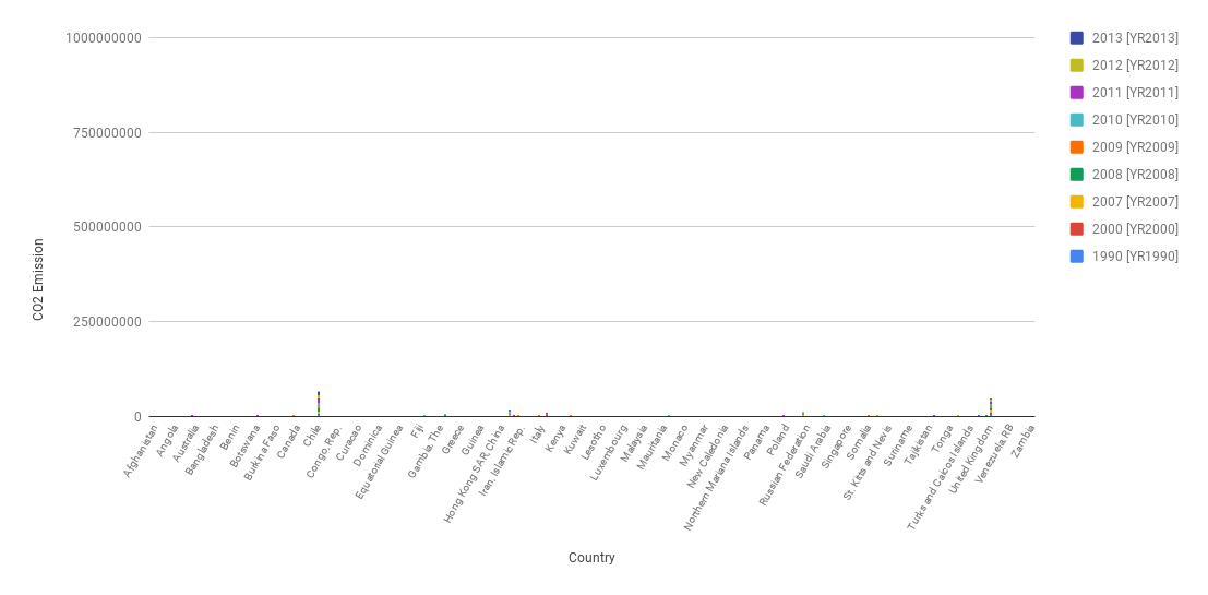
CO2 Data Visualizations
CO2 Data Visualizations
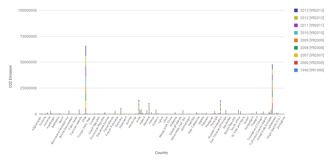
I used stack graphs to visualize how much CO2 each country produced over time. I assumed that there would be a few outliers–meaning that there would be countries that produced significantly greater amounts of CO2 than the average countries.
 This visual is for my argument. It is a stacked graph that shows that there are indeed two outlier countries (China and United States) that produce more CO2 than the average production amount.
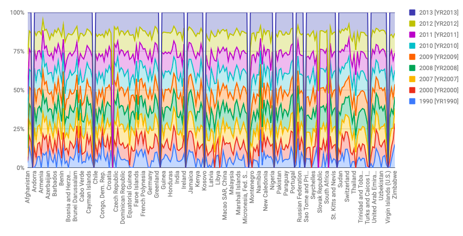 This visual is against my argument. I used the truncated axes deception method here by using a 100% stacked graph that would spread the data out to not include outliers. Here one can conclude that every country averaged around the same CO2 production and there weren’t any outliers, especially in the Year 2013 (that account for the 100% basepoint).
 -
Mapping Space, Time, and Narrative
In our rough draft, we came up with this model in ArcGIS:
.PNG) Using the point-to-line tool we created a map of Melville’s routes as provided in the dataset, darkening the lines as his journey grew later in time. Through the use of a color gradient, we introduced a third axis, time, into a two-dimensional map.
Using the point-to-line tool we created a map of Melville’s routes as provided in the dataset, darkening the lines as his journey grew later in time. Through the use of a color gradient, we introduced a third axis, time, into a two-dimensional map.This graph is limited in that we used straight lines to connect two locations. We did not follow real urban configurations, as Wyn Kelley did in her maps. That would be complicated as you would have to insert a historical map of London into the ArcGIS software and use graph algorithms (or even more labor-intensive, hand-draw) the routes he might have taken by following existing streets and walkways.
However, we did manage to come up with another interesting visualization. Using the kernel tool, we generated a heat map showing the areas Melville most frequented. This was rather difficult as he went to some bizarre, out of the way locations occasionally, as you can see in a zoomed out version of the gradient map.

The heat map shows us three main areas of London most frequented by Melville. Most obvious, Melville spent the most time around his neighborhood in Craven Street, where he lived for the two months in 1849 detailed in the journal we are drawing our data from. We also see that he spent much time in the Mayfair neighborhood, an affluent area of London (at the time and now) with many businesses, shops, and churches. He also spent time in the Temple, one of the main historic legal districts of England, and Ludgate Hill.
Overall, we found the learning curve in working with ArcGIS to be a bit steep, as it takes awhile to load whenever you change the scope of the map (which is often, in our case). There is an extensive range of user-developed and third-party add-on software and scripts that can be quite useful. It is nice to not have to program a functionality from scratch, but instead slightly modify and existing tool. However it is difficult to figure out which tools exist, and which suit your needs, as there is a lack of well-maintained documentation that details current add-on capabilities and shows examples of their use.
-
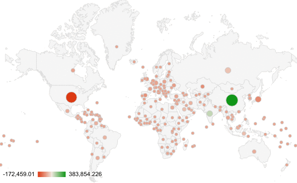
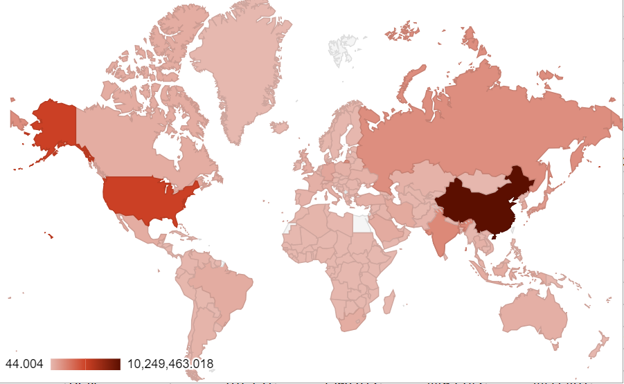
Deceptive visualizations
We started by visualizing the CO2 emission of 2013 of different countries through color coding a world map, where we used a gradients of light to dark red to indicate the amount of CO2 emission. The argument we were trying to make is that China and the U.S. are the two largest contributors to CO2 emission.
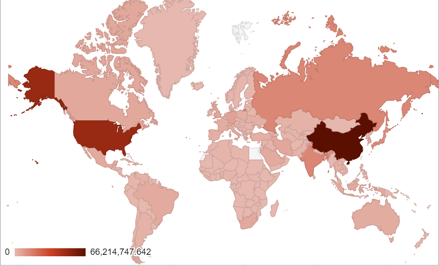
As a next step, we refined the map by using the sum of CO2 emissions from 1990-2013 (as far as the dataset extends) to give a more precise representation of our arguments. The refined version, however, doesn’t have much difference compared with the original graph. The only major perceivable difference is that the US becomes darker, indicating that they become an even larger contributor to global CO2 emissons than prior, second only to China.
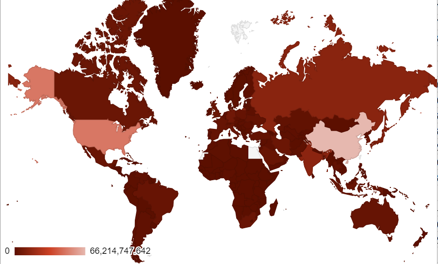
We flipped the color gradient as a deceptive tactic. Now, U.S. & China are the lightest shade of red and the rest of the country is a dark red. Since red is typically to denote warnings or dangerous behavior, this map is less alarming than when U.S. & China are the deepest shades of red.
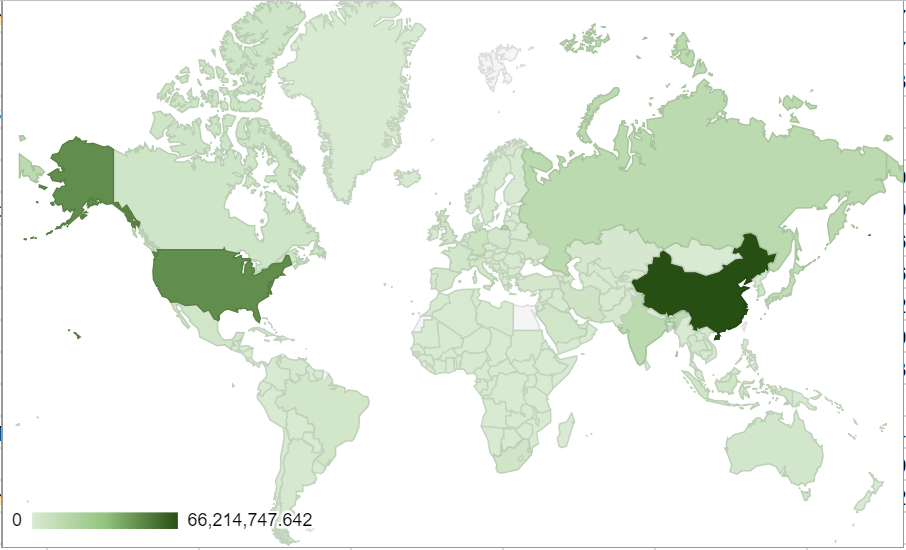
As the second half of the assignment, we changed our color code from red to green, which is typically associated with environmentally-friendly behavior. At a quick glance, a user may think that since U.S. and China are the darkest green, they are the most-environmentally friendly. In reality, they release by far the most CO2 emissions of any country. We hope that common sense might overrule these deceptive tactics, but unfortunately, we could probably fool some people.
The simple choice of color, as we also learned about in the Tufte reading, makes a significant difference in our visualization. Just by using a different color scheme, or reversing a color scheme, it is possible to create deceptive visualizations.
-
Triptych presentation slides
https://docs.google.com/presentation/d/1ANkcpiKPlNjFTLYS0d97xLSxeeLqpWcjQwO4wlQfU0g/edit?usp=sharing
-
sortinghat.mit.edu
We gave up on the environment and decided to focus on a more important aspect of the world: MIT.
We are proud to present:
The MIT Sorting Hat
Leave your important decisions in life to the pros.
Details can be found in this Google Slide
-
Playlist made physical
Image credit: Yichen

Project description: Using isometric models or perhaps AR technology, we want to make a model in which users can map music to physical objects. For example, a user could map the song “Don’t Stop Believing” with a high school yearbook or the album Thriller with a leather jacket. Users could also link several songs to one object and make a playlist. In an isometric model, users would be able to select specific objects, see what kinds of music is mapped to that object, add more songs, and play them. In an AR model, users would be able to scan over existing, physical objects, see what songs are associated with them, add and play music. This unique way of organizing sounds challenges the traditional methods of organizing music, which is often hierarchical. But human memories are associative. This project attempts to emulate the human emotion and memories in organizing music. This project also attempts to add another dimension to the current digital understanding of sound.
-
Melville data visualization idea
I don’t have much yet for this, but my idea is to have an interactive map that highlights the most likely places Melville will visit from any location you select.
Here is a very abstract and low-fidelity animation of what it might be like:
So, instead of just seeing his travels one by one, and since Melville often revisits the same places, it might be interesting to visualize a probability distribution of his travels directly over the map. I’ll be implementing this in D3 and have not figured out exactly yet how the probability calculations are going to work…but I think I’ll keep it simple and make a basic naive bayes classifier.
-
Mapping Space, Time, and Narrative
Rough Draft

We’ve begun experimenting with GIS and seeing what we can do with Melville’s London travel data. As we’re still getting used to working with the program, we opted for something simple to start – we wanted to use a color gradient to represent his travels in time. So, the later his journery, the darker the line used to represent his journeys from place to place.
-
Layer cake critique
I find that layer cake is an interesting way to introduce another axis in spatial representation. It provides a 3D visualization in specific groupings, with each “layer” representing a specific period of time. However, while the layering is pleasing to look at, I do not think it is strictly necessary. It seems to me that the layers could be removed, and time could still be represented as a continuous range on the vertical axis. That is, rather than segmenting time, time can be represented linearly according to depth. I believe doing so would be clearer and still make just as much sense visually.
-
Layer Cake
Layer Cake Critique
A layer cake is a unique way to display the events of someone’s pilgrimage journey. However, this layer cake showcases Ibn Jubayr’s travels in pretty concise way. Each event is portrayed both geographically and temporally. In addition to the portrayal of each event, there is an accompanied description and date of each event. Also, events are linked to photos of the locations that Ibn Jubayr explored. Events are separated by descriptors that give viewers an idea of the overall mood that Ibn Jubayr was in throughout his travels. This layer cake could be the beginning of a Surface/Depth view of Ibn Jubayr’s travels. It could give a high level view of the major events happening during the time of his travels and show the juxtaposition between world events and Ibn’s pilgrimage.
-
Layer Cake Critique
I think layer cake is an interesting experiment in mapping events both spatially and temporally in the same visualization. Using a map/GIS is very helpful to understand where events took place, and the route he traveled. However, adding the third dimension didn’t really help me understand the journey, but instead made the visualization less clear, because of the ambiguity 3D->2D flattening adds. It also didn’t help that text was sometimes obscured by other text, that I was a bit confused by the amount of data suddenly shoved in my face before I had even managed to figure out what it was all about.
-
Critique of Layer Cake
The layer cake method is interesting because it uses time as a third dimension and adds it to a two-dimensional map, therefore indicating the time and location of each event in a straightforward way. However, the effect is compromised when the three-dimensional visualization is flatten and shown in the two-dimensional screen, which could cause misreading and misunderstanding if people are not looking at the model carefully enough. As a result, I am really interested in seeing the project in a virtual reality environment, where people can actually occupy the 3d visualization, therefore having a better understanding of each event’s spatial as well as time contexts. The list of events on the left half of the page is helpful when people want to find specific event. But it draws most of the attention so the effect of the 3d visualization on the right is negatively affected. Maybe the detailed descriptions of each event can be shown on the visualization instead of shown as a second column that is attached to the list.
-
Critique of Layer Cake: The Travels of Ibn Jubayr
I found the use of a third axis to represent time to immediately be the most interesting part of this visualization - this part of the description was really helpful and provoking. However, I probably would not have been able to gather a solid understanding of the visualization without reading the description, as there is not a ton of accompanying info/labeling on the visualization itself. Toggling around with the map is also a little difficult (maybe moreso when using a trackpad), and due to the coloring, it was difficult for me to figure out what region I was looking at on the map and what direction to orient myself in. A simple compass would be a easy and prominent fix for this. The coloring of the map boundaries makes it difficult to discern in general, and the coloring of the data points are overwhelming because you can’t immediately figure out what the colors denote. The list on the left of locations I feel would be more helpful along with dates, or if there were an option to list it by time rather than location.
-
Critique of Itinerary
Itinerary is a tool to combine timeline data with geographic data.
Advantages
- Itinerary can be used for literary data and nearly any map, such as “A Frightful Number!” documenting plague counts in the Netherlands.
- It can overlay multiple maps to compare different visulaizations of geographical space, potentially at different times.
- It can depict regions, points, and paths, which all have different physical implications that are not always communicated in data visualizations.
- It allows us to see alternate paths, making it clear that the data is not clear.
Limitations
- Itinerary does not accurately portray the time between events, makking it difficult to fully understand the story behind them.
- The visual alone does not portray time clearly; it requires clicking through it to understand ordering.
- There is limited use of color, and when it is used, there is little to no clear meaning as to why.
- There is little connection between the visualization and the meaning of a particular point-the heart/story of the data remains in simply reading the words below.
-
final project ideas
thinking of focusing mainly on AR media, also linking physical + digital stuff. these are some initial thoughts and I’m planning on adding more later.
primary idea: an AR app that lets you write stories in 3d space, letting you walk through/around them. also thinking about creating physical data visualiations from literature, e.g. 3d printing instead of just working with web based visualizations.
skills needed: 3d modelling, parametric / generative design, fiction writing, special effects and film making
-
Rethinking Museum Labels
Art in art museums are almost always accompanied by a “museum label” – a small rectangle next to the piece, typically detailing the title, artist, time period, medium, donors, and a short 25-30 word description. These descriptions are static in an increasingly digital world, and may not always or even in most cases tell the audience member what they want to know about an artwork.
This project focuses on the re-design of art museum labels by taking into the account the curiosity of the viewer. Through an app, museum-goers can scan perhaps a barcode or QR code accompanying a work of art. If they wish to know more about a specific piece, they can search keywords or click on pre-existing blurbs that each focus on specific aspects of the work – the artist, the historical context, the medium/style, and notable features of the work. Museum curators will be able to see this data, and be able to determine which artworks are most popular/ are scanned most frequently, and what people want to know after initially seeing a piece. Museum curators will then have a much better sense of what the public’s interests are and can digitize the labels so that they can be easily updated over time.
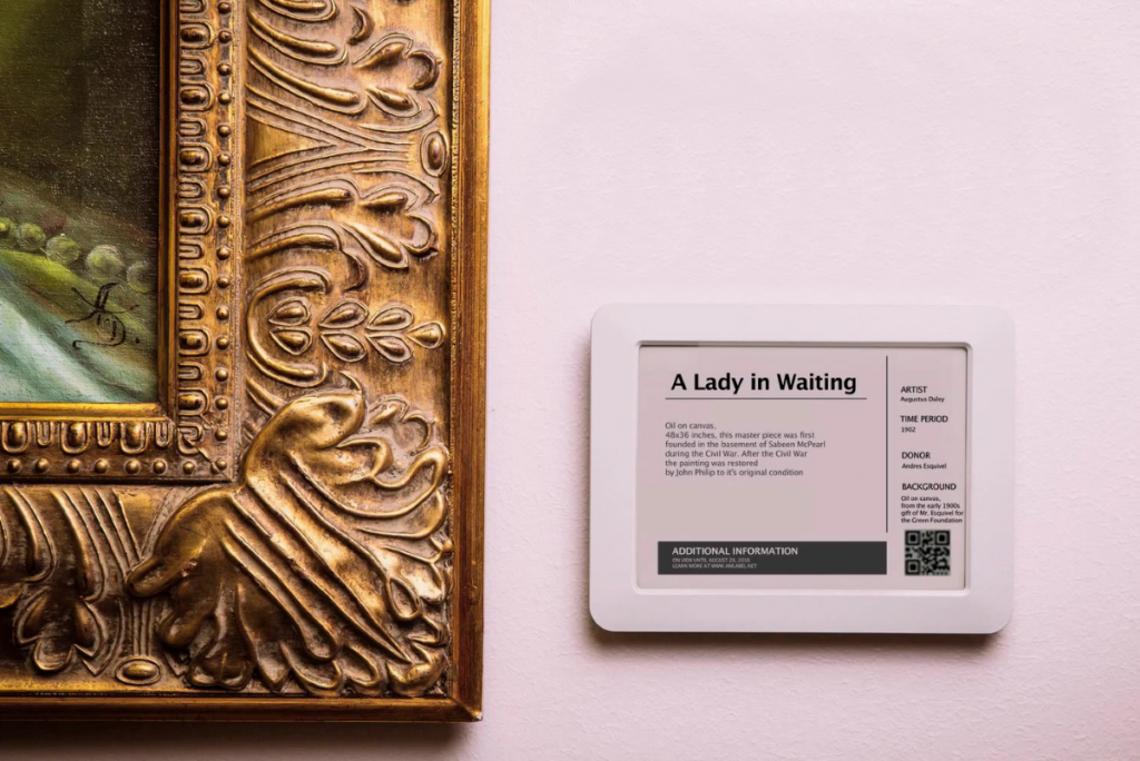
Skills needed: -App developers, or people interested in trying app development -People interested in partnering with an art museum -People interested in art education
-
Remapping Apps
Concept: There are so many apps available on the app store nowadays that can help people do all sort of things. However, it is hard for people to find the app they want to use sometime because of how app store organizes and display its apps (based on categories and search engine). The project will redesign the organization of those apps based on the assumption that each app’s function is related to the function of a physical object (either supplementing it or replacing it).
Outcome: A website that shows the interior of a room (either in 2d drawing or 3d model), with a lot of daily objects displayed in it. When the users mouse-over the object they will see a list of apps that are associated with the object. (For instance, notes-taking/to-do apps will be linked to a notebook on the table, closet organizing apps will be linked to a closet in the room, health eatting apps will be linked to lunchbox/tableware)
Ideally, the website will also include an user interface for app creators to link their app to one of the objects or creating new objects that can represent their app.
Questions: Mapping digital products to physical objects that have similar/associated functions but are categorized in different ways. Challenge the tradtional digital humanities process of “physcial to digital” to “digtial to digital” by recognizing something inherentially digital as part of our culture.
Target audience: People who are looking for apps of specific functions App creators who want to showcase the function of their app in an innovative format
General interests: Web-based 3d visualization
-
Mapping Early Immigrations in North America
The project will map out immigration flows in North America since Christopher Columbus discovered the “new continent”. It will focus on the dynamic changes of populations of each ethnic groups in different regions.
Question: How to represent abstract concepts such as immigrant flow and locations that are not precise on a map? How to make complex and messy information readable and understandable? How to indicate the missing of data that represents specific groups or regions in a visualization, so readers could be aware of their existence? How to represent the spherical world map on a screen? (Inspiration: https://paperplanes.world/ ) How to represent the North American map and worldwide map at the same time when levels of information density are dramatically different?
Target audience: Students in American History class, general public who are interested in American history
Skills need: People who are interested in mapping /3d data visualization / interested in or familiar with the history / knowledge on JavaScript and its data visualization library (or other programming language)
-
Assignment 3: US-Iran Relations Timeline
Assignment 3: US-Iran Relations Timeline
For this assignment, we chose to focus on the US-Iran relationship over time. Using the descriptions of the timeline events, we determined whether each event had a negative, neutral, or positive effect on the relationship.
For events that had a negative/souring effect on the US-Iran relationship, we gave it a numerical value of -1.

For events that had a neutral effect (neither detrimental or benign), we gave it a numerical value of 0.

For events that had a positive effect on their relationship, we gave it a numerical value of 1.

After manually inserting these values to each event, we converted the data to a Json file that we then used to make our visualization. This visualization shows how the US-Iran relationship bettered or worsened over time. It also gives a brief overview of how many events had negative, neutral, and positive effects on the US-Iran relationship
 ![Screen Shot 2018-10-02 at 11.55.49 AM.png]
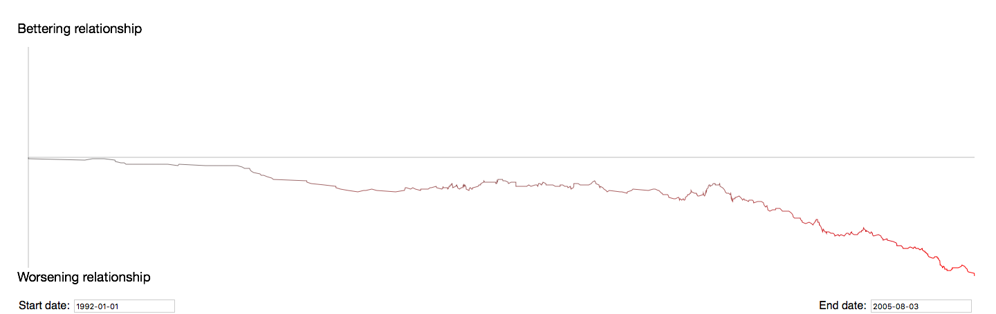
-
Assignment 3: US-Iran Relations
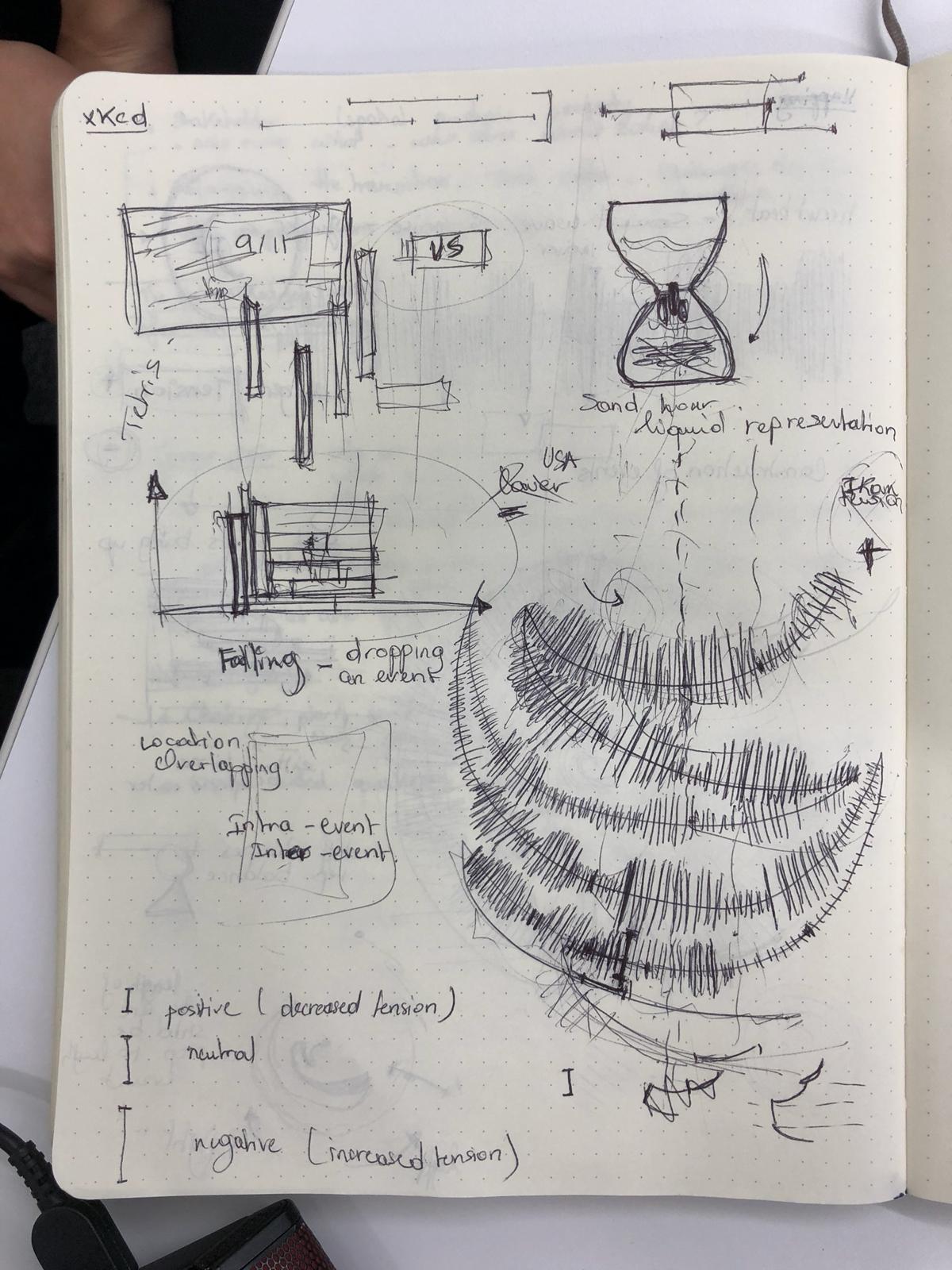
Attempting to Reinvent the Timeline
When approaching this project, our team decided we wanted to consider the nature of the timeline itself, and come up with a representation that was able to describe more than just the linear progression of time. We considered three different ways of approaching this:
- Conveying the Positivity or Negativity of the Event
- Indicating the Idea of Spiraling/Violent Cycles of Aggression
- Communicating How Events Build on Each Other
We developed these into a number of potential visualizations, each one focused on one or two of the concepts.
Sketches 1
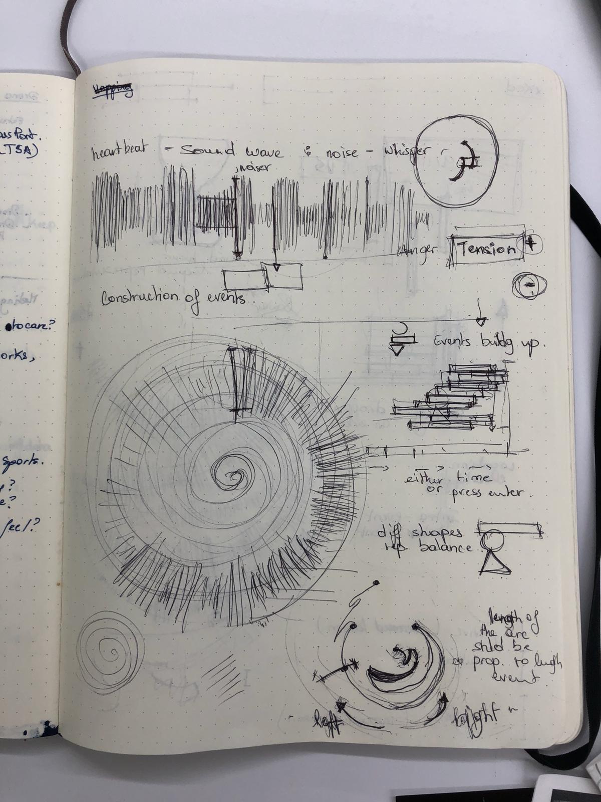
Sketches 2
Sketches 3
Positivity or Negativity of the Event
The US-Iran relationship has been incredibly tension filled for both sides, and each event that happened on the timeline had an effect on how the US and Iran saw each other. In order to properly tell the story of the two countries, we needed a visualization that showed some sort of emotional impact. Our first instinct was to use NLP sentiment analysis to determine the positivity or negativity of the event based on tone. To represent the data, we wanted to create a visualization that would make you feel the increases/decreases in negativity. We started with a line that could looked like a sound wave, and would get “noiser” as tensions increased (see Sketches 1, top sketch). We also considered adding an audio component to the visualization, where, when users moused over specific areas of the timeline, they would hear a heart beat faster/slower depending on the amount of tension at that time. These ideas were also highly transferable to other concepts, and we attempted to combine this with a number of our other ones.
However, we ran into difficulty exactly defining what we meant by “positivity” and “negativity.” Are they decreases/increases in tensions? Moves towards/away from war? Simply the emotion conveyed by the briefing book? Because of our uncertainity of this definition, we decided to change the axis to how much the event was in favor of the US or its allies versus in favor of Iran or its allies.
Spiraling and Cycles of Aggression
We started with the spiral on a conceptual basis of moving away from a linear representation of time to a circular one. We also felt like it represented the US-Iran relationships in a way-the two countries, attempting to make peace, eventually take actions that spiral into conflict. We also felt that different sections of the spiral could indicate the same type of event happening-for example, the top left quadrant of the spiral could be events related to an attempt at reconciliation, followed by a betrayal by one country (Sketches 1, bottom left). We even attempted to subvert the shape of the spiral itself by bringing in the US/Iran axis of the event-the spiral would switch turning directions as events favored the US or Iran (Sketches 1, bottom right). We futhered this by undoing the spiral and changing it to more of a pendulum motion, swinging back and forth between the two sides (Sketches 2, bottom right and Sketches 3, middle left).
In the end, we had two main issues with this concept. One, the spiral limited us geometrically-if turning indicated positivity or negativity, then if we made the length of the line time, it could be confusingly interpreted as being more positive/negative with longer time, which was not necessarily true. Two, we worried that enforcing the image of spirals and cycles on the data could be artificially fitting a narrative onto the data that the data did not necessarily represent, and so we pivoted away from a literal spiral. We did keep the idea of changing angles to indicate benefits for/against the US or Iran, as we felt that literally moving to one side would be an impactful and meaningful visual.
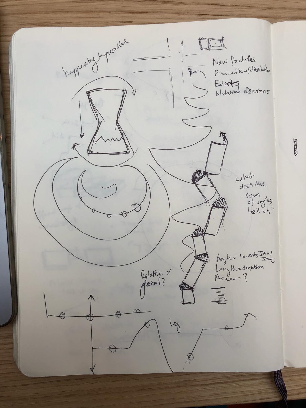
Events Building
One important part of how time proceeds is the relationships between events. We wanted to create a visual way of representing this concept. Our first idea was having the events be rectangular blocks that stacked upon each other, but having their placement be dependent on the positivity/negativity axis, creating essentially a wobbly tower (Sketches 1, middle left). We considered emphasizing the wobble by using shapes other than rectangles, such as circles and triangles. However, we were concerned with making the tower too unstable and felt that it didn’t escape enough from the linearity of events. We then looked at having the events build on each other via sand in an hourglass timer, or building up the events from multiple angles (Sketches 2, top).
We ended up taking the idea of building and changing it to an unfolding, and we wanted to have each event “unfold” from the last. For our final visualization, we implemented a simplified version of this idea.
Final Visualization
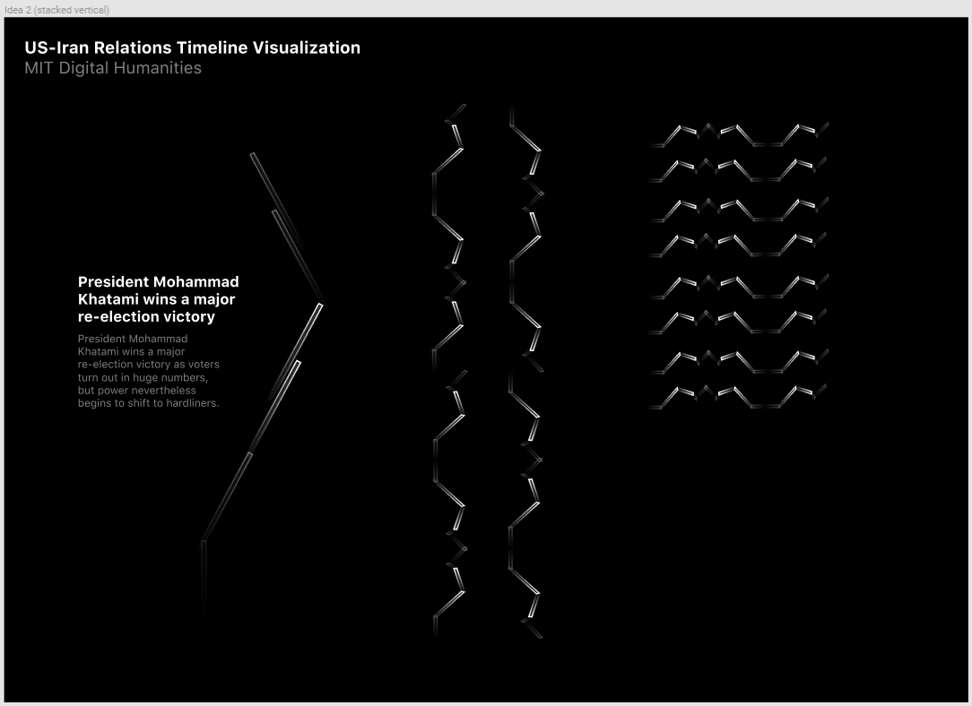
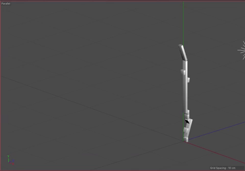
Our visualization implements our idea of using angles to indicate the direction of pro-US or pro-Iran events and our idea of the unfolding the events sequentially. We considered using the width of each rectangle to indicate time, but settled on using the length, as it was the most familiar and understandable method of communicating time passing. The angle, as previously mentioned, indicates how the event benefited the US versus Iran. We also added a third axis to indicate the time between events. This enabled us to keep the main representation as a continuous line while also giving viewers a way to determine the timing between events. It also makes the representation look more like a staircase, which we felt added to the idea of the events building up.
-
Assignment 3 - Experimenting with Timelines
Access our project here: https://amyshim.github.io/matrixtimeline/
In our first approach, we wanted to challenge our understanding of timelines by creating something that was non-linear. But we tried to avoid making something nonlinear just for the sake of making something nonlinear – we wanted a design that actually enhanced one’s understanding of the data in a way that a conventional timeline would not.
We brainstormed a few approaches, initially trying out a radial design.
Our idea was to make a timeline based on the key people in the US-Iran conflict as depicted in the dataset we were given (Spreadsheet 3). Using a word-counter software, we determined the top 6 most frequently mentioned people in the dataset: Bill Clinton, Mohammed Khatami, Kamal Kharrazi, Akbar Hashemi Rafsanjan, Ali Khamenei, and Ali Akbar Velayati.
We thought we could perhaps illustrate this like so (filler names and data):
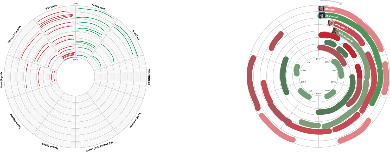
Since the event descriptions were somewhat contentious, we took into account the source of the event data. If the source was based in the US, we would indicate so with a red marker. If the source was based in Iran, we indicated so with a blue marker. Grey referred to an international source. We hoped that this color-coding would take into account the varying perspectives regarding the US-Iran conflict.
Yichen realized that this could be made even clearer as a matrix. The radial aspect was not really contributing to the readability, so we abandoned the radial design in favor of the matrix and ended up with something like this, made using JavaScript and d3.js:
Since the event descriptions were somewhat contentious, we took into account the source of the event data. If the source was based in the US, we would indicate so with a red marker. If the source was based in Iran, we would indicate so with a blue marker. Purple referred to an international source. We hoped that this color-coding would take into account the varying perspectives regarding the US-Iran conflict.
Yichen realized that this could be made even clearer as a matrix. The radial aspect was not really contributing to the readability, so we abandoned the radial design in favor of the matriz and ended up with something like this, made using JavaScript and d3.js:
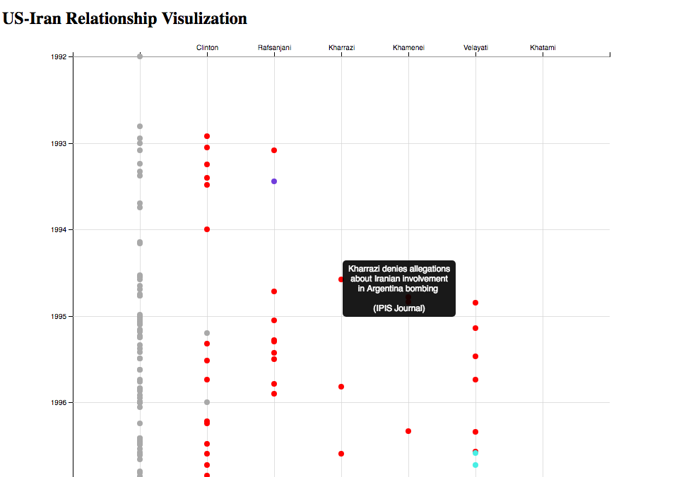
Hovering over each dot gives you the event and source. The left-most column contains events that are not specific to the six most frequently-mentioned people.
Our visualization helps separate a dense timeline into the actions of six key people involved in the US-Iran conflict. For example, it is much easier now to focus on specifically Clinton’s actions, and compare his timing to the timing of the other events unfolding around his decisions. You can see, by looking at the entirety of the timeline, when certain people became prominent actors in the conflict and when they “laid low” politically; when leaders reached the height of their influence and how they overlapped with each other. Geopolitical relations and tensions are extremely complex, but perhaps breaking down the story by its major players can lead to insights on how and why the US-Iran conflict came about.
Some things we wanted to implement but didn’t have time this week:
- use lines instead of dots to convey times longer than a day
- include event description instead of just event title
- add more people
- closer vetting of sources
-
Visualizing Ticket Sales by Seating Section, Over Time
The core idea of our initial project design was to visualize ticket sales over time by seating section of the theater, as an overall gauge of the popularity of theater entertainment in the 18th century. In our initial plan we wanted to have a side-by-side laydown of the facsimile next to the according theater floorplan, so that one could see the direct relationship between the portion of the facsimile and its corresponding spatial representation. We could then allow the user to customize his/her query so that they could observe ticket sales for a specific year or drag a slider to view changes over time.
With no programming experience, we used the approach of working directly with .csv data in a spreadsheet rather than JSON/API. However, the specific dataset we needed was not available from the site’s raw .csv files, only in their JSON files - the “/play_ticket_sales” endpoint (“Ticket sales by seating category for each play/performance”). Therefore, we had to first use a converter to convert this JSON file into .csv, which worked almost seamlessly except for some of the numerical data converting over as text and needing to be converted back to numerical format. Then, we needed to find a means to visualize the data without programming, so we tried different charting methods in Excel and searched for others online, but the problem was that our visualization relied on the spatial plan of the theater and automatic charting could not allow for custom shape-drawing. After playing around with many options to no avail, we explored Tableau visualizations and found a compromising solution.
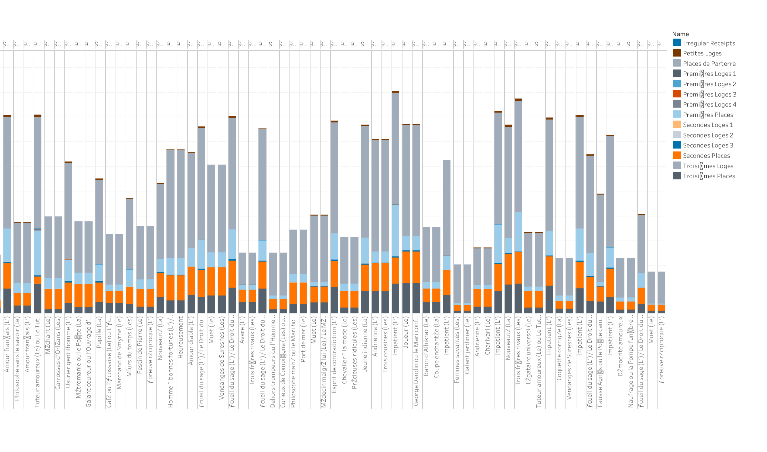
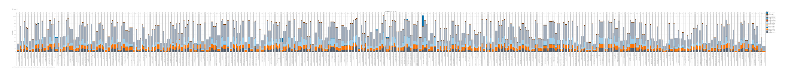
As seen in the screenshot above, we were able to use a stacked bar chart to visualize the same information on ticket sales by seating section by play, which was our focus of the original idea, but just not laid out on a spatial floorplan since we were unable to do that. Additionally, the idea of viewing these trends across time is still upheld with the schema of a horizontal timeline showing chronological trend, similar to our slider bar idea. Along the bottom you have each performance ID, so each bar represents a performance, and within each performance, you see the breakdown of each seating section. While this is a much more crude representation and not as compelling of a storytelling feeling, it still offers the same information and allows the viewer to see at a quick glance the ebb and flow of ticket sales by seating section varying across time.
-
Update on Magnat de Théâtre
After a huge struggle to actually get access to the data (Java didn’t like to import the JSON tools, so we eventually moved over to Python, which didn’t want to install the necessary library to fetch data directly from the API, but would at least read pre-downloaded JSONs), we managed to crunch a few numbers.
However, we quickly realized, after having read the Wikipedia page for the French Livre, that any rudimentary economic analysis would probably be a waste of time, because of the highly fluctuating value of the livre, and difficulty knowing exactly which unit of currency the prices were recorded in. The different seating categories were also difficult to access and analyze, so what we ended up with was looking at “how popular were each of these plays, probably”.
To get a popularity score (not corrected for inflation, otherwise fluctuating currency value, expenses or really anything), we added up the income for each play, and divided that by the number of times that play was performed. This would most probably give an advantage to plays performed later in the time period, but the world isn’t ideal.
The advantage to this is that by using the avarage income of each play, compared with eg the total score (which was available in another JSON), is that this method wouldn’t benefit mediocrely popular plays that were performed all the time, or give the impression that plays that were only performed a few times were incredibly unpopular.
Had we gotten the Java JSON import to work, this could have been implemented into our game to give the player an accurate choice of plays, and a more realistic price level.
Further, using the same dataset, we could see how the same plays would perform better or worse over time, thus giving the player even more accurate information.
-
RAWGraphs
easy tool for quick data viz on the web. https://rawgraphs.io/
-
Magnat de Théâtre
Zidane Abubakar, Priya Pillai, Caspar Kerr
Facsimilie to Data
We would start by attempting to apply computer vision/NLP processing tools to the images of the registrars. However, we suspect that the old style of handwriting may make it more difficult to accurately read the pages, and so we plan on hiring graduate students who are experts in the time period and know French to write up all the data.
The data that we collect will be the following:
- Tickets
- Prices
- Number
- Category (social class)
- Play Information
- Title
- Date
- Expense Categorization
- Types of expenses
- Net earnings
- Actor/actress information
- Names
- Pseudonyms
- Dates performed
We also plan to connect to another database to determine the genres of the play, as well as gather information on important historical events happening in this time period in Paris.
Storing and Presenting Data
We will input the collected information into an online database, which will be publically accessible for people to look and analyze the data themselves. However, our main method of presenting the project will be an online interactive simulation game that will allow players to pretend to be the owner of the Comédie-Française and make decisions about the theater based on the data.
Tools Built
There are two main methods we will share the data. The first is a traditional method of allowing the database to be publically accessible. This is to maintain the transparency behind the project. The second is the game. It will serve the purpose of humanizing the data and making it easier to understand the context behind the data. The game will ask players to pick plays, ticket prices, and actors every year based on information in the database.
Audience
We are planning to design the game focusing mostly on middle/high school students who might be studying French history or theater more generally. We would like the game to be fun enough that anyone in the general public would want to play it.
Research Questions
How did the sociopolitical context affect the decisions theater managers made? How did the Parisian public’s taste in theater change over time?
- Tickets
-
CFRP Part 2: Real Data
Gathering data
First, we downloaded our data from the endpoint
http://api.cfregisters.org/play_ticket_saleswith paramsgenre=genre=eq.comédieandplay_performance_id=lt.1000, which essentially gave us all of the play ticket sales from each seating area for each play.Visualization updates
Missing data
One of the first problems we realized was that we couldn’t show the data of each play throughout the year. Some plays were only shown for one or two months and the theaters didn’t show anything at all during some parts of the year. For example, in 1779, there are only sales data from December to July, leaving everything from September to November blank. In 1780, there was only sales data from January to March.
So instead of having our visualization show the sales data for one play through the year, we decided to take the total ticket sales from the most popular play each month.
Analysis
We created Jupyter notebook to analyze everything step by step and converted the JSON response we got into a Pandas dataframe. This allowed us to perform SQL-type operations on the data and organize it neatly for our vizualtion.
Eventually, our data took this form:
[Play name,Premières Places,Secondes Places,Troisièmes Places,Places de Parterre ]Where each seating category had the total ticket sales for the most popular play that month.
3D Modeling Updates
We also redesigned our 3D model to the actual theater from the data. However, beacuse the Odeon Theatre had each of its seating areas stacked vertically, we couldn’t use our traditional “bar graph” method of visualization because the actual 3D bars would intersect each other. So, we made the theater “expandable” to allow each of the seating areas to grow and shrink according to the ticket sales without overlapping with each other.
 ![aggregated.gif]
Implementation
In order to make the data interactive, we used the visual programming language Grasshopper to bind our CSV data to the different heights and labels in our model.
Grasshopper script overview:
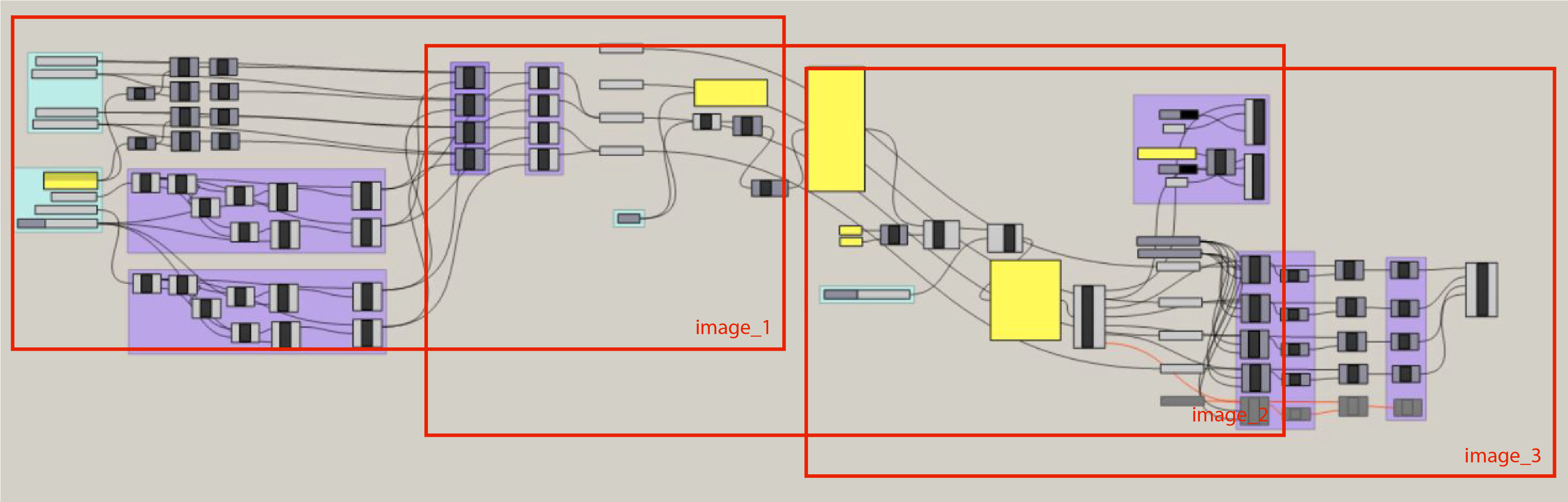 Grasshopper script image_1:
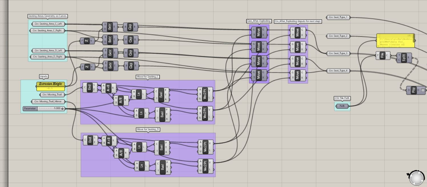 Grasshopper script image_2:
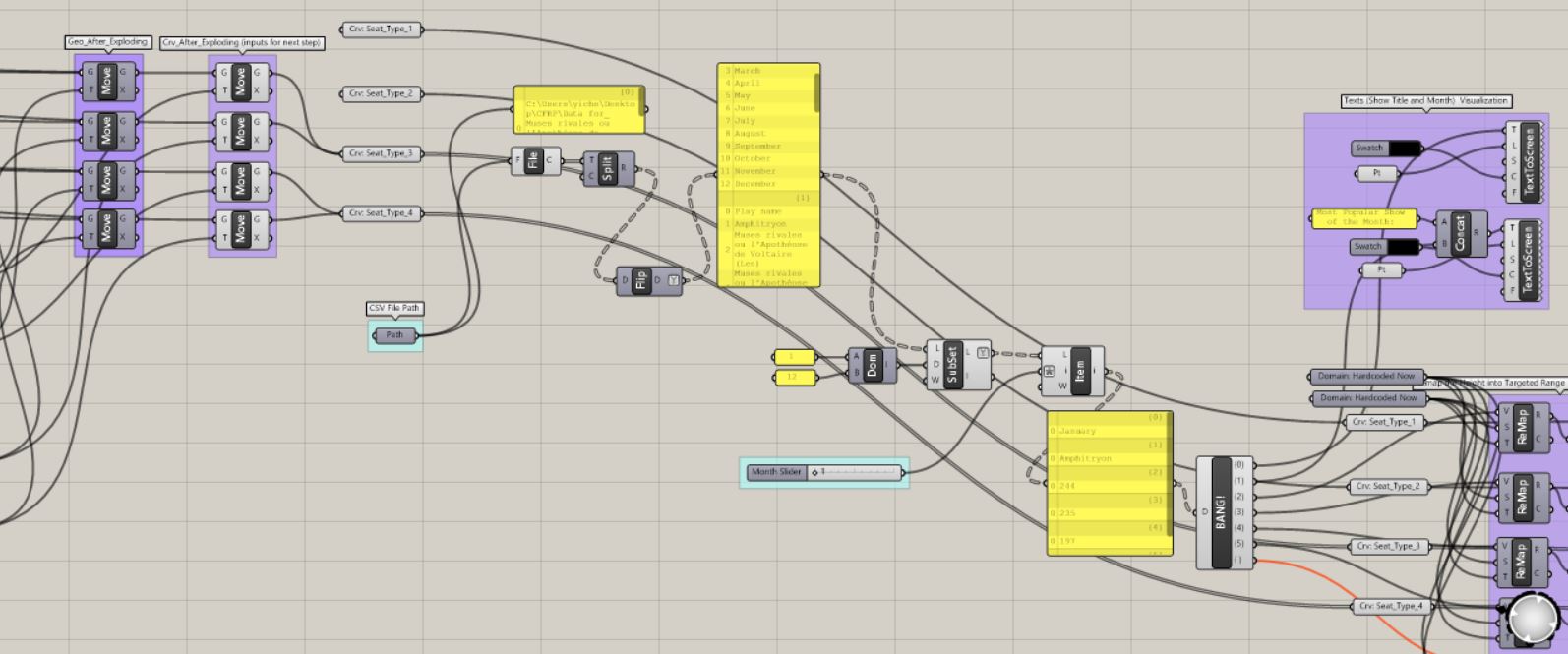 Grasshopper script image_3:
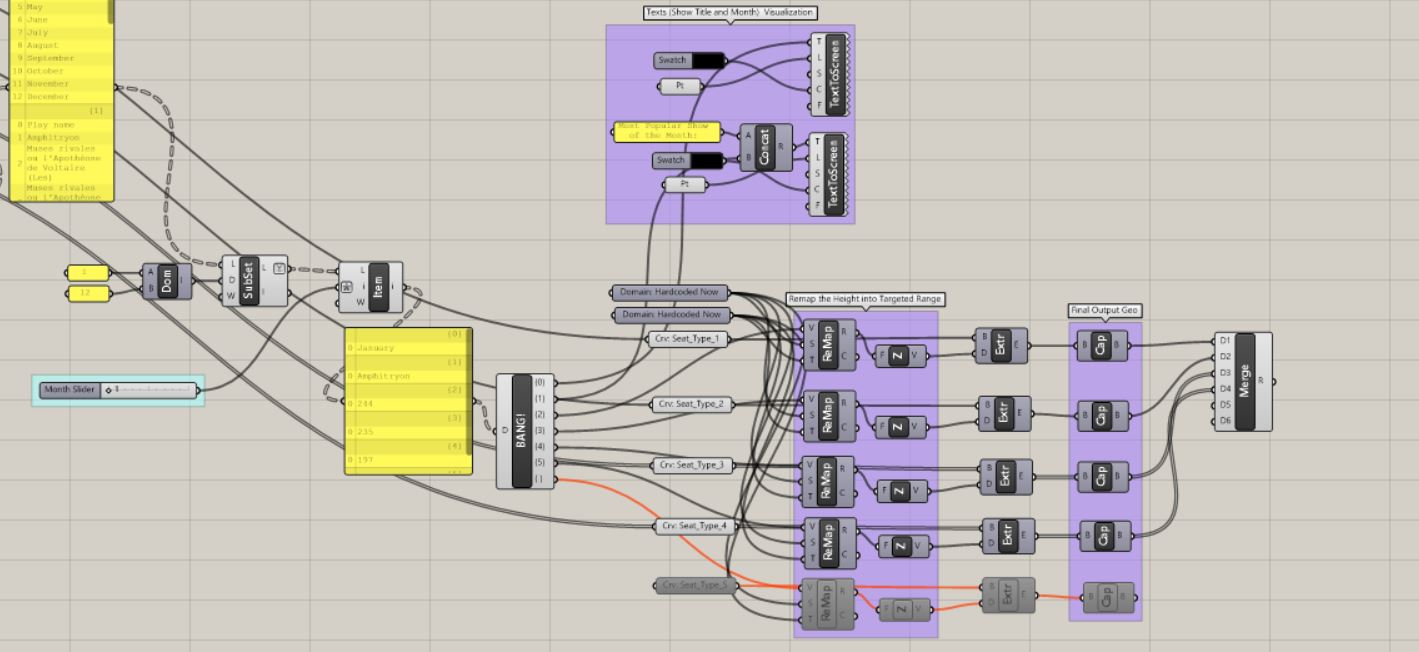
Screen record of sliding through different months: Screen record
Implications
From a storytelling perspective, this approach to visualizing the data is more historically representative than just showing the data of one play over the year. By visualizing the most popular play each month, we get a clearer image of what theater-goers wanted to watch overall and how that influenced the theater’s business.
-
Assignment 2 Writeup
Most Popular Theater Seating in 18th Century France
Our initial approach to working with the CFRP data was to use a slider graph to measure the amount of tickets sold in each seating area and compare that data with household income during the same time period. Our reasoning for this was to be able to gauge leisure spending habits among French citizens across the 17th and 18th centuries, which could lead to insights about trends in class disparity at that time.
After actually viewing the data available to in the JSON files, we concluded that our initial approach was no longer feasible because the ticket prices were not documented as a separate category. However, we noticed that the quantity of tickets sold was documented. As a result, we looked for more creative ways to showcase the data given to us. One approach that we considered was to create a simulation game where participants would pretend that they were in the 17th and 18th centuries and using a chatbot to purchase tickets. Similar to Ticketmaster or StubHub, users would have the ability to interact with a chatbot to order tickets for a show based on popularity and ticket availability. We planned to use the JSON data and focus on the number of tickets sold per seating section to determine popularity and availability. After many failed attempts to connect the API (which contained the JSON data) to the chatbot, we decided to follow a different approach.
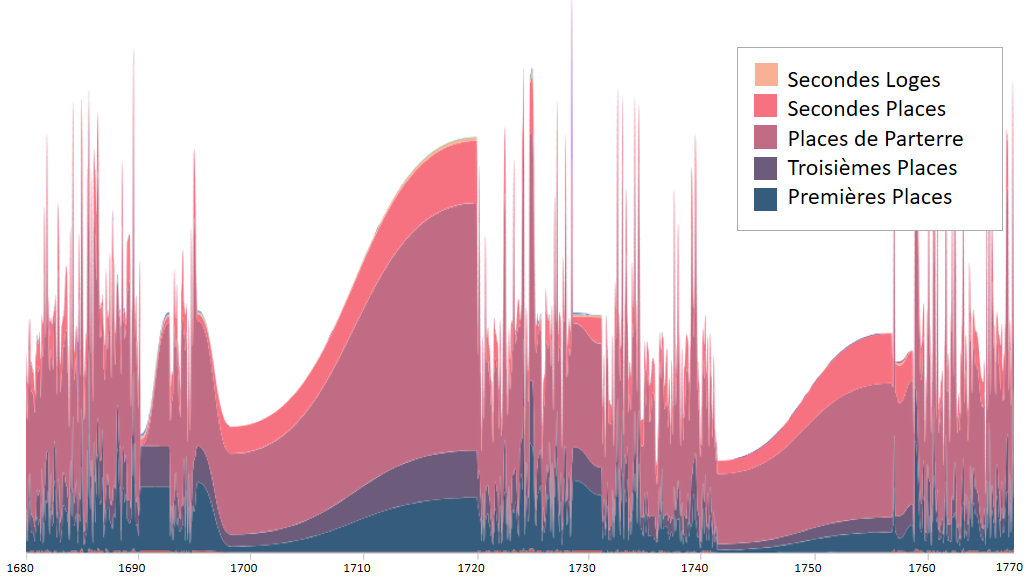
Our next approach was to display the plays by ticket sales and sort the data according to the quantity of tickets sold in each section. For this, we decided to display the data using a stream graph. Stream graphs display the changes in data over time of different categories through the use of flowing, organic shapes that somewhat resemble a river-like stream. Our reasoning for choosing this graph was to be able to display the changes in the amount of tickets sold in each seating section over time. Since there were missing gaps in the data in the time span we chose (1680 - 1770), a stream graph was preferable to a linear graph, because it demonstrated a more natural rise and fall in ticket sales, rather than the many jarring, jutting peaks a linear graph would show.
We thought displaying the changes in seating over time could help tell the story of who was attending the Comedie Francaise performances. By looking at the graph, one might notice that the most commonly purchased seating during the years depicted was in Places de Parterre, or “places on the ground”. This dispels the notion that 18th century French theater was for the only the elite of society. As evidenced by ticket sales, the French working class actively attended Comedie Francaise performances.
We could have chosen to tell a number of other stories by choosing different variables. Indeed, other scholars have made beautiful visualizations telling us which plays were most popular, how playwrights’ popularity changed over time, and even which days of the week had the most sales. However, we chose to focus on the theatergoers themselves, and help illuminate who those people might have been, and where and when they might have sat in the historical theaters of France.
-
Assignment 1
Our project aims to make the archives of La Comedie-Francaise more accessible to researchers and academic people by offering a visual interface to the data at hand. Since reading the original documents present several challenges ranging from a language barrier to the unclarity of the writing and the general composition, our approach is based on several steps leading to the transfer of these facsimile to the digital world.
Our extraction method to go from facsimile to data is via an algorithm/software. The algorithm would scan handwritten text and translate it into digital text to be stored online (on servers or cloud). Additionally, it would also be able to translate the digital text into other languages in order for it to be accessible to researchers from different backgrounds. While technical challenges to this algorithm exist, we have researched existing softwares that have this capability so it is definitely possible.
The final interface would be a website which displays the original document next to a schematic plan corresponding to the theater in the document. The user would be able to see a 1-to-1 highlight of a section in the original document to its corresponding section in the visualization. Our research shows that the company played in several theater depending on each period of time (ie :Théâtre de la République,Théâtre du Vieux-Colombier, Studio-Théâtre), so various theater plans would be available. We imagine the user would also be able to visualize these trends and patterns over time, and filter for different attributes to refine the query to their interest.
We envision that this tool would facilitate the research work conducted by academics by making it easily accessible and by providing them with an estimate of the ticket prices and benefits done by the Comedie-Francaise within a certain time period. Moreover it would give a general sensibility about the popularity of La Comedie francaise and thus by tracking how many seats were reserved by night.
-
Activity 1 Write-Up
Amy Shim, Peri Green, Abnell Comas
We were given four facsimiles of register pages from the Comédie-Française in Paris, a theater troupe commisioned by King Louis XIV in the late 17th century that is still active today. The pages revealed a number of interesting records from the time – like the price of coal, costumes, and food at the time – but we chose to focus on the more prominent notes on the ledgers: the types of tickets sold, the quantity, and the prices based on seating type. We expanded our thinking to outside of the four register pages we were given. What if we had been handed a hundred pages? A thousand?
By analyzing and sorting the data regarding the price, type, and quantity of tickets sold, the data could tell us about trends that illuminated economic inequality during the time period, which roughly spanned the 18th century. For example, an increase/decrease in the amount of cheaper tickets purchased over the years, when combined with household income trends in France during that time period, could tell us more about changes in popularity of theatre attendance and leisure spending among the lower class. Average ticket pricing could tell us more about levels of disposable income across classes and how the French economy had grown or suffered.
While natural language processing tools continue to make strides, we believe that the AI is not yet developed enough to be a dependable tool to extract the data necessary. The registers are handwritten in a manner that is even difficult for a human to decipher due to its layout. As an alternative, we will process the data with actual manpower (perhaps several UROPs could be hired!) to transfer the data on to spreadsheets. Though this process is labor-intensive and time consuming, it allows for better accuracy in ensuring the data is appropriately collected and categorized.
The tools we plan to build and use are data visualizations, so that the audience – historians and people interested in French income disparities – can easily identify and grasp trends without sifting through hundreds of pages of registers. We hope to address research questions about average income gaps in the French economy, particularly in the contentious years leading to the French Revolution.
-
Assignment1: CFRP - Tyler Angert, Yichen Jia
Presentation: CFRP Presentation
Prototype Description:
Your approach to go from facsimile to data
We will use a combination of computer vision based techniques and manual labelling. We can use OCR (optical character recognition) to get the raw data from the page into digital format. We are unsure of how to handle the edge cases and inconsistencies in labeling, and will likely need to manually enter in data from uncertain cases (however, the uncertain cases can be automatically grouped together).
The process by which you will store and present data
During the data storing and presenting process, we believe the major problems we need to address include how to cluster different types of data, how to deal with different in seating category names among different theaters, how to organizing qualitative to quantitative data, and how to model a database to sort, organize, as well as filter.
Because the data is highly unstructured, we will use a NoSQL database. This will allow us to easily organize the various and (perhaps unpredictable) formats of data we extract. We can also easily add new categories and data types to store on the fly. From a prototyping perspective, this also allows us to use something like Google Firebase, which is both NoSQL/document oriented and has real time functionality built in– meaning that anybody who connects to the database gets automatic updates.
What tools you would be building
Our tool will represent the data from facsimile in a three-dimensional Augmented Reality environment, where the user can walk around and interact with the different theaters and their metadata. We will project the interior setting and seats layout of each of the theaters inside an empty room, with ticket data floating on top of the corresponding seats type. Students will be able to walk inside and around the interactive model, and perhaps even control the the time period by walking/moving through space.
Who is the audience
Audience for our project will primarily be students in history classes learning about the history of the humanities– in this case, the history of theater in France.
What kind of research questions does it answer?
How can you explore time in a historical context? How to represent data in three-dimensional space? What impact do collaboration and community have on understanding history? How can immersive AR experiences increase engagement and understanding of complex material? What impact would it have if it is used in related courses in K-12 education?