Commentary
-
Zidane - Database
A New Post
I thought this reading had an interesting viewpoint. I’m not sure whether it was written in the 90s or closer to the current day, because it switches points of view sometimes (going from talking about the Razorfish visit in the present tense, and then moving to reflecting on it). Upon reflection, it seems like it is the latter option. I was confused however, because I’m not familiar with the timeline of how workspaces began to transform from the traditional cubicle setting to more of what Razorfish has been doing. At the start the narrator was describing the discovery of Razorfish’s workspace as a futuristic and uncommon one, while from my point of view, it was simply a modern workplace. However, the fact that he was reflecting on this experience and still saw it as new created some confusion. I thought it was interesting when the author said, “If with GUI the physical environment migrated into the computer screen, now the conventions of GUI are migrating back into our physical reality.” This was interesting, both because I’ve never thought about work spaces like that, even though I’ve worked in a start up that is laid out very similarly, and because It reminds me of Augmented Spaces. It’s not the same as those - they hadn’t integrated any innovative new technology into the spaces - but the idea of modeling digital spaces after physical spaces, and then later on doing the reverse is shown in both. It was also cool how they linked this to other real world institutions of their age - how libraries and museums were being replaced with computer databases. However, it was not necessarily a complete migration as we still have those (newly augmented) spaces. [Side Note: I noticed that what he mentioned about computer spaces, specifically using 3D navigable space to display the semantics of human language was very similar to a project happening in our class with the 3 boards] It was interesting how they used a video game to talk about how narratives have been presented as continuous navigation through space, specifically Tomb Raider. This has become commonplace in not only (the majority of today’s) video games to a huge degree, but also physical entertainment experiences , like themed roller coasters (i.e. pirates & space mountain at Disney world). One point I didn’t agree with was how the author attempted to reverse the assumed roles of informational and spatial communication. They said, “For instance, the user navigates through a virtual space both to work and to play, whether analyzing scientific data or killing enemies in Quake.” I don’t really think this negates the innate association of work with text, and entertainment/media consumption with spatial/graphic representation. Maybe if they pointed out that text-based adventure games existed, as well as 3D software for different types of work. But abstractly comparing a realistic, 3D world in a video game to the GUI usually found on a desktop doesn’t really do much for me. When the author introduced the two goals (essentially creating interfaces for processing information, and creating a way of navigating spatial representations) I thought it was interesting how he related them, in that they were extreme ends of a spectrum tat one should strive to be in the middle of. However, when they used search engines as on a far end of the spectrum, claiming they want to “immerse” the user in its universe to prevent them from going to other sites, I was less satisfied, as the entire purpose of search engines is to find other sites. Maybe if they argued that Google, for example, has added numerous features to immerse the user in the improved and expanded functionality of the base search engine in order to prevent them from using other search engines, I thought it would have made more sense. -
The Language of New Media
Manovich describes and is able to put into concrete ideas what I have always kind of thought about the world with respect to media and computation - being the general idea of data and algorithms being like the most basic unit/building block of media and underlying everytihng. Especially because I have always been surrounded by very technical people while I myself do not have the “coding” gene, I have always marveled at how people are able to deduce problems into matters of numbers and algorithms. In a way I always thought of it more in the reverse of Manovich’s description, that all these large and complex forms of media and programs can be broken down all the way to the level of data input and algorithmic output, whereas Manovich kind of walks you through the idea starting with the data and how they work together to then build up to the final image, program, game, etc. I especially like his constant use of examples to support his ideas to make it a lot more relatable and easier to understand these super conceptual ideas he’s putting forth (especially the whole section on video game narrative). Another one of the most interesting topics to me was the idea of the interface being a more recently introduced, third element to exist that connects what’s going on behind the scenes versus what’s going on with the user, and therefore has a lot of control to affect the user outcomes.
-
The Language of new media | The form
Manovich’s approach to GUI (Graphical User interface) is interesting in the way he describes it as a circular pattern where there is a migration into the digital realm for the last period of time while recently there have been a bridging back into the physical reality manifested through AR/VR and all the Human-Computer interaction platforms.
He stresses out the importance of the use of computers as a medium used both to execute work tasks and leisure/gaming activities. The parallelism he draws between description and narration and then again between narratives and databases is insighttful. Actually nowadays a lot of importance is put to the aesthetics and the representation medium(description)which might at some point overwhelm the information conveyed(narrative). This mainly manifested through the communication medium used in web interfaces .
Databases being in their nature a collection of data follow a specific logic from gathering to storing and indexing. While the web is an open platform that keeps on growing, Manovich points out how this feature puts webpages under the collection title rather than a narrative.
While the simple assignement of a task for the player within a game(winning, killing the monster, achieving a high score…) pushes the interaction into the narrative realm. Games are by nature governed by algorithms where as Wright explains the repetition of the experience turns into a loop building between the human mental model and the computer model.
-
Database: the forms
As the world still appears to us as an “endless and unstructured collection of images, texts, and other data records”, it is only natural that we should seek to collate them in a ordered manner and that results in a database.
The idea behind a database to help us make sense of the world, but being a jumble of separate things, it perhaps has less appeal that the cause and effect nature of narrative to which we are so accustomed.
The database represents the world as a “list of items” but refuses to order that list for us in anyway which can become confusing and frustrating when we have a tendency to depend on things evolving in a linear fashion. The idea of a database of information works against our notion of time.
Manovich argues it’s simply a matter of finding the right ‘algorithm’, the right way of reading a database for it to become as normal to us as narrative.
-
The Potential of Spatial Humanities
It seems that the disadvantage of using GIS in the context of the reading is that it it ignores the relations that take place in mapped places. It is purely technical with its data and so poses a challenge when trying to use the technology with the humanities. Also, it can be expensive and hard to learn, both crucial aspects that can drive people away from using it. In terms of advantages, it provides useful data that if used properly and extrapolated, can answer many fundamental questions about the area in question.
-
The Poetics of Augmented Space
One of the most interesting points made by the article was the evolving relationship between architects and augmenting space technology. The author gives examples of how architects are redesigning their spaces to allow technology to work with them. The author shows how one architect followed a more radical approach with his spaces and how he integrates technologies such as computer controlled lights. He eliminates all straight surfaces and angles. This can be very important since technology used to augment spaces can greatly benefit from easily mutable spaces. This added variability aligns with how data in the augmented spaces can be constantly changing in time and space. I believe many museums can learn from this in how they design their spaces since if they make them too fixed it can hinder future creativity within them. Now thinking about the MFA after reading this paper I can think of some areas in the museum that seemed like they would never change, one example I remember was a curved slim pathway with paintings on the curved walls. The nature of it being curved and narrow makes it impossible to change and since not many people fit through it one cannot do much with it apart from sticking art on the walls.
-
The Chartjunk Debate
The main argument of this paper was that adding irrelevant “junk” information to graphs is not at all that useless. The researchers argue that even though the data in some graphs may not be organized in the simplest and most efficient way, they help readers remember the main takeaways in the long term. This may be true for graphs designed for users that are not experts with the topic at hand, such as those described in the paper that appear on newspapers. These type of graphs may even need to be presented in such manner so that readers would actually be interested in reading them. Graphs that are used in the workplace on the other hand need not any of these embellishments, since they are meant to be read by people already familiar with the topic. This research however made too many assumptions by only studying cases by a very small group of people. To be able to show trends they need more people from different backgrounds as well.
-
Museum Curation
The articles describe how museums have shifted from having their focus on just objects towards the relevant society’s relationship towards to those objects. I believe that this should be the main focus of museums, they should strive to foster discussion and educate people.
The second article talks about how many museums have had to integrate technology into their collections to make experiences more immersive to the public. This is probably true since we live in a society where even little kids have phones and when they go to a museum they can get easily tired of objects and text. I think it is important to use technology wherever appropriate to provide different experiences but museums should still keep in mind their main goals. Many museums take a different approach and overly use technology to make it more fun to the general public. Even though this is innovative, too many such distractions can make museum users lose focus on the stories the objects are trying to say, since they would have much of their attention on the technology itself.
-
Layering and Separation
Tufte’s main point in this chapter is that layers of information in designs need to have a certain degree of separation and communication between each other to cleanly present the data. Clustering and boldening can remove emphasis from the main argument of the design and so an approach that focuses the reader on the relevant information is essential for these models. He argues that failure to do this lead to cluttered and incoherent displays filled with disinformation, which will visually distract the user.
-
Deceptive Visualizations
This paper discusses how data visualizations can be deceptive. Such data is presented in a distorted or exaggerated way causing the user to believe a different story than the real one. The study presented in the paper showed that a significant portion of the participants got tricked by the graphs. I have seen a lot of the techniques, such as distorting the axis, on the television, which plays a large role in manipulating people into believing something that may be true or not. The power from such manipulations comes from the fact that most of the population do not spend time analyzing a graph. They just look at the visuals to notice a trend, size difference, or steepness in lines and get a clear message from it rather quickly. The study was not able to provide with a definite answer to the correlation between individual cognitive abilities and the individual getting tricked. Even though this probably plays a large role, many smart people read a graph fast and do not spend time deeply analyzing both axis, checking the scale factors, etc. In a fast paced world, simple deceptive visualizations can even fool the smartest individuals.
-
Database Commentary
This article mainly discussed the relationships between database and narrative. It talked about how the user of a database traverses it and then gets a narrative from it. I liked how these interactions were described throughout but did not like how things like the internet were analyzed in terms of narrative. For example, I have no problem with the internet just being a massive collection of items that may or not be related to each other. Unless a specific narrative is explicitly given by a medium, in cases such as the internet it makes sense for the user to make his own narrative. The author described the relationship between databases/algorithms to tangible actions and objects. I do not think we really think about these sort of relationships when we read the news, watch a movie, study for an exam, etc, but doing so can potentially lead to gaining a deeper understanding of our surroundings.
-
Case Studies
Augmented Objects
The Project being built on collection from the memory of the Jewish community while manipulating them in an augmented reality setting presents a rich perspective where the different artifacts are read in a continuous narrative to be displayed in an authentic setting in order to draw a more comprehensive meaning for the objects.The approach presents of course many challenges in the execution specially in relation of a high resolution in conveying the actual feel of the period of time these objects belong to.
##Virtual Reconstruction
The virtual reconstruction of a refugee camp is definitly a challenging process, however very problematic, it might also lead to infidelity in conveying some features which might affect a lot of the misconception already built around these spaces. However, I think that the intent of bringing this experience for people who otherwise will not go inside a refugee camp would be an educational in the aim of bridging the gap and overcoming racism.
-
Museums as a Discursive Space
Kreps discusses object- and people- orientation in curation and how they go hand in hand. She argues that the museum experience cannot be just one or the other, but rather an “interplay of objects, people, and societies” and their relationships, all considered in the context of society and culture, since individuals experience objects from different perspectives based on their social context. Jana further proposes the idea of museums being a “discursive space”, where negotiation, debate, and discussion are invited, acting as fields for action that the curator has the power to dictate. This is exemplified by the recent movement away away from the “blockbuster museum spectacle” and towards more individualized meaningful exhibitions that connect to visitors’ senses, emotions, identities, and interests. She calls for museums to be more cognizant and inclusive of a wide variety of identities when curating experiences for visitors, which she even calls “users” rather than visitors. I think the overall movement to make museums less object-focused and more people-focused definitely enhances our consumption of them, as should be true for designing any kind of experience (i.e. architectural, product) - the more you keep the final user in mind when creating anything the more engaging the experience. However, there is definitely a limit to which this can be accomplished, and it is much more challenging to accomplish, given that such wide ranges of cultural and societal contexts exist that cannot possibly all be considered. I personally feel that the MIT Museum is an example of a museum that does not totally successfully accomplish this engagement with its visitors - with visitors form such a wide range of cultural and intellectual backgrounds that come to visit ‘world-famous’ MIT, I feel that the museum’s exhibits do not a great job of fully “onboarding” its users because they can be quite technical and difficult to understand, and do not engage with all ages and kinds of users equally.
-
Museums and curatorship
I think it is great that objects, and the value of objects, are diminishing in significance in the museum space. As Kreps points out, the traditional object-oriented approach to museum curation creates problems in decontexualization and also in provenance. The question of who rightfully owns these objects can be quite murky. For example, even today, the Greek government is still trying to reclaim the Parthenon marbles, half of which were looted in 1812 by a British earl and are currently property of the British Museum.
The Museum of Broken Relationships, originally a travel exhibit before finding homes in Croatia and Los Angeles, innovates as a social practice by collecting objects donated by visitors (or “users”, as Macalik would say). The museum was borne from the curators asking their friends for relics of past, failed relationships, and eventually expanded to asking visitors for their objects, whether they be images, documents, physical keepsakes.
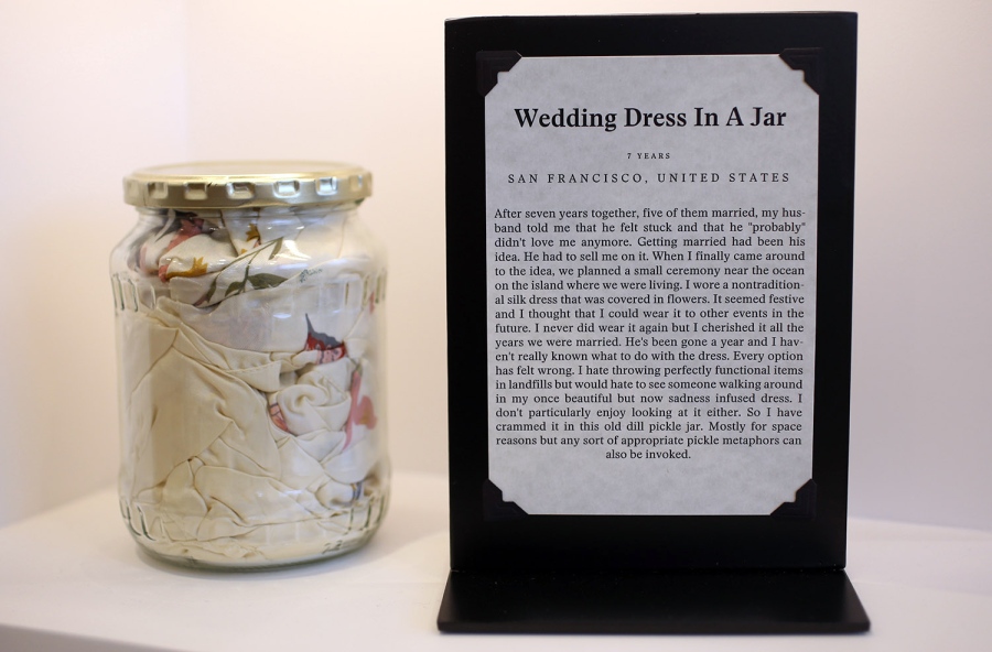
I love how the Museum of Broken Relationships challenges traditional curatorship by collecting objects that are not rare, aesthetic or particularly valuable. What makes these objects worth collecting and what draws in visitors is the story behind the objects, why they were significant to someone in the world. The context is everything. The objects, often, are just everyday objects that are not expensive or extremely unique. The museums encourages discussion and reflection not only on the fragility of human relationships but also on the political, social, and cultural circumstances surrounding the stories being told. The collection respects the audience’s capacity for understanding wider historical, social issues inherent to different cultures and identities and provides a catharsis for donors on a more personal level.
As for being a discursive space, I am also glad to see a shift to promoting museum-goers as equals in power and importance with the institution of the museum. If museums are, as many claim, serving the public, they should reflect the needs and life experiences of the museum-users. And in order to do that, users need to have some way of providing feedback or contributing to the museum curation.
That said, I’m not saying museum curatorship should be a democratic process. Rather, there should be balancing of the current hierarchy in museum management to give museum-goers/users more say in the preservation of their cultural heritage, history, and understanding of the world.
-
Museums and Curation
Christina Krep Reading:
Role of the curator is constantly evolving. Museums are now more concerned with providing an educational experience for visitors than it is with the actual objects within the museum. Curating has evolved into a people and socially-oriented field of work just as museums have evolved into such.
There’s a debate on whether museums should be people or object focused. I think there’s room for both to shine. Similar to Krep’s point I believe that these two concepts are not “mutually exclusive”. Instead there should be a call to action to encourage curatorial work that highlights the “interplay of objects, people, and societies.”
“Curating as a social practice.” Meaning that individual societies have patterned ways of seeing, valuing, and ascribing meaning to and treating objects. This point leads me to believe that the way we experience and engage with art is biased. When we frequent museums, we are doing so through the lens of the curator. Therefore, understanding the curator’s background is essential to understanding how you’re experiencing museums.
I appreciated Krep’s point that in Western museum culture, the “social value” of objects recede into the background once they enter museums. I have been in a many of museums whose sole focus was the uniqueness or rarity of an item instead of its historical implications.
However, museums have shifted from being defined by their relationships with objects, towards their relationship with visitors. Curators should make an effort to involve those cultures whose artifacts are a part of their collection, in an effort to not offend them. Furthermore, the shift in how we define museums has moved towards defining the curators relationships to those people represented in their collections.
Jana Macalik Reading:
Discursive spaces are defined as spaces that foster negotiation and debate. Museums serve society best when they are founded on the principle of intentionality. I like the notion presented to challenge the use of the term “visitor” when speaking about those “users” who explore and engage with the museum itself. “Visitor” implies that those coming to the museum are being hosted and therefore the objects found inside hold weight that supersedes interaction with said objects. This brings me to my point that my most memorable museum visits have been those where I am the engaging with the artifacts and feel a deep connection to the items in the museum (culturally). An example of this, was my visit to the Smithsonian National Museum of African American History and Culture in Washington, D.C. In this museum they provided users with a wide array of explorative and immersive experiences. One of my most memorable experiences was an exhibit that gave users the opportuinty to record a video based on prompts that relate to the African-American experience.
-
Museum and Curation
In “Curatorship as Social Practice”, Christina Kreps suggests that museums has shifted their focus from the objects being collected to the relationships between objects and people, as the role of curators expanded. In “Introduction to the Special Issue: Discursive Space”, the authors take a step forward to argue that museums are spaces that “foster negotiation and debate, polarize and politicize space, and invite discussion fraught with contradictory views.” Under such situation, “visitors” of museums will become more like “users” so that the power dynamic can be changed. Besides, they advocate users to publish their museum experience on social media, as a second selective curation.
A positive example of that is the the American Museum of Natural History. In the “Unseen Ocean” exhibition, the curators are using a lot of different technologies to make the displayed objects more interesting, and the experience more immersive, especially for kids.
Unseen Oceans Exhibition at American Museum of Natural History
Harn Museum of Art provide a “Instagram frame” to its users in order to encourage them posting on their social media, both as an advertisement for the museum and a selective curation of the arts.
-
Digital_Humanities Commentary
Case study 3:
There are a lot of interesting details to consider in this case study, especially in regard to the unstandardized documentation methods of all the religious artifacts. The amount of complexity involved in both collecting and validating the information is remarkable, especially with the recordings of private religious practices. How do you preserve sanctity and respect for the culture while making it vulnerable and open to interpretation and observation?
Case study 4:
I like that the case immediately talks about “the idea of using a virtual reconstruction…touches many nerves.” I thought the same thing right before reading the sentence. This case presents some unique challenges because it is deliberately not a display of collected artifacts, but instead a careful reconstruction of a site. Ultimately, its accuracy and impact is largely in the hands of the artists who interpret the information collected about the site— interviews, images, testimonies. I am particularly curious how they will integrate multimodal data into the experience and what they decide to prioritize in terms of the experience.
Case study 5:
The diversity of the types of manuscripts and written information in this case definitely lends itself well to the idea of a “multidimensional essay.” I often get frustrated whenever I read purely textual analyses of multimedia pieces and experiences— it feels like it’s “down sampling” in a sense. However, this project team handles these discrepancies very well, not only in their media and presentation of choice, but in their choice of team members and prioritizing complementary and diverse skillsets. I also particularly liked that the first point of the work plan is that the ENTIRE team works together to develop the information architecture— rather than immediately dividing work between siloed teams.
-
Curatorship as a Social Practice + Museums as a Discursive Space
The question of the role of a museum and the role of a curator highlights an idea we have discussed extensively: given data (in this case, museum objects), tell a story. Kreps comments on how the specific role that a museum plays has changed over time from one of simply presenting collections of objects and information without commentary to telling a narrative with these collections. This transistion parallels the commentary on the role of the library as an institution. Previously, the goals of a museum and a library were similarly making information available to the public (although the museum’s information is curated and the library’s is not). With the availability of technology to allow people to access nearly any information electronically, these roles have had to shift. The museum’s focus must also be on its “users” as Kreps calls them. In particular, as captialism has extended its influence to museums, the users now carry even more power in their ability to provide funding for a museum.
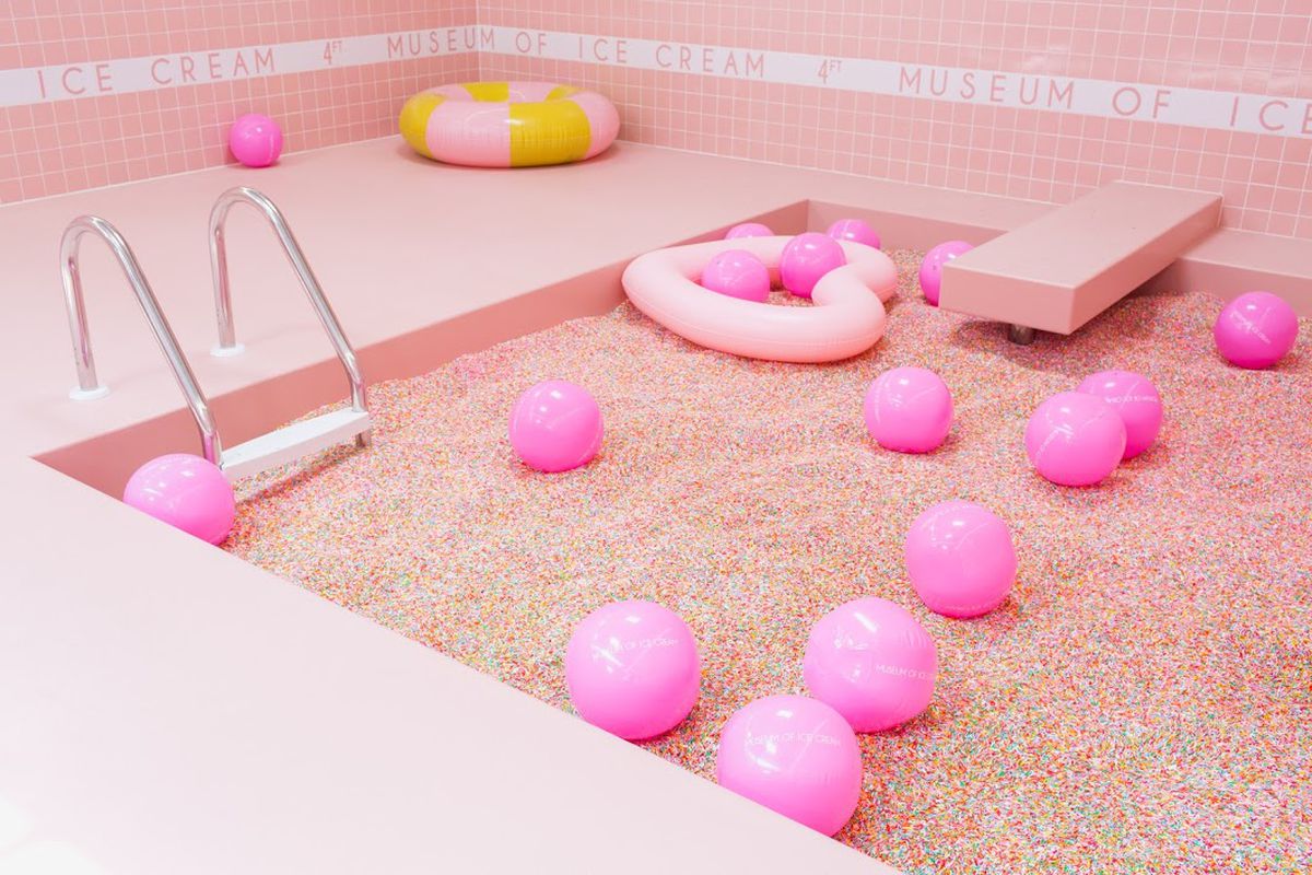
This power can be taken to an extreme. The Museum of Ice Cream, and other pop-up museums like it, exhibit the extreme of focusing on making a museum an “experience” for the user, ignoring the importance of anything else. These provide their visitors with a visually enticing Instagrammable location, but do not provide the visitor with any new information. Arguably, they do not even achieve their goal of making an experience, as there is no story behind oversized plastic popsicles; it solely exists as a “pleasing” image.
This is where Jana Macalik’s discussion of making a museum a discursive space is important. Kreps touches upon this, as the role of the curator can be to counter the users’ traditional beliefs. The Enemy at the MIT museum was clearly a good example of this, but as this was already discussed in class, I can comment on another exhibit at the Museum of Science and Industry in Chicago called Extreme Ice. This exhibit shows photos and videos taken at the poles over the past ten years as a dramatic visual representation of climate change. Its clear intention is to serve as a call to action, and to influence people to care more about this pressing issue facing us. This is explicitly stated a number of times throughout the exhibit. By creating this exhibit, the museum hopes to exert real change to an existing problem by spreading awareness about it. The exhibit is perhaps a more specific example of a discursive space, as it is less about starting a discussion and more about increasing awareness.

-
Comments on Case Studies 3-5
All the studies look at projects that aim to digitize and exhibit physical information (that is, objects, buildings, sites and other inherently non-abstract things) to a wide audience, while being careful to do so accurately an in accordance with the wishes of those originally associated with with what is to be exhibited. This is no small or easy task, and it is interesting how the different projects approach it differently, both using different tools and aiming for different platforms.
The projects, especially the “Augmented Objects & Spaces” and “Virtual Reconstruction of and Afghan Refugee Camp”, face interesting dilemmas regarding how much to display of the available data, and how to do it in order to present a nuanced, factually correct view without disregarding subject privacy or sensationalizing the experience at the expense of the content.
As the case studies do not include any reports of how well the projects went, and the descriptions are fairly high-level, it is difficult to point out any appearent major flaws or strokes of genius. If done well, though, I believe they all have the potential to expand upon our knowledge in the relevant fields.
-
Commentary
Curatorship as Social Practice vs Introduction to the Special Issue: Discursive Space
Both texts describe how museums are nowadays reflect more the connection with culture rather than focusing on the actual itself. Curators are not anymore simple care taker of the artifact but actual designers of stories and narratives building up for an educational experience.
The actual artifact is not anymore treated as a freestanding object but more of a social construct. Cash Cash’s argument in relation of the curatorial world as a direction for people’s orientation. The general predominant idea of decontextualization of the object to be displayed in an environment outside the culture where it belongs in order to fit within the frame of the museum to be displayed in is stripping a lot of the conceptual strength.
This decontextualization of artifacts creates conceptual distance between the object and the people actually going through the exhibit which transform the experience into a skimming activity rather than an immersive activity.
This fact is actually mostly experienced with a lot of the historical artifacts that are exhibited especially when they are displayed outside the culture where they belong to.
The concept of “Discursive spaces” as platforms for social dialogue, aligns with the shifting of the role of curator towards provoking educational insights in launching this discussion.
One of the latest exhibitions I visited was at the USS Constitution in Boston where the main experience involves visiting an exhibition space in addition to the boat. The main exhibit was mainly built around the actual making of ropes around the boat. I think that the fact of focusing on one element and dive deeply in the making process why explaining the relation to the life on the boat is an interesting approach.
-
Case Studies
Case Study 3- Augmented Objects & Spaces: Jewish Ritual Objects in Diaspora:
This case study takes in to account the provenance of the objects in the museum, which I find to be especially important. You cannot truly understand something or someone if you don’t understand the origin of it. In this sense, provenance is crucial to preserving the artifact’s cultural and historical implications. I also appreciated that the museum sought to bring in the people whose culture is being displayed so that they can understand how to best or showcase (or not) certain artifacts that were obtained “surreptitiously”.
Case Study 4- Virtual Reconstruction of an Afghan Refugee Camp as a Site for cultural memory:
While this virtual reconstruction of an Afghan refugee camp is unique, its focus on reinventing traumatic experiences for users brings up many questions for me. While I realize that the purpose of this virtual reality immersive experience isn’t solely to reinvent traumatic experiences of those who endured these camps, I could not help but keep that at the forefront of my thoughts when reading this case study.
Case Study 5- Multi-Authored Locative Investigation of the Zenon Headquarters and Corporate Archive
I believe that if done right, this project can be scalable and translated across a multitude of historic buildings with rich history embedded in the architectural landscape. The most fascinating part of this project to me was having to take something physical (augmented reality) and turn it into an experience that off-site visitors could also enjoy. This addresses the notion of accessibility within the field of Digital Humanities in a way that I sometimes feel is overlooked. I appreciated the call to action to allow those interested but unable to visit the site, the opportunity to explore the archive in a unique way.
-
Museum Response
A New Post
In Kreps’ article, they speak of a shift in the “goals” of museums. It talks about how they, both the museums and curators, are no longer focusing on collecting objects for the sake of having a collection to display, but are focusing on striving for more of an educational role, and using said objects to reach that goal. Most of the focus in the article is on how the role of the curator is changing with the times. On how the work of a curator is seen as a social-practice, and how that work changes as the relation between objects and humans changes. It’s also interesting that they note how if curating is a social practice, then it follows that curatorship in different societies is unique.
The current ‘state of operations’ for museums that the article is arguing for a departure from involves decontextualizing of objects. Museums currently take objects from their social settings and decontextualize them, or give them a new meaning outside of their initial one, inside of the museum context. They argue against this act, because it creates a disconnect between the people and the object - it is only understood as a “special artifact” and not in the correct context. Also, another point they bring up that is really important to me is that this neglects the cultures it takes from at the least, and at the most, it disrespects them. This change is good because it’s important that the museums give the necessary respect to the cultures they are using to profit.
The Macalik article goes into slightly more detail on what these museums should be moving towards - Discursive Spaces, being “spaces that foster negotiation and debate, polarize and politicize space, and invite discussion fraught with contradictory views.” The main focus of this article, is about how museums (and curators) ought to be more fluid with their purpose than they currently are, by transforming themselves from an object display house, to a more discursive space. They also made the point that in order for the conference on this topic they had to have relevance, they must have relevance not only to the museum community and other curators, but to the users that populate them as well - a great point. However, I’m not really sure that the current mode of being for museums doesn’t take relevance to users into account - each museum has it’s own category / niche (museum of fine art, museum of science) and users know what they’re getting themselves into when they go to these.
There was a portion of the article that mentioned a change of referring to those who frequent the museums from visitor to user. At first I didn’t really understand how changing the syntax of the same entity from visitor to user changed anything about the actual practice. Curators can still dictate how materials are perceived by guests, regardless of whether we say they’re using or visiting the museum. however, reading further I understood what they meant.
A problem I had while reading these articles is that while I think it is a very interesting movement to provide a more personalized experience for each user that curators have less of an absolute say in, they don’t really go into detail on what exactly that means. It’s easy to make the connection that augmented spaces from out previous discussions can be a good way to implement these values - but what exactly would the content of these new museums be? They don’t give any concrete ideas as to what these experiences would be, and while they make a convincing argument, I don’t really know where to go from there.
Enter text in Markdown. Use the toolbar above, or click the ? button for formatting help.
-
Comments on The Role of Museums
Generally, I think the change from object-centered to user-centered methodology is a welcome change to museums, as it has been in other areas - notably the tech industry with the advent of human/user centered design. It makes museums more accessible, hopefully making it easier to spread knowledge to, and spark interest among, the general population.
By subsequently moving beyond what Kreps suggests, and into the realm of Macalik’s ideas of the museum as a discursive space, it is also possible to engage the audience further by facilitating debates between both different external persons, and between the public and the museum itself. This, however, is a move I view as more risky, as it requires a more educated audience than simply a narrative exhibition. It also assumes audiences want to participate in a discussion, something that I would consider far from given. It is a very interesting directioin for museums to go in, though, and I would be excited to see what sort of experiences strategies like that can result in.
Finally, I also want to express how important I think it is that this new direction expands upon, not replaces, museums’ roles as specimen colletions and time capsules. The fact that interactivity and discussion can make knowledge more accessible, doesn’t mean the origins of the knowledge are no longer important. (Though I am not too concerned about this.)
-
The Poetics of Augmented Space
As Manovich discusses in his article, there are many ways in which a space can be augmented with information, with various degrees of personalization. The “simplest”, and most common way of augmenting space, is in a way what humans have always done; adding extra information to architectural surfaces through paintings, inscriptions or, more recently, screens displaying dynamic imagery. What characterizes this form of augmentation of space, is that everyone will have the same experience of, save for personal associations or varying connotations, and agree upon, what the space looks like. The next, and increasingly common way of augmenting space, is agumentation that is customized for each user. This is however no small category, and comprises everything from public devices with input mechanisms, to personal AR technologies.
In the Boston Public Library, Space is augmented in three main ways. The first is through books, that while arguably less accessible, or at least less in your face, than large, electronic displays, is definitely information distributed in space. It was also very expected of a library.
The second is through electronic information boards, where one could explore the library’s colletions and delve into the items’ metadata in addition to digital representations of the items themselves. None of the electronic information displays we found, did, however, work properly, which rendered us unable to assess the value and usefulness of a working system.
The third was through personal computers for people to use for web browsing and document writing. This was the most personalized augmentation in the library, as the computers seemed intended for single users, as opposed to the information boards, that could equally well have been used by small groups of people (had they worked).
There were also some more outdated pieces of hardware, like several microfilm magnifiers and scanners, though these were more hidden away and not in use by anyone.
All in all, the library was not particularly successful in augmenting the experience with advanced technology, instead serving as a space for people to use personal computers, an activity so generic I would say it doesn’t really augment a space as much as it makes the space irrelevant, and occationally reading or researching books.
However, whether this lack of augmentation is actually a negative thing is a discussion completely skipped in Manovich’s article. He doesn’t discuss the implications as much as he is simply fascinated with the possibilities, which I feel provides a somewhat shallow analysis of the situation. Especially with the recent focus on both privacy/surveillance and online, isolated groups/echo chambers, I am personally concerned about the extent to which spaces should be further augmented, at least as we move in the ever more personalized direction. While I definitely agree that augmented spaces are cool, and could have the possibility of streamlining our lives for minimum cognitive load (or of course maximum if you so choose, but who will realistically choose that?), I do not think ultimately risking a shared reality is worth it, almost no matter the benefits.
Exactly how this will be solved is of course a different matter, but being blinded by shiny, new technology is definitely not the right way. We need an open, enlightened debate about this, before we’re at a stage where “big brother” knows everything and curates specific realities to each and every one of us.
-
The Poetics of Augmented Space
In his essay Lev Manovich talked about the increasing existence and importance of “augmented space”, which he defined as “physical space overlaid with dynamically changing information”.
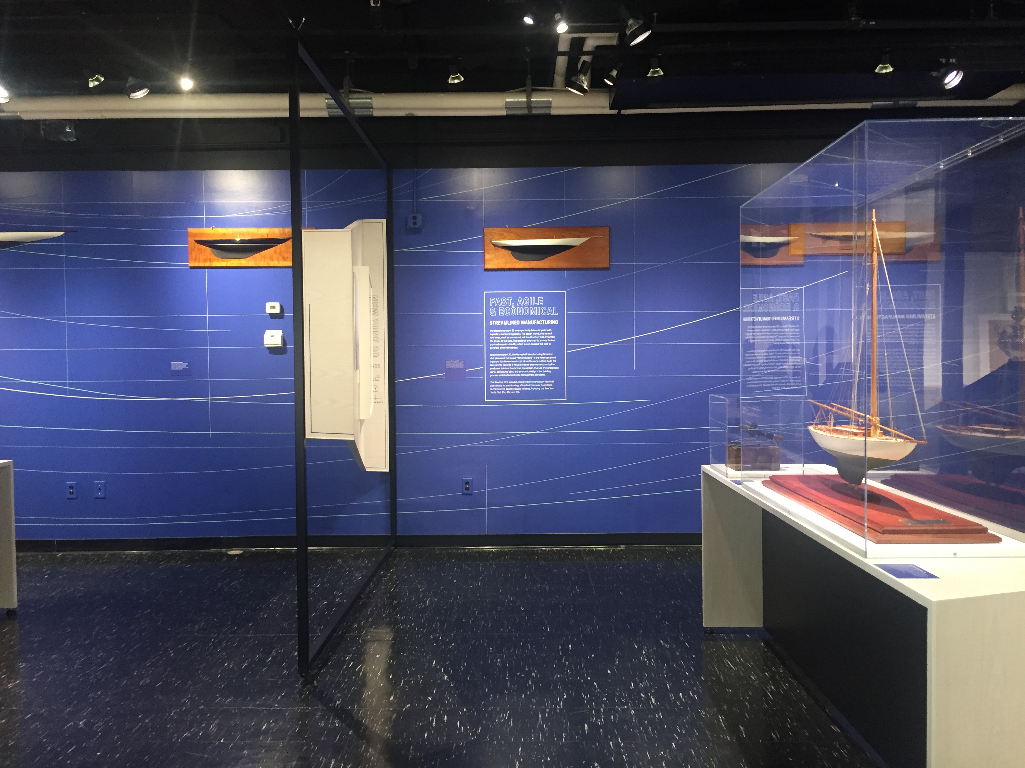
I totally agree with Manovich’s statement that the high-tech society is featured by the close connection between surveillance/monitoring and assistance/augmentation. The concept is illustrated in some of the interactive art installations at MIT museum. One example is the staircase that can sense people’s movement and play music responding to the movement, where the kinetic sensing is a form of monitoring, and the music is the augmentation. However, like most of the other installations in the museum, it doesn’t have the ability to gather more information about each individuals, therefore can only offer an universal experience to everyone. One potentially improvement, according to Manovich’s theory, is to ask all the interactive installations to collect more information about the specific user’s demography and preference, and provide a tailored experience based on that data. The improvement, however, is associated with even more surveillance and monitoring. In the essay, Manovich also talked about the transition in how galleries display work: from placing two-dimensional objects on a wall to using whole 3-dimensional space of a gallery. In the “Lighter, Stronger, Faster” exhibition that showcases marine design and engineering, the exhibition space is partitioned corresponding to the size of the drawings and physical models. In the “Advanced Visual Studies” exhibition, one of the artwork is a cubic dark room with moving lights projected to all directions, which allows the visitors to actually occupy the artwork.
Lastly, Manovich suggested that architects should take augmentation into consideration and integrate it into the design. In the case of the MIT museum, however, augmentations are always changing as the exhibitions are changing. What the architect can do is probably provide a “white cube”, as a canvas for the artists or exhibition designers.
-
The Poetics of Augmented Space
Manovich describes many more techniques than what we observed in our Ethonographies of Public Spaces activity that could have greatly enhanced the experience. While we did observe some of the paradigms of information technology that Manovich highlights, there are many that the MIT Museum lacked and could have benefited from. Of the technologies the MIT Museum did exhibit, the most prevalent was probably tangible interfaces - bringing closer the human to the computer in HCI by employing physical space as part of the interface. Touch screens and other tactical exhibits were plentiful throughout the museum (i.e., interactive staircase playing music with each step). On the same hand, ubiquitous computing, intelligent spaces, context-aware computing/ambient intelligence, and sensor networks all go hand-in-hand to help make tangible interfaces possible.
However, the museum does not go far beyond this, not employing much of any cellspace technologies at all which is a large component of Manovich’s essay, or wearable technology, augmented reality, or building intelligence. And what the museum does employ is in modest, not highly immersive, engaging, or paradigm-shifting, with interactions brief and limited in scope and scale. I think what the MIT Museum could probably capitalize on the most would be in building intelligence, since there seems to be a lack of connection / harmony between the contents of the museum and the building itself. Exhibits seemed somewhat arbitrarily tossed into the spaces and I felt, as a visitor, that I could have been better oriented and more engaged with the space if it were better at “fusing” building and exhibition, as described by Ineke Schwartz (p. 234).
The museum also incorporates a now interesting mix of “white cube” and “black box” displays, with spaces littered with small black screens as well as large projected surfaces. While this may have seemed compelling and innovative at the time and to an average museum-goer, it in retrospect seems almost amateurishly motley, given Manovich’s comparison of the two.
Black Box Versus White Cube example


-
Museum of Design Atlanta
This weekend I was in Atlanta! So I went down to the MODA and see what they had on exhibit.
One of the coolest parts of the space is that it caters to basically every age group but emphasizes being a creative space for kids. 3D printers and workspaces greet you at the door, directly adjacent to exhibits themselves. It’s inviting and makes design seem approachable to even people outside of design. I brought three of my friends with me– all of which are not in design fields, and they had a blast.
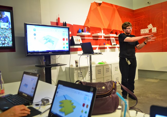
I was expecting some more interactive stuff though. There wasn’t that much, mainly just some displays, but nothing touch screen or app oriented. Although, one distinct thing here was that all of the 3D models and pieces on display were completely open, touchable (carefully), and it was very easy to gather groups around the pieces. This layout seemed to encourage discussion quite a bit.
Here are some cool pictures I took from some of these open displays:
These two were from an open exhibit about a public space being built in Kenya (I think).

This was a piece of glass that only had the negative of a photo printed on it. It was offset from the wall slightly so it would cast shadows behind itself.

There weren’t really many experimental technologies implemeneted which I think could’ve made some of the exhbits more engaging, but you’d be suprised by just how much layout and interior design affects conversation. Although, I always loved the idea of having location based notes – in the same way that you can see a map of all of your photos wherever you take them. If there was a way to pin thoughts and questions to a location – in this case, MODA – I’d love to see what people have previously said about exhibits / the space. Other than that, I’m not sure if asking about having more and more social interaction is always the right question in a museum setting. Museums and exhibits can be really personal and emotional, so inserting technology into the space to encourage social interaction might detract from some exhbits. Time to go to the Cooper Hewitt though.
-
Augmented Spaces - BPL Respose
Augmented Spaces - Zidane
This is a really interesting way to describe the world around us - with many of these readings I’m learning about new ways to view the existing features of our everyday lives in a new scope. (From chart junk to deceptive graphics and now to Augmented Space). In terms of the library, I saw many examples of augmented space right when I entered. There are many tv screens of different sizes that provide information about upcoming library events, staff book picks , etc. It was also interesting to observe how in the transition from the 20th to the 21st century, the scope of technological advancement has switched from providing access to virtual spaces from a stationary computer, to bringing these virtual spaces along with the user into the actual physical spaces they inhabit. Even more interesting, is the fact that the library utilizes both of these techniques - both with stationary Macs and desktop PCs that allow you to interact in different ways with the contents of the library, and the tv screens that give visitors direction.
There was a particular concept in the article that raised some concerns for me: the one where they speak about collecting a multitude of different types of information to allow a centralized program to perform tasks and make recommendations for them. The first thought that comes to mind is a black mirror episode where they take this concept to the extreme, and create an AI of a person by copying their conscience into a program, and having it perform their tasks around the house for them. While this is clearly an extreme and unlikely case, the real life example mentioned in the article has the same goals, and the means to achieve these goals involve a great deal of privacy breaching.
Conceptualizing this concept for the library. To what extent does a user need to be physically tracked through the library, or have their preferences data mined from their browsing data? It may be interesting to track their path through the library and observe how they explore different sections in order to give recommendations based on sections they might not know much about or more of the catalog of the sections they do visit. To a much lesser degree, the same information can be obtained by tracking their checkout and search history (on the library website ONLY). The first idea is much more useful in terms of the breadth of things you can actually do with the data, but how justified is the breach of personal space and privacy for that goal?
The article also mentions immersion - how you can be immersed in different ways through both augmented and virtual reality, as well as traditional ways of viewing media. I.e. video games, movie theaters. The library’s tv screens by the entrance could be seen as the greatest attempt to strive for immersion, but I personally don’t feel that they create that effect you get when watching a good movie in the theater, or when you’re engaged in a great video game. I acknowledge that these are meant to be different experiences, but I do feel like the library has the potential reach it’s own type of immersion - separate from the traditional feeling of immersion you achieve when you’re in a particularly silent section of the library engrossed in a particularly good book. It could be argued that audio books are a form of technology that the library offers that creates a type of immersion separate from the traditional form.
Enter text in Markdown. Use the toolbar above, or click the ? button for formatting help.
-
Augmented Space
Augmented Space
At the beginning of this reading, Manovich states that he “want[s] to re- conceptualize augmentation as an idea and cultural and aesthetic practice rather than as technology.” This particular point immediately interested me because I’ve only ever considered augmentation in a technical context and never as a cultural and/or aesthetic practice. Manovich aimed to show how architecture, media, art, cinema, etc. can be understood through augmentation—making this approach a fascinating one for the field of Digital Humanities. However, one point that I disagree with is the one in which Manovich declared that “augmented space is also monitored space.” While I do understand his reasoning behind it, I disagree with the dogmatism of this statement. While some augmented spaces can be reframed as monitored spaces with the intention of assessing patterns and behaviors, not all augmented spaces are created with that intentionality in mind. One instance that I see augmentation as monitoring occurs in some shopping malls around the nation. Some shopping malls use store trackers to assess and track the behaviors of their shoppers and adjust their store layout accordingly. Making the augmentation architectural in a way because foot pattern tracking allowed for the store to make data-driven adjustments to better sell store merchandise. Similar to Manovich I see a lot of augmented spaces occurring in the interior design and even retail space. Augmented spaces become a place to engage the user in its surroundings in a fashion that extends far beyond the limited view of electronic media (i.e. screens). Retail spaces currently are testing out ways to allow users to try on clothes through an augmented experience. This new reality reaffirms Manovich’s hope that augmented spaces can transcend beyond historical limitations.
-
Augmented (Public) Space
The Augmented Space article discusses how data can be layered within physical space. Prior to the technological age, this was done with mostly visual ornamentation, by adding a level of symbolism to the space. With technology, visual ornamentation can constantly adapt and animate given stimuli, and other mechanisms of incorporating data are possible, like audio tours. The question then becomes how might the idea of augmented space incorporate itself into our public institutions. The author argues that public institutions should experiment and become innovators in augmented space, rather than far behind in technology as they currently are. While I certainly agree that most public institutions are far behind the times technologically (there were MANY microfilm readers at the Boston Public Library), the reason for this is not a lack of willingness to innovate, but a lack of resources to do so, as well as a higher prioritization of the institution’s other goals. The library’s function is to serve as a public resource for knowledge, preventing it from only reaching the elite. As computers have made knowledge more and more public, the limiting factor to accessing knowledge equitably has become access to computers. Therefore, it has adjusted by providing free access to computers to the public and people who need it. While it should keep up with the times, its primary goal is to provide its users with easy access to other knowledge. Too often, attempting to “innovate” in augmented technology leads to glitchy and ultimately useless spaces. Since the library plays a vital role for people, it should not waste its time and money on unproven methods. Augmented spaces have potential, but public spaces should not be running experiments on the people it is trying to help. Rather, they should focus on implementing current technologies well.
-
The poetics of augmented space
Manovich calls for us to go “beyond the ‘surface as electronic screen paradigm’” and think of information flow as something physical, tangible, and studied just as much as the material.
I think Manovich is correct in that often, people who work with media often think of the virtual space as something separated from the physical space by a screen, or by technology. Rarely do we think of the physical and virtual space as one, an entirely new expanse Manovich calls “augmented space”.
The MIT Museum struggled to make that jump of seamlessly blending the physical and the virtual. The “black box” Manovich described was certainly on display, with a video playing on the first floor with seats facing the projector – a standard, uniform way for visitors to experience the virtual, with a clear divide between what was electronic and what was physical.
There were a few exhibits that managed to somewhat cross the divide. The stairs that lit up and played tones when a person walked across them involved both physical and virtual elements. But the physical seemed more like triggers for the virtual rather than a blending of the two.
I think blending best occurs when the virtual actively engages and makes use of the user’s physical space, rather than expecting the user to shift from the physical into the virtual. In the example Manovich gave, Janet Cardiff’s Alter Bahnhof Video Walk (https://www.youtube.com/watch?v=sOkQE7m31Pw), visual and auditory information from both the phone (the virtual space) and the grounds of the Kulturbahnhof in Kassel (the physical space) are blended in such a way it is difficult to differentiate one exprience from the other. They are blended such that they become one experience.
Cardiff’s piece reminds me of Yoko Ono’s work, like her poems in Grapefruit, which are written as instructions. By commanding the reader to physically do something, Ono blurs the line between the imagination and the physical world, much like Cardiff blurs the line between virtual and physical.
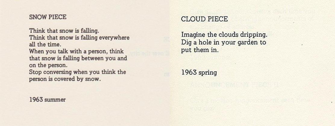
Poems by Yoko Ono, which augment the literary space by calling for the reader to physically do something.In Cut Piece (https://www.youtube.com/watch?v=-yqhSZsXIJQ), Ono breaks down the “black box” Manovich describes of performer and audience by asking the audience to cut off a piece of her clothing and take it with them. It introduces themes of vulnerability of the artist and effectively combines the space of “performance” and “audience” until they are indistinguishable.
So, Manovich’s idea of blending worlds is not a new one. But the idea of specifically blending the virtual and the physical in an augmented space, and treating the blending as a “substance” as tangible as the physical, is a novel idea, atleast for me. Drucker called for us to focus on the experiential over the material. Manovich seems to say that the two are so tightly intertwined that that we can should treat augmented space, and the flow of electronic data within, the same way we do with the material.
-
How Deceptive Are Deceptive Visualizations?
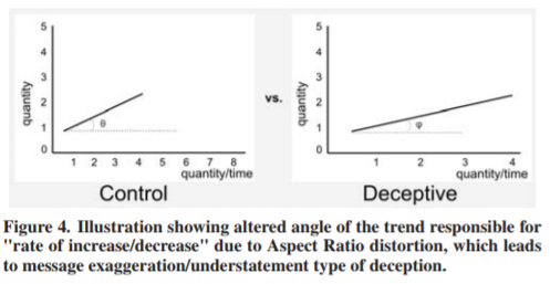
This study focused on four common techniques of distortion of data (truncated axis, area as quantity, aspect ratio, and inverted axis) that lead to two main deception effects (message reversal and message exaggeration/understatement). The line chart/aspect ratio proved to have the biggest distortion effect, which makes sense to me because among the other techniques, a distorted aspect ratio seems the most difficult to mentally adjust for, if that makes any sense. For example, it is easier to imagine/visualize a non-truncated axis, or an accurate bubble case, but harder to mentally see what a corrected aspect ratio graph would look like.
It was interesting to read through the identification and classification of different techniques was because I feel like I often notice and am critical of when these techniques are used in the real world, but I never stop to really crystallize and classify them in my head. On the other hand, while seeing these distortion techniques irks me, I also have been guilty myself of distorting data and I think it is something everyone does because we are always looking for stories out of data and we obviously want to be able to tell the strongest narrative that we can paint. However, there have definitely been times where I have tried to exaggerate my data, but as much as I try, there is a point where the data IS what it is.. Therefore, in response to the question of how deceptive are deceptive visualizations, I think you can definitely stretch the truth a bit but there is a limit to where you cannot completely “lie” or fabricate something that is just blatantly opposite/false.
-
When Maps Shouldn't Be Maps
When Maps Shouldn’t Be Maps
It’s easy to think that data that contains geographical information could be best displayed on a map. However, the problem lies in not whether or not the data can be displayed using a map, but rather should it be given the context that surrounds it? In the case of this reading the author focuses on the latter part of the aforementioned question. A focus that many more data visualization creators should take note of.
!
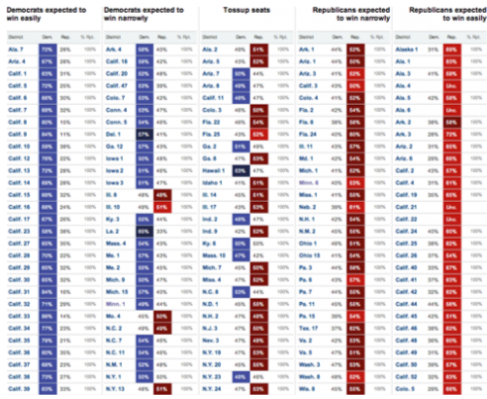
Visualizations like the one mentioned in the reading allow readers to gain deeper understanding of events based on additional context knowledge. Here the creator visualized which Congressional seats were most likely to go to Democrats vs. Republicans. The visualization therefore clearly shows the polarization of the parties and the juxtaposition of votes allocated in accordance with initial predictions. Now users can easily tell that Republicans gained majority of the congressional votes and disallows for the data to be easily distorted by graphing it on a map.
-
How Deceptive are Deceptive Visualizations?
How Deceptive are Deceptive Visualizations?
Deceptive Visualization effects can be classified as “message reversal” or “message exaggeration/understatement”. The study classified these effects and then rendered synthetic examples to reproduce them in a controlled environment. Results showed that deceptive charts did indeed affect the way people interpret messages and that sometimes this occurs in accordance with people’s personal traits/attributes.
I think the author brings up an interesting point when they say “not following best practices of visualization design, such as truncating the axes, may lead to a deceptive visualization either with or without intent, depending on the sophistication of the creator.” The researcher is saying that those who do create deceptive vizualitions do it either with the intent to deceive or because they lack the skillset to appropriately convey their message through these visualizations. I appreciated that they clarified that while intent is a problem area, it is not the focus of deceptive visualizations. Instead, the focus should be prioritized to the way the message is received by the reader.
“Almost all visualizations are prone to distortion or lie.” I agree witht this point because people interpret messages very differently and as a result the visualization can be painted as a “distortion” or “lie”. Also, there isn’t a one for all distortion technique one can use. Different distortion techniques–such as color deception, truncated axes, and missing labels–are dependent on the type of data being visualized and the message being conveyed. When thinking about my interactions with deceptive charts the one that is most common are visualizations than employ the truncated axes distortion technique.
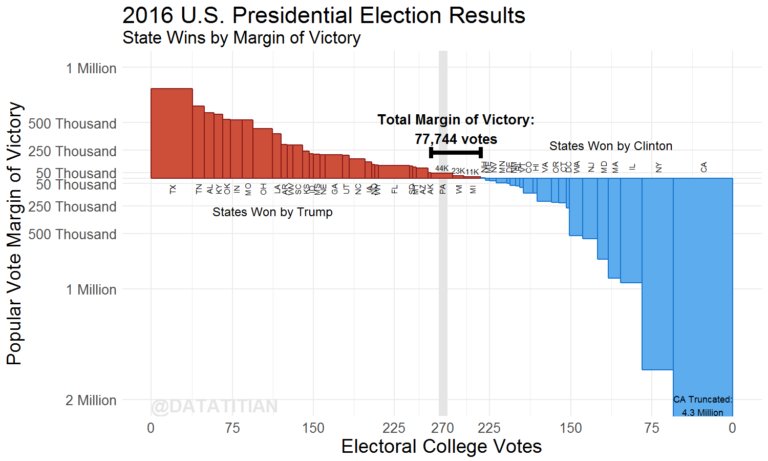
When looking for examples of truncated graphs of the past Presidential Election, I came across one that explicitly stated that some of the data had been truncated. This led me to think that if data visualizations are distorted and they explicitly tell the reader that it is–is this still a deceptive graph?
-
Commentary: When Maps shouldn't be Maps
I think Matthew Ericson has a good point here, though it is very similar to what others have expressed before: Any tool can be great in certain situations, and useless in others. What this text does is provide more concrete examples that elaborate on Bodenhamer’s “The Potential of Spatial Humanities”, showing both examples of when GIS is well used, and when other visualizations were more appropriate. Overall I liked the examples and agree with him.
-
Commentary: How Deceptive are Deceptive Visualizations?
Based on the analysis presented in “How Deceptive are Deceptive Visualizations?”, it is clear the answer is “Potentially very”. With fairly simple techniques of deception, techniques that I would say could be mistaken for simply poor graph design, the researchers were able to both understate, exaggerate and even reverse the meanings of datasets. This is of course very fun and interesting, but the implications can be dire. As suggested in the analysis, many people don’t even seem to consider that visualizations can be skewed, and thus accept the image they’re presented as accurate and true.
It is important both as a consumer and visualization designer to be aware of this, and, in my opinion, actively try to counteract these effects in visualizations we create ourselves.
-
How deceptive are deceptive visualizations?
deceptive visualization: “a graphical depiction of information, designed with or without an intent to deceive, that may create a belief about the message and/or its components, which varies from the actual message”
Throughout the article, I was thinking about whether or not all visualizations are a bit deceptive, in that we all have our own biases and personal beliefs which get projecte to our work, often unconsciously. I think the answer to that is no. I think there are some messages that are truly unbiased (for example: the population of Wisconsin has increased by 20,000 over the last two years, at an average rate of 1000 people/month; there are 15000 more words in the Old Testament than the New Testament) that can and should be visualized without deception.
I find it interesting that line graphs were found to be the most deceptive (in this specific example, and when compared to a bar and circle graph) when they are arguably the most common in the Real World and in academia. (I do not have evidence for this statement, but having read through a significant number of course 6 papers, that has been my experience.) I wonder if the simplicity of the line makes it easier to manipulate, or perhaps people are just worse at interpreting lines compared to interpreting areas.
They gave this as an example of a deceptive line graph, but I have seen graphs like this (where the axis is changed so that the slope seems steeper/lower, and fits into a graph more nicely) all the time in scholarly publications. This ties into the whole culture of “perish or publish” in academia. Nobody wants to read about inconclusive results, so people will fudge with the data a bit to make it seem like there is a conclusion to be made, even when the unfiltered data says otherwise. Of course, publishing is necessary for tenure-track postions, prestigious postdocs, grad student fellowships, etc. It is a huge problem in academia and probably at MIT, that doesn’t seem to have an easy solution without a major shift in academic culture.
-
How Deceptive are Deceptive Visualization Comments
In “How Deceptive are Deceptive Visualizations?”, the researchers first define the concept of deceptive visualization as “a graphical depiction of information, designed with or without an intent to deceive, that may create a belief about the message and/or its components, which varies from the actual message”. After that the paper focuses on two types of message-level deception: “Message Exaggeration / understatement”, and “Message Reversal”, and four techniques associated with them: truncated axis, area as quantity, aspect ratio, inverted axis. Later, the researchers conducted a case study, whose results confirmed that the four techniques mentioned before do lead to major misinterpretation.
By looking at the examples of deceptive graphics giving by the paper, I think it is a bit difficult to read the graphics without any context, and judge whether they are deceptive. For instance, I can see the bar graphic of “Access to Safe Drinking Water in Willowtown and Silvatown, as of 2010” to be a good graphic if it is placed in an article where the writer firstly presents the graphic of access to safe drinking water of all the towns with y-axis ranging from 0 to 100%, and then zoom in to the “Truncated Axis” graphic from the paper, to talk about a detailed comparison between Willowtown and Silvatown. In some way, the “Truncated Axis” method functions similar to a log-scale graph, which could be useful in many circumstances, but would also cause misunderstanding if people are lacking background information, or not looking at the graphic carefully.
-
Narrative of Space and Time
In this chapter Edward Tufte examined three major topics: the motion of Jupiter’s satellites, itinerary and timetable design, and the notation systems for dance movements
In the first part, Tufte talked about the evolving representation of Jupiter’s satellites. When Galileo started to get interested in the satellites of Jupiter, he represented their movement with simple diagrams on his notebook. In the diagram, Jupiter and its satellites were drawn as dots of different shapes. They are aligned in different sequences according to their relative position Galileo observed from the sky. Later, Galileo constructed Jovilabes with the others, and the representations of the satellites’ movements evolved from dots to continuous curves that report every positions. The representation was updated again, in the end, the Voyager spacecraft revealed the true image of satellites.
In the second section, Tufte described a series of timetables and route maps, each with its own advantages and shortcomings. He started with looking at examples of comprehensive description of a transport system requires both time and spatial experience. The map for the Czechoslovakia Air Transport Company, and the China Railway Timetable Index Page were used as good examples here of how complex network of routes and times can be shown at the same time in limited space. After discussions on timetable and train schedules, he mentioned some strategies can be used in data representation: serpentined data formations, which is especially useful when data are lognormally distributed; spilled outlying data; and end-to-end cylinder/circular graphic. I think the three strategies can be really useful on different datasets, even though they may also cause confusion and misunderstanding.
Lastly, Tufte talked about notations of dance movement, which is defined as the process of “translate human body movement into signals transcribed on flatland”. I totally agreed with Tufte that the notations themselves can be something elegant and beautiful that are independent from the motions they represent. The diagrams from Dictionary of Kinetography are almost like drawings themselves.
-
The Chartjunk Debate
Stephen Few argues a more moderate approch in the chartjunk vs. embellishment debate-well designed embellishments, when conveying simplified data, can help serve as a mnemonic to remember data, but can become chart junk when attempting to look at more complicated analyses of data.
He comes to this conclusion on the basis of a paper on the usefulness of embellishments. In this paper, the authors have 20 students look at either “embellished” charts or “minimalist” charts to compare which improved recall. They found both were equal in the short term, but in the long term embellishments do better. Few takes issue with this conclusion, as the study took what Few considers to be some of the most well designed embellishments by Nigel Holmes and pits them against poorly designed minimalist charts that even the strongest hater of chartjunk Tufte would despise for a lack of clarity. The study also focused only on graphs with relatively simple messages, as Few doubts that the same conclusion would be drawn with more complicated data. The limited sample size also skews the results-we cannot base everyone’s understanding on a few college students who likely have some familiarity with charts.
Few states the following modified conclusion from the study:
When a simple message—one that could be expressed verbally in a single sentence—is presented in a chart that includes embellishments relevant to that message, along with quantitative values that are related to but incidental to the message, then a reader will comprehend the message as well as he [sic] would had the graph lacked embellishment and will also better recall the basic subject of the chart and pattern in the data two or three weeks later, but no better soon afterwards
While Few criticizes the study for drawing broad conclusions based on a limited sample size, he does the same, drawing his own conclusions based on his own presumptions and instincts on the matter. This is not to say he is necessarily wrong; simply, I claim that Few has little more evidence for his argument than does the paper.
That being said, I do think Few’s argument has flaws. Few does state that chartjunk is too broadly defined in Tufte’s work, but Tufte has roughly the same definition that Few does. Tufte does argue that as long as it supports the work’s meaning, it serves a purpose. Few, however, includes Holmes’ works in the category of supporting meaning. However, by Few’s own admission, Holmes’ embellishments do NOT add meaning; rather, they add memory. Drawing a woman on a chart about diamonds will make you remember what the chart looked like, but it gives you no additional understanding of the underlying data. It is an artificial construct that is separate from the data, and when it overwhelms the chart, it can obscure the actual meaning of the data to one small conclusion.
While reader engagement and memorability is a valid goal, Few acknowledges that if they impede understanding, embellishments become chartjunk. In the case of Nigel Holmes’ work, they limit readers understandings to only the most basic of conclusions, and are therefore excellent examples of chartjunk.
-
The Chartjunk Debate Comments
Stephen Few argues that Edward Tufte’s definition on the term “chartjunk” is too loose. Instead of using it to label all additional decorations and graphics that don’t contribute directly to the dataset being present, people should take the intentions of the designers and the intended messages of the charts into consideration. Few also argues that the study “Useful Junk?”, which were used to deny Edward Tufte’s opinion, is not valid because of its shortcomings in methodology. I totally agree with the author that different visualizations have their own purposes and target audiences, which may be independent to the datasets they are presenting. We should take those elements into consideration when we define what are “chartjunk” and what are not. The danger is if the viewers can detect those intentions as something subjective and something that are created by the designers to express their own opinions.
-
Reading response |The Chartjunk debate
A New Post
A graph might not convey the full story in a data set but it should be designed to present the ideas in a rich way. The author examines the use of data in different scenarios whereas he tries to specify how the visual representation affects the viewer and helps in communicating the message in a more effective way. Discussing the different scenarios, on a scale ranging from an excessif embellishment to a very minimal rendering points out the importance of the designer in the choices they make to use the proper communication representation in coherence with the data used. The way Holmes’ chart introduced embellishments was not useful to convey the message because it engages the audience’s brain in a distractive way (metaphor) rather than a focused way on the data.
Moreover, Stephen Few points out a very important concept on the interrelation between the simplicity of the message and the visuals conveyed that would enable us to state the message in one sentence.This is a very important component to be taken into account while design for a data visualization because we tend to get lost in the compelling representation while forgetting the focus of the message.
-
Reading Response |Edward Tufte: Envisioning Information
Layering and separation
Effective layering of information can be challenging. An important consideration should be given to the relationship of information represented in both visual and content. Unlayered visual representation fail to communicate the ideas. A grid helps in the general reading of the information as long as it is muted and represented in a way that doesn’t overwhelm the reading of the actual data. The 1+1=3 concept underlines the importance of the space formed as a consequence of two lines and how it affects the reading.
I totally agree with the way he defines ”information” in relation to “differences” in layers and the way we separate the data that help in the reading and the conveying of the message. The cluttering and incoherent display of data can lead to disinformation and false perception from the readers specially if they are not familiar with the topic conveyed.
-
Layering and Separation
In the chapter “Layering and Separation,” Tufte explains how even complicated data need not look that way and how quality design can distill information visually into an understandable form. Tufte remarks on the following effects on understanding:
Figure and Ground
To distinguish figure and ground, Tufte recommends using color, shade, and weight delibrately and meaningfully. A mess of black lines with the same thickness conveys little information; shading unimportant things in lighter colors helps indicate where focus should be placed. When there are multiple sets of information interacting with each other-like labels for each part of a diagram-bold color (like red) can help indicate its importance. However, bold colors must be used sparingly-an abundance of bold colors against a white background can be visually jarring.*
Interaction Effects
Borders should not be the visual focus of the image-the information should. Boxes surrounding information should be enough to indicate separation, but they should serve no other decorative purpose. Using “small spots of intense, saturated color” can help increase the focus to the actual information, especially when constrasted with the rest of the image.
1 + 1 = 3 or more
Negative space can be as important as positive. When you draw 2 lines, you do not only see those 2 lines. You also see the space in between them. These 2 lines can also be drawn in many different ways-right next to each other, parallel, crossing at various angles, etc. Each method conveys a different meaning. Using this concept, we can be more aware of using negative space meaningfully (for example, to depict roads) and notice when we’ve added too many elements in (for example, excessive bordering)
*This sounds like a symptom of the times, as design nowadays tends to employ incredibly bold uses of color and strong constrast. On the other hand, given how stressed out we are, perhaps we should listen to Tufte and calm our designs down.
-
Edward Tufte Layering and Separation
In the chapter Layering and Separation, Edward Tufte argues that one must be aware of how visual objects interact with one another when appearing on the same surface, summed up in the statement “1+1=3”. This comes from a specific example of two lines next to each other creating a third one between them, but can be extended to any situation where the negative space between elements becomes as attention-grabbing as the elements themselves. These situations are to be avoided in order to convey information clearly, Tufte argues, and follows with numerous examples of bad graphic design and how it can be turned good with only minor tweaks; usually removing unimportant elements, reducing contrast created by supporting shapes and differentiating elements using line weight and color instead of exessive lines and descriptions.
-
Edward Tufte: Envisioning Information commentary
One of the things that struck me most was how authoritative Tufte’s claims are. His writing style almost sounds religious. Although he does amazing work and many of his claims and opinions on design make sense, I’m curious if his tone implies there’s only one correct “camp” of design. For example, “dark grid lines are chartjunk.” Of course dark grid lines almost always don’t help data analysis, but I was surprised by how direct his argument was.
Also, his use of color and ability to balance different visual elements together is amazing (especially when he’s redesigning the Marshalling signals chart!). Not to mention quantifying basic perception using the “1+1=3” rule. What’s funny though is that so many of these basic principles about information design is practically identical to what graphic design students are taught– and I’m curious if STEM education in general would benefit from a more integrated view of visualization and design and influence how people actually solve heavily quantitative problems.
-
Edward Tufte: Color and Information
Right off the bat in this chapter, Tufte makes his points of view on the use of color very clear. He interestingly states that the main focus in using color to convey information is to avoid mishap, rather than to strive for great designs and color combinations. I was wondering if this was due to his apparent bias against graphics (I read the other reading first), or the increased probability that certain designs will not be good due to the immense number of colors. I assume it’s the latter, based on his following appraisal of color in the Swiss Map.
He later reveals how he subscribes to Imhof’s CRP, a guideline on how to properly use color to convey information. Reading through that, I really like what he has to say about certain color combinations - these things are true, I had just never given them any thought past what looks good and what doesn’t. I also think the 1+1=3 analogy perfectly describes the effect of incorrectly combined colors, and the map example right after this was in fact an eyesore. I also thought his wording was hilarious.
Having read the other one first, this is a very interesting read. I’m beginning to sympathize with Tufte’s views. In the other reading, his ideas were not articulated as well they were in this one - probably because the author was for the other side of the debate. However, the quotes they did use were more blanket statements that could be seen as discouraging the very ideas he is supporting here.
I really like what I was reading about the rules of color combinations, particularly the usage of primary colors and black - I feel like I will definitely use these colors in future personal designs.
Tufte also makes the point that a neat fusion of color coding and precise and concise text can be an optimal option in the presentation of data in the context of proofs. I think this is very true, the example shown proved that, and it is also used in diagram or map legends in the same way, also incorporating smaller shapes.
I think his question about using the multidimensionality of colors (3) to communicate data about multiple dimensions was extremely insightful and very interesting. I also think his question about how far that can go in terms of what we as humans can understand is equally as important and interesting, if not more.
The suggestion about using the natural colors in nature was also very interesting to me, and the reasoning behind it (familiarity, natural blending) makes perfect sense - the colors in nature play a HUGE part in information gathering of our surroundings, and it’s an interesting form of biomimicry.
Tufte says that color has immense power as a natural quantifier, just based on how many different values and combinations it can take. However, it’s not as great as it seems, as there are numerous constraints, as most of this chapter points out, to be followed when considering color choice in the communication of information.
-
Color and Information
Color itself is subtle and exacting. And, furthermore, the process of translating perceived color marks on paper into quantitative data residing in the viewer’s mind is beset by uncertainties and complexities. These translations are nonlinear (thus gamma curves), often noisy and idiosyncratic, with plenty of differences in perception found among viewers (including several percent who are color-deficient).
Tufte gives sound advice, accompanied by beautiful example illustrative maps and expository pieces, on using color. Avoid using bright colors in large areas, in conjunction with one another, and/or next to white. Take inspiration for color palettes from nature. Value scales can be useful, but be wary of how they rely on context. And be careful with lines.
It almost seems like Tufte goes much more into depth on what not to do rather than what to do. And it seems like for color, a lot more can go wrong than can go right. But I think all of us can attest to the extraordinary effects color can have on any sort of visualiation when executed well. The map of the T is a great example.

So much information made so readable by use of color. Of course, Tufte also mentions the shortfalls of color – like all visuals, perception can be subjective, and one must be mindful of those who are color-blind or have other difficulties seeing color. For that reason, it should be said that absolutely crucial information should not be encoded using color, or alternate displays should be available to people in those cases. But I think color, like salt, while not the substantive part of the meal/display, can really bring out all the subtleties that one might have not noticed previously, and really make the experience enjoyable rather than just funcitonal.
-
Chartjunk Debate
Chartjunk Debate
My main takeaway from this reading is that comparing embellished graphs to simple charts (rid of “chartjunk”) is like comparing apples to oranges. Stephen Few poses the notion that Edward Tufte may have been a bit presumptious about his certain idealogy that “chartjunk” is an inefficient way to visualize quantitative data. Instead, Few argues that Nigel Holmes’ use of embellished graphs is just as useful as Tufte’s simple graphs. Few also presents a study (that has noticeable biases) which examined how 20 University Students interpreted both embellished and simple graphs. I appreciate that Tufte noted the apparent flaws in this study–including that all of the embellished graphs were those of Nigel Holmes. In my opinion, I must say that I agree with Few’s notion that both Tufte and Holmes make noteworthy points. Yet, if I had to choose a preference for how I’d like to receive quantitave data I would prefer embellished graphs.
-
The Chartjunk Debate
“To the degree that the message is important and the information contained in the message is sufficient, the fact that these charts are memorable is useful. When the message is important, but greater understanding is needed, however, these charts fail. When charts of this type are promoted as examples of the way data visualization for other purposes should be designed, they are harmful.”
Summary: Like all things, Holmes-style charts have a time and place. They are most effective when the data’s message is straightforward and can be conveyed easily and memorably through illustration. But for more nuanced messages, displaying the data itself in a readable format, without illustrations, is often clearer.
Commentary: I readily agree that visual embellishments, when tasteful and functional, can enhance the presentation of data. And I would also agree this does not classify as “chartjunk”. But from my own experience, embellishmemts more often errs on the side of overdone rather than underdone. This is especially the case – and often is the case – when someone not trained/experienced as a graphic artist tries to make an embellished image. Since embellishments are in some ways an art form, I think people tend to consider it as a subjective work that anyone can do, when in reality, the vast majority of times it would be better to hire an actual graphic artist.
“When graphs are used in this more typical manner, they should exhibit the following characteristics:
- Present all the data that is needed for the audience to see and understand what’s meaningful.
- Present nothing that isn’t needed.
- Represent data accurately.
- Represent data in a way that is easy for the eyes to perceive and the brain to interpret.
- Provide appropriate context for interpreting the meaning of the data”
“Three factors in particular come to mind that should have been taken into account and controlled in this study: • Characteristics of a representative sample of quantitative graph users • Different purposes for which people use quantitative graphs • Different types of chart embellishment The study suffered from ignoring these factors, producing results that cannot be trusted, despite the fact that they are probably true, and cannot be used to evaluate the effects of chartjunk on most of the quantitative graphs that are used in the world.”
Summary: Graphs should express what is strictly necessary with context in a way that is accurate and aesthetic.
Commentary: Of course, deeming what is necessary can be, at times, subjective. I got the sense that the author of this paper believes that every chart should have a clear (if multifaceted) message. But I think that if a chart can be explained in one sentence, why not just express its message in a sentence? Why have the chart at all? For example, for “the basic message that steelworkers are paid a lot more in the United States than elsewhere, especially in South Korea” referenced in the article, I think the sentence does a better, more concise job of explaining the facts rather than the chart. Charts, while pretty and helpful for breaking up long texts, should be reserved for data that cannot easily be summed up in a sentence. Other illustrations can be used to add insightful visuals to a study.
“By defining chartjunk too broadly, Tufte to some degree invited the heated controversy that has raged ever since. The fundamental issue is whether embellishments support the data or to some degree distract from it or distort it. Embellishments that represent data, even metaphorically, can themselves qualify as ‘data ink.’ Embellishments that are not data in themselves can sometimes support the display of data in a useful manner”
Summary: The term “chartjunk” does not include embellishments that enhance a dataset.
Commentary: Readily agree. While modern aesthetic favors the minimal, and I very much personally am in favor of the minimal art style, embellishments can help make data memorable. And as publications are often vying for the attention of the reader, being memorable is indeed perhaps one of the most difficult tasks of a researcher.
-
The Chartjunk Debate Commentary
“The Chartjunk Debate” investigates, via a research study, the actual impact of chartjunk-y versus plain graphs to assess if chartjunk entirely deserves the bad rap set forth by Tufte who coined the term. Participants were shown one style or the other and asked about their comprehension and short- and long-term recall of the data. The findings showed that chartjunk did not actually have a negative effect on viewer’s comprehension and recall, and actually improved recall in the long term. The argument made here is that embellishment can in fact be useful if employed effectively, as it serves as a mnemonic device.
However, the study has a number of shortcomings in its limited and oversimplified scope, so the findings are not catch-all by any means. The embellished charts used in the study were particularly simple, contained small datasets, and were designed by talented graphic artists. Chartjunk that is just visually ugly (as is often the case) indeed can detriment the data, but if designed well, does have the power to support the message and impact of the data. On the other hand, unembellished charts that are just plain ugly and designed poorly do not fare any better either.
In conclusion, it seems that it really is not all about the embellishments - it all comes down to how the information is represented at its core, and then embellishments on top of that may improve or detract from our understanding.
-
Narratives of Space and Time
Narratives of Space and Time
During this Chapter, Tufte tells different stories of how past scientists, historians, researchers, etc. have attempted to depict both space and time. He goes further to explain their thought process in the design and ways in which it could have been simplified to tell a clearer narrative. My two favorite examples he gives are: Transportation Timetables and Dance. Tufte gives an example of a railroad timetable that was very cluttered and did not appropriately make good use of the space the page allocated. Tufte, then gave an example of a better organized version of the same timetable that allowed for clarity of reading and disallowed for a serpentine reading path. My biggest takeaway from that was that there is almost always a better way to reorganize common timetables. Instead of forcing the reader to expend more effort deciphering dense information that relies on accuracy of understanding.
-
Layering and Separation Commentary
The main arguments purported in Chapter 3 of Edward Tufte: Envisioning Information regarding the power of layering and separation to streamline data are:
- to be wary of the 1 + 1 = 3 effect, which is when two elements in close proximity create an interaction that can be obtrusive and adds noise
- to utilize shape, value, weight, and especially color effectively to create distinction / layering
- to avoid strong lining and gridding which is loud, data-“imprisoning”, and closes off white space
- to subtract weight where possible, activating negative/white space
When it comes to the specific strategies and examples illustrated, I agree with most of them - especially the shape, value, weight, color, and lining examples. I have actually always followed these strategies subconsciously in all my design work. However, I do not necessarily agree with the 1 + 1 = 3 argument, because I think it is not always necessarily a detriment. I believe there are cases in which the “incidental by-products”/interactions that arise can be positively utilized - for example, one may want to purposely create white space, to create the “3” out of “1 + 1”. In the map example of the Rhein river label, I personally found the first box to be the most legible because of the white space created under the text, a practice I have used myself to create white space between text and line.
-
Chartjunk commentary
Primary points of the argument:
1. Embellishments can be useful
There are a few cavets here.
Embellishment can work (primarily) if:
- The chart communicates an extremely brief message
- The chart contains a small set of quantitative values
- The embellishment is tied metaphorically to the chart’s message.
2. The debate between mimalist and embellished data viz is often based on emotion, not data (ironically)
To make the comparison more quantitative, Carl Gutwin, Aaron Genest, David McDine, and Christopher Brooks of the University of Saskatchewan conducted a study titled: “Useful Junk? The Effects of Visual Embellishment on Comprehension and Memorability of Charts”
The study was designed to test the influence of chartjunk vs. plain (“minimalist”) graphs on two effects: comprehension and recall. In the end, long term recall was far better in the embellished charts, but short term recall was practically the same between the two groups.
On the flipside, non-embellished graphs are useful in the following (primary) situations:
- Present nothing that isn’t needed.
- Represent data in a way that is easy for the eyes to perceive and the brain to interpret.
- Provide appropriate context for interpreting the meaning of the data.
3. Chartjunk should be defined more clearly
Chartjunk was relatively vaguely defined by Edward Tufte and excludes any kind of thematic display of data as useless. However, embellishment can primarily assist comprehension by:
- Engaging the interest of the reader (i.e., getting them to read the content)
- Drawing the reader’s attention to particular items that merit emphasis
- Making the message more memorable.
All of these can only work under the assumption that they “refrain from undermining the message by significantly distracting from it or misrepresenting it.”
4. Benefits of the study
- Properly designed embellishments can make simple messages more memorable.
- Encourages a more rigorous definition of “chartjunk”
- Sets up a good platform to scientifically test different kinds of embellishments.
General comments:
Looking at anything from the New York Times, Bloomberg graphics, The Pudding, or 538, almost every visualization they have is (at a minimum) thematically embellished. Politics take a huge role in the design of their visualizations, and they make a conscious effort to make concrete connections to their viewers and the data. The abstractness of statistics and mathematics, in general, often scares people away from trying to analyze visualizations, but mixing the visualizations with relatable and relevant imagery or icons can, as shown above, have real benefit.
Also, I’d be curious to see if you could use eye tracking (pupil dilation, or gaze fixation) and other biometrics to more accurately measure visual attention on the graph at hand.
-
The Chartjunk Debate
The text outlines a debate of whether graphics beyond what conveys hard data can be helpful or not in information visualization. It starts off presenting Tufte and Holmes as champions of the different camps, Tufte being against and Holmes being for non-data elements. Tufte’s argument is that anything not directly conveying data is often harmful to the effectiveness of the visualization, calling it chart junk. Holmes, on the other hand, argues that creative and elaborate ways of displaying information can make it more interesting and easier to remember - mostly using a study titled “Useful Junk? The Effects of Visual Embellishment on Comprehension and Memorability of Chart” to back up his argument.
When the study is presented however, it is appearent that it is both not as definitive as the supporters of embellishment claim it to be, but most importantly, also very badly designed. While the embellished examples were all made by Holmes, who usually makes well thought out embellishments that stick to the theme of the numbers, the “minimalist” examples were mostly badly designed - neither of which are representative for how most graphs appear in the real world. That the study was also conducted on a small sample of 20 people, all of whom were college students, means that the results are at best reliable for a very specific combination of people and charts - though most probably they simply can’t be trusted.
In the end, there is still no conclusive evidene of whether embellished or un-embellished charts are superior, but I think author’s suggestion of looking at what the case calls for doesn’t seem like a bad idea.
-
Summary of Two Emerging Areas in DH
A Summary of Two Emerging Areas in Digital Humanities
**Augmented Editions and Fluid Textuality
This method has many advantages. It allows for historical texts to be transcribed and reconstructed over an extended period of time. When thinking about religious texts, in particular, one an see how these texts have grown and developed in many facets since their initial origination. The ability to recreate different versions of such important texts fosters a sense of inclusion and collaboration, and ultimately maximizes the intellectual investigation of these documents as a means of displaying these varying interpretations. Collaboration is further fostered through the fluidity of texts by showing a move from the individual voice to that of the “collaborative, collective, and aggregated voice.” Readers of these texts can now engage with many versions of the text in one sitting. In addition to a more engaged and well-versed audience, the augmented editions of texts adds another dimension to editing practices. And it is because of these improved editing practices that authors now have the ability to allow for further understanding of texts through features such as sequence, juxtaposition, ordering, navigating, and analyzing.
**Distant/Close, Macro/Micro, Surface/Depth
The juxtaposition of distant and close readings lies in the epistomelogical approach. Distant readings have the ability to summarize a large quantity of texts in a way that allows researchers to detect large-scale trends, patterns, and relationships. Close readings have a much deeper hermeneutics approach in that it pays close attentin to the details of a text. However, rather than looking at these two readings seperately, there has now been a move towards the conjunction of the two concepts. Digital humanists are now able to “toggle” betweend differing views of the data by zooming in and out. This toggling of views leads to the ability to search for large-scale patterns while simultaneously focusing on detailed analysis.
-
Summary of Two Emerging Areas
Augmented Editions and Fluid Textuality
In the book Fluid Textuality is defined as “the mutability of texts in variants and versions whether these are produced through authorial changes, editing, transcription, translation, or print production”. Even though it has existed for a long time, the recent rising of digital tools such as NPL provide people the increasingly ability to analysis different versions of a single work, and produce various verbal and nonverbal versions of a single text. The increasing fluid textuality leads to corresponding changes in authorial identity from individual to collaborative, collective, and aggregative. Under such context, augmented editions become especially important since they allow critical analysis of records of human thought and culture when they are in digital format, as well as understanding of works within larger cultural-production field.
Visualization and Data Design
Recent years there has been a shift referred as “visual turn” or “spatial turn” in humanity scholarship due to the prevalence of digital tools. However, the existing data visualizations mostly limits themselves to technicals from social science, business application, and natural science, while they fail to look into visual languages of art, architecture, and design, which may be more relevant to their intentions. Different from illustrations, visualizations are arguments themselves, and they can be produced computationally. Mapping, as an distinguished type of visualization, can be used to visualize various objects and concepts. Experiential visualization, as an investigation of a state of knowledge, uses movement through the time and space to create immersive experience. To conclude, the new basic of digital literacy requires not only understanding on what to read and visualize, but also knowledge on how to read and visualize.
-
Response to GIS
I think we (speaking generally of society, particularly American society) are gravitating more and more towards visual mediums. From theater performances, to silent film, to “a television in every living room”, to web-based and then mobile media, and now with AR, VR, and immersive visual technologies – it is clear that visual experiences appeal to us.
I think what GIS does very well is that it brings together different datasets, stories, and knowledge in one layered, visual representation. And it does it in a way that centers on space. And we, as humans, exist within space, of course, so I think this kind of spatial mapping is intuitive to how we understand and process things.
And, as always, there is always the caveat in how we define things – in this case, how we define space. I think Bodenhamer puts it well when he says, “But GIS privileged quantitative data, which it required to be precise. It did not accept uncertainty or fuzziness. It also favored official representations of the world, a result that was highly problematic because this view reflected the influence of money and power.”
GIS is a representation, and representations are subjective. I think when people look at maps, they tend to accept them as “factual” documents. I worry that this mindset transfers over when people look at GIS visualizations, without taking into account that the synthesizing, organizing, and processing of the data in the backend is certainly, to some degree, opinionated.
-
GIS-Advantages and Shortcomings
GIS (Geographic Information System) is a method for overlaying statistical information with maps to connect geography to information.
Advantages
- GIS serves as an incredibly powerful tool for understanding and visualizing data that would otherwise be incredibly difficult to interpret.
- It can help us understand the context of what makes a space a “place”- for example, archaelogists can use it to represent a time in history and understand the context of that time better. Essentially, it can create a virtual world.
- It can be applied in non-geographic contexts as a spatial tool to understand data-for example, it can create a “deep map” that juxtaposes a variety of data in a spatial format to understand as a whole.
Shortcomings
- GIS can , by its nature, imply a logic that does not exist. It is designed to tell a specific story with the data, and can hide the complexities and details that exist in real life.
- It assumes a positivist epistemology, which means that knowledge is an objective truth that can be determined through scientific means. Critics would argue that knowledge relies heavily on perspective, and so GIS is inherently subjective. This is dangerous because it appears to be objective.
- GIS also requires precision in data (it must have clear boundary points, for example). This can misrepresent data that is “fuzzier” and has less clear interpretations. This can be described as “reductionist” as it takes away some of the information inherent in the data.
- GIS also relies on official (and often Western) databases for its data, which means its interpretations have a Western bias.
- It cannot accurately represent networks of interconnections, as these do not map well to 2D (or even 3D) spaces.
- It is still a non-intuitive and costly tool for humanities researchers. Humanities researchers are also unused to visual interpretations and reliant heavily on words.
-
Advantages & Shortcomings of GIS
GIS clearly has changed the way we document and analyze historical data. Although, as stated multiple times in the reading, the foundation of GIS is obviously quantitative, which presents its own set of biases and pitfalls. While it can very easily create rich data visualizations and map spatial, cartesian-based data effectively, it also implies a sort of “ground truth” with the way location and geographic data should be mapped. Especially since historians often converse about events relationally, the locations of events might not always be the most important thing to visualize.
Further, so much of our history is imprecise, inconsistent, and written in natural language. And because GIS inherently requires precise and consistent quantitative data, using it thus requires additional interpretation to try to make an “objective” geographic sense of history. While these methods can be successful, there is clearly a large variety of interpretations and favors “official representations of the world, a result that was highly problematic because this view reflected the influence of money and power.”
Also, not everyone knows how to code, but being able to visualize really complex and high dimensional data — especially language — is currently reserved for engineers. However, the people who can analyze these complicated, qualitative questions the best are usually not engineers, so there’s a lot of work to be done in terms of making spatial analysis accessible and work with qualitative data rather than around it.
-
Advantages and Shortcomings of GIS
Advantages and Shortcomings of GIS
**Shortcomings
Prior to reading this, I assumed that there would be many advantages to GIS. And while I was right in that way, I was wrong in another. My prior knowledge of GIS and my Westernized POV led me to believe that GIS’s cartographic methodological approach would be the reigning pro of this technology. However, after looking at GIS from a humanistic POV, I now understand how that approach was instead a shortcoming. An inherent shortcoming of GIS is that it disallows for Non-Western viewpoints. It does so by favoring institutional or official databases as the primary sources of knowledge about the world. It also has diffculty managing different cultural viewpoints of space due to its Euclidian geometric lens. It’s metaporical assumption that the world is flat offers a view of physical space that is seemingly stripped of all cultural assumptions.
**Advantages
On the other hand, GIS could manage the logical overlay technique that allowed for the overlay of data on a map of the Earth’s surface. And GIS’s ability to manage quantitative spatial datasets would eventually create spacial infrastructures, such as Censuses. GIS can also be used in conjunction with the internet to bring spatial and archival evidence together and give readers a fresh view of this digital history evidence. GIS’s flexibility in this arena would eventually lead to intense data visualizations, mainly used by Archaeologists.
-
Advantages & Shortcomings of GIS
I agree with Bodenhamer that GIS has limitations when it is trying to represent abstract concepts such as time and blurring information. However, most of the problems of GIS Bodenhamer mentioned has been or could be resolved. For instance, advancing technologies could make GIS less expensive and cumbersome, and better UIUX design would enable humanists to learn the tool faster and less painful. I believe that the advantages of GIS is that it can visualize text-based information, and make it easier to understand especially for the general public. Moreover, as Bodenhamer states, it shows the relationship between individual pieces such as writing records, video records, and artifacts, so people can always understand them within a larger contexts.
-
Two Methods from Chapter two of Digital_Humanities
Distant/close, Macro/micro, Surface/depth
When working with large data sets, one has the possibility to both look at the large picture and individual entries of data. The two perspectives compliment each other, as one can both find large trends that describe the overall situation and might help predict (guess about) the future, while the micro perspective affords more intimacy with the data, providing anecdotes and a more relatable view.
Humanities Gaming
Though previously often looked down upon by scholars as toys and unintelligent ways to pass time, games, as examplified by the wondrous Magnat de Théâtre (Theater Tycoon) game concept, can be a good way of engaging with data and creating interest in important topics. When done correctly, games can be a very visceral experience that highlight the conflict and drama hidden in data, that might be difficult to get across using less interactive means. Of course, as any technology, it is important to think through when to, and when not to, make a game, as gamification (that is, forcing game mechanics upon intrinsically non-game-like activities) seldom works beyond a brief wow-factor, if at all.
-
Comments on "The Potential of Spatial Humanities"
In my opinion, GIS is a tool that, when used correctly, can help visualize data in more intuitive and useful ways than other, non-spatial or analoge techniques. Placing events not just on a timeline, but on a map, can help highlight connections that might otherwise be lost - especially to audiences not very familiar with the particular area in question. Visualizing space helps ground material in reality, and has the potential to spark interest into delving deeper into the material.
When that is said, GIS is of course, as any technology, not the solution to all the world’s problems. As with any tool, one must be concious of its limitations, and be open about what is lost when data is interpreted spatially (it is often hard to accurately display several dimensions at once, so for example a good spatial representation isn’t necessarily a good temporal one). It is especially challenging when trying to visualize data that is not easily mappable to real positions. Examples include social factors, when the data represents a world view that isn’t easily translatable to cartesian coordinates and data that includes multiple time lines. In those cases, however, I would argue that it is up to the creators to either expand the GIS target space to incorporate this expanded world, or simply use another tool. Though forks are great tools, nobody complains that you will have a hard time trying to use one as a water bottle. I think we need to approach GIS (and other technologies) the same way: Be happy for what they do great, try using it creatively when suitable, and simply look for other tools when they fall short of helping you accomplish your goal.
-
Advantages and Shortcomings of GIS
GIS has many advantages in its ability to manage and visualize data, solve spatial problems, deal with large amounts of data, measure with great precision (as it can be replicated and verified), reveal patterns that would otherwise remain hidden in statistical analyses, and spur intuitive interpretation.
However, there are many disadvantages that Bodenhamer discusses that I would have never previously considered. The major theme of GIS critics’ arguments revolves around the “positivist” nature of GIS - that spatial information is all derived from empirical data and analyses. They believe that GIS lacks cultural context and knowledge necessary to understand the true nature of spaces, and so it produces and perpetuates “uncritical”, “naive”, biased, and/or inaccurate images of the world. They argue that the reality of spatiality is closely intertwined with social and cultural influences that GIS excludes, as it “delineates space” as merely “a set of Cartesian coordinates” with attached attributes, rather than a “relational space that maps interdependencies” and “societal complexit[ies]”. Because of this exclusion, GIS often lies on Western-favoring conceptions/assumptions, and corporate-favoring motivations.
-
Response to "Time in Print"
Time has throughout history been represented in different ways, each with its own virtues and drawbacks. Though the timeline is by far the most common way to represent longer stretches of time today, it is not the only way, and perhaps not the best way. Especially the way events affect each other can be difficult to capture on a timeline, while, similarly, events that happen at the same time can look like they’re interlinked, when in fact they are not. It also doesn’t show cyclical events as intuitively as eg a circle, and it is almost impossible to compare things of massively different timescales and actually get anything out of it.
This text reminded me of an article I read at the start of this year, about “What the year looks like”. The author had reached out to more than 40 000 people through one of the websites of Norway’s largest broadcaster, and asked “What mental image do you have of the year? And more specifically, if it’s circular, where would you place December and March?” It turned out that 70% of the participants had an even circle for their model of the year, while another 9% imagined an ellipse. Of those 79%, there was surprisingly little agreement of both the placement of months and the direction of time. When that many different models of the year can work, I think it would be strange if we have found the best way of visualizing time in general. (Article in Norwegian: https://nrkbeta.no/2018/01/01/fasit-slik-ser-aret-ut/ )
-
Reading Response to "Time in Print"
Before the invention of timeline, the key issue in representing history is to find a simplified and clear visual scheme for the notion of chronology. After timeline is widely adopted and extensively used in everyday life, its linear format starts to conflict with the non-linearity and complexity of history events. As a result, even though timeline is still dominating the representation of history, other forms such as trees and matrix are also being tested and utilized. I find the reading inspiring because it makes people pay attention to the linear metaphor of time which we all took for guaranteed, and provokes people to think about alternative forms of representing history. Those representations may be less accurate or comprehensive compared with a timeline, but they potentially are able to reveal the personal interpretations of that history.
-
“Time in Print” Commentary
“Another reason for the gap in our historical and theoretical understanding of timelines is the relatively low status that we generally grant to chronology as a kind of study. Though we use chronologies all the time, and could not do without them, we typically see them as only distillations of complex historical narratives and ideas.”
I thought that was a great way to introduce the importance of the history of timelines. This is because often times, timelines are looked at as subsidary material to enhance the (seemingly more important) narrative of history. Reading this chapter helped me to alter my opinion on timelines significance and ability to standalone when narrating history. The chapter notated that historians around the world had differing views on timelines. What stood out to me was that Western historians tended to view timelines as a moderate priority and “rudimentary form of historiography.” While Europeans from the medieval era revered the chronological discipline. An Indian historian also took chronology a step further by viewing the discipline as a powerful, graphically dense way of describing and interpreting the past. Furthermore, Westerners were known to view chronologies as “mere sequences” in history that did not possess an order of meaning. The Westerner viewpoint of timelines for me is one that makes sense. I say this because even when you think about the narrative of Westerner culture, much of the history is overlooked based on apparent significance. Westerners have a tendency to place priorities on different parts of history and no two events are considered as “equal”. Having to view things such as Annals–which make no distinction between natural occurrences and human acts, gives no indication of cause and effect, and where no entry is given more priority than another–would prove to be a difficult feat in my eyes.
-
Example Commentary
Here’s an insightful response to the assigned reading from Digital_Humanities - etc., etc. If you edit this post in Prose and click the Meta Data button, you’ll see it’s been given the Digital_Humanities tag. Other readings will show up as available tags too, as we get further along.
(By the way, here’s the url for the open access edition of the book: mitpress.mit.edu/books/digitalhumanities-0)