Project Updates
-
Wikipedia Dramatizer - Design Document and Presentation
Here is our final Design Document for the Wikipedia Dramatizer
-
diMAPspora Design Paper and Presentation
Design Paper Pitch Presentation
The final version of diMAPspora is available here.
-
diMAPspora Design Paper
Design Paper Draft:
https://docs.google.com/document/d/1QYBO8xYKlKEnFKc-A09vRXBRvPYaiR6RU6MsC_yVFig/edit?usp=sharing
-
Monumental Memory in Space Update
Here’s our link to our design document draft!
https://docs.google.com/document/d/1j59ic1N0E1TEFGb6lnIb1H8j61hup88MZROqHtgz0ec/edit?usp=sharing
-
Monumental Memory Project Updates
‘Monumental Memory in Space’
Monuments venerate a person or commemorate an event, relevant to a social group’s collective memory and history. In recent years, communities have been rethinking who and what they have memorialized, and if in fact their local monuments are commemorating intolerance, violence and hatred when viewed through a fuller understanding of lesser-known histories. Monumental Memory is a public participatory platform built to preserve local institutional memory and document the journey of the debates, controversies, and changes to known community history in the Boston area.
Link to working prototype:https://lyip12.github.io/memorial/
Link to draft presentation slides: https://docs.google.com/presentation/d/1LGXyPjCeV0F2PAYd6w8RZC4mHBB7Ukw9czb5xifpTto/edit?usp=sharing
-
diMAPspora Progress Summary
Data
The data we used came from Integrated Public Use Microdata Series (IPUMS) which is used to access individual population data from the US Census and American Community Survey (ACS). We used the American Community survey from 2005-2017 to gather information about what language is spoken in a given household, and where those inidividuals are located in orde to build this tool. We also used information from the US census to get population estimates by state for this range in order to calculate the density of speakers at a state level. We had also hoped to make this tool more granular and be able to display information at a county level, but there were only limited counties available.
Technological Approach
The past week we focused mainly on the technological aspect of our projected in order to create a working prototype. We are becoming much more familiar with the QGIS software that is used for our visualization, as well as the QGIS2Web plugin that allows us to create an interactive web interface. We dedicated a lot of time into getting the web plugin working and hosting the interface on a GitHub Page, which proved to be more challenging than expected. Now that we have succeeded in doing that, the focus will be on learning to customize our interface by better understanding the plugin.
Visual Design
Since the technological aspect of our project took much more time and effort than expected, we haven’t yet been able to fully implement our design ideas. However, we have mockups that will be used as guides as we figure out how to customize using the plugin.
-
Wikipedia Dramatizer 11-26-19 Update
We have made a number of significant updates to the Wikipedia Dramatizer in the past few weeks that add substantial depth to the interactions that we offer.
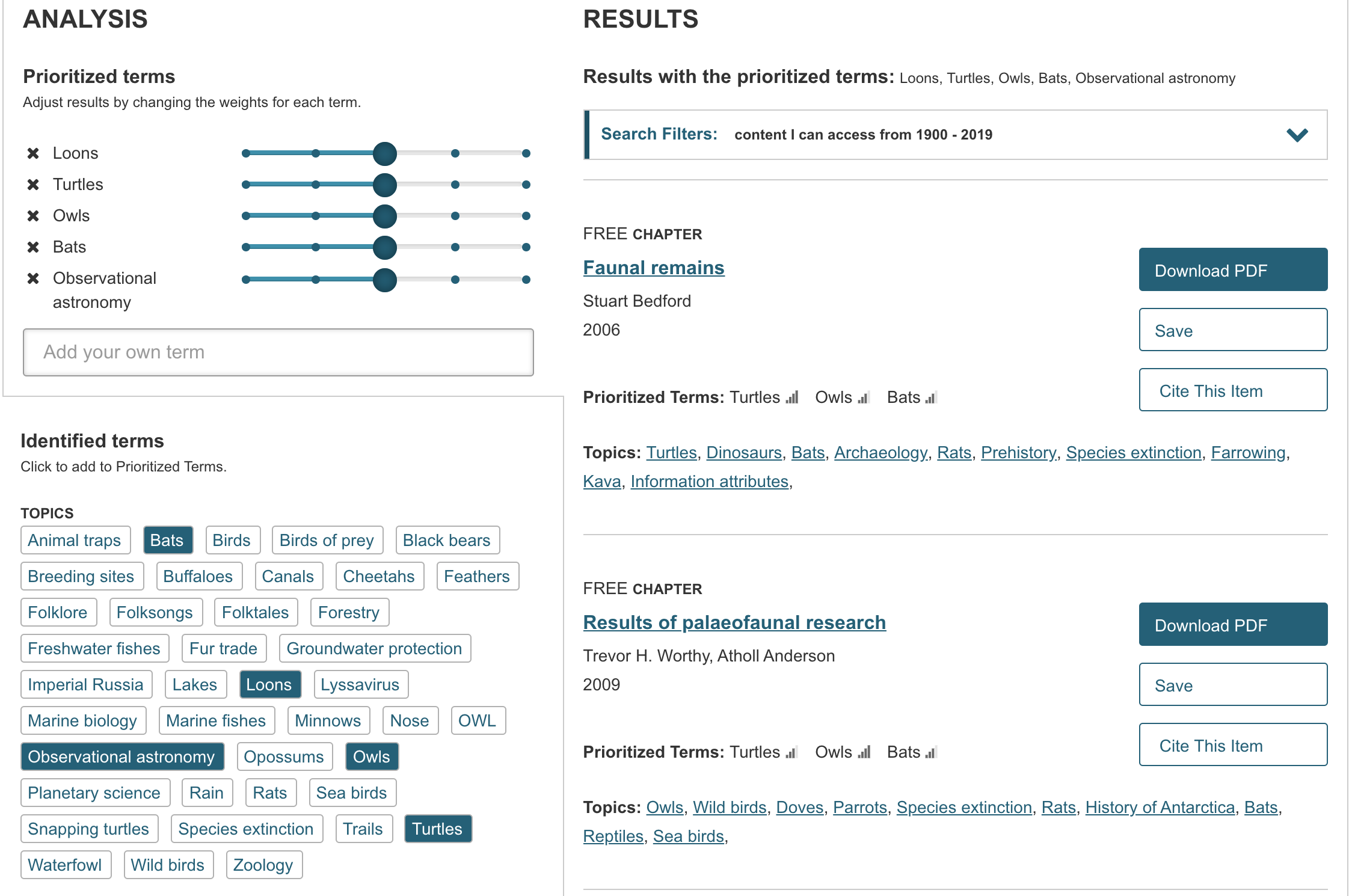
Functional Updates
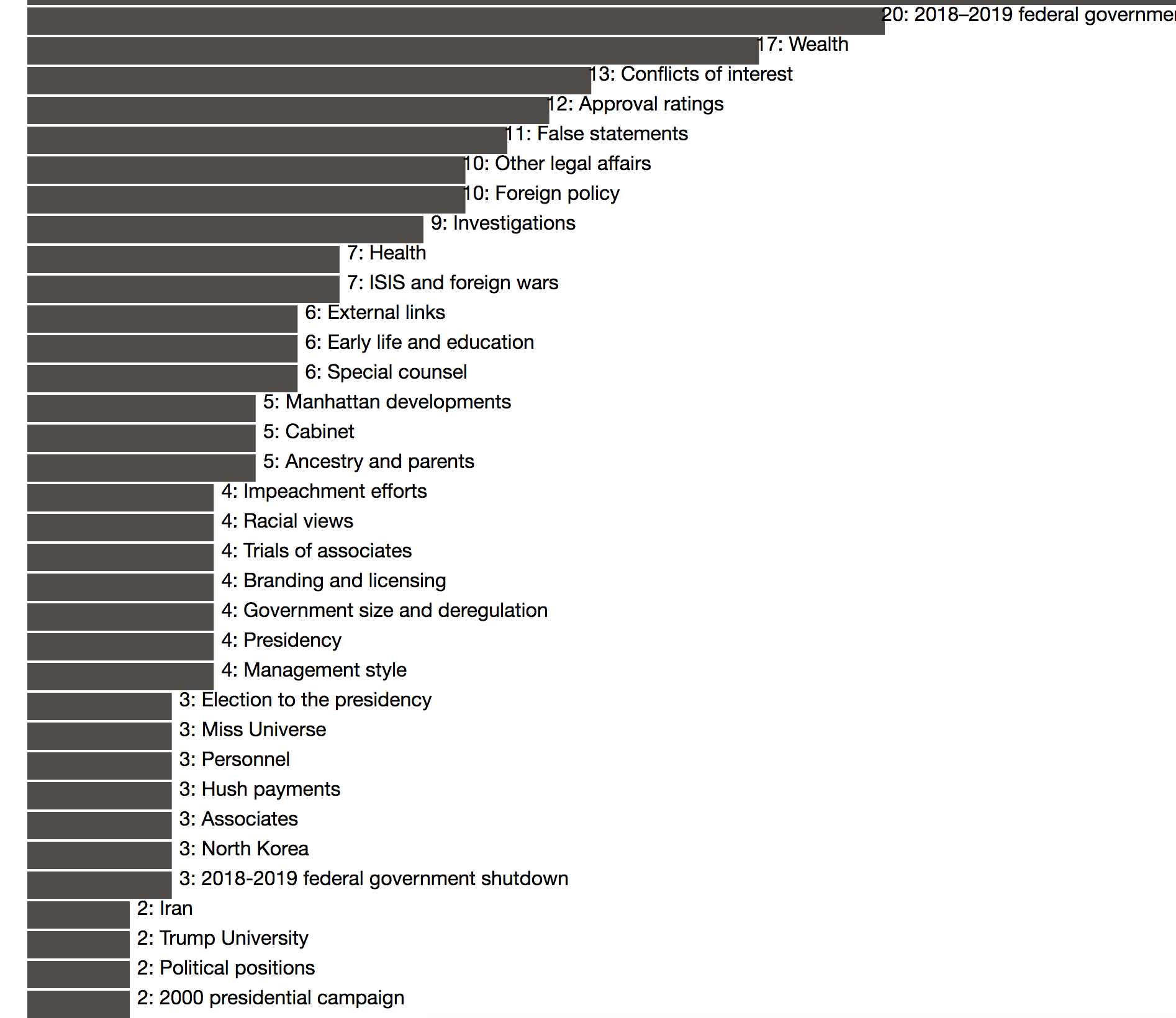
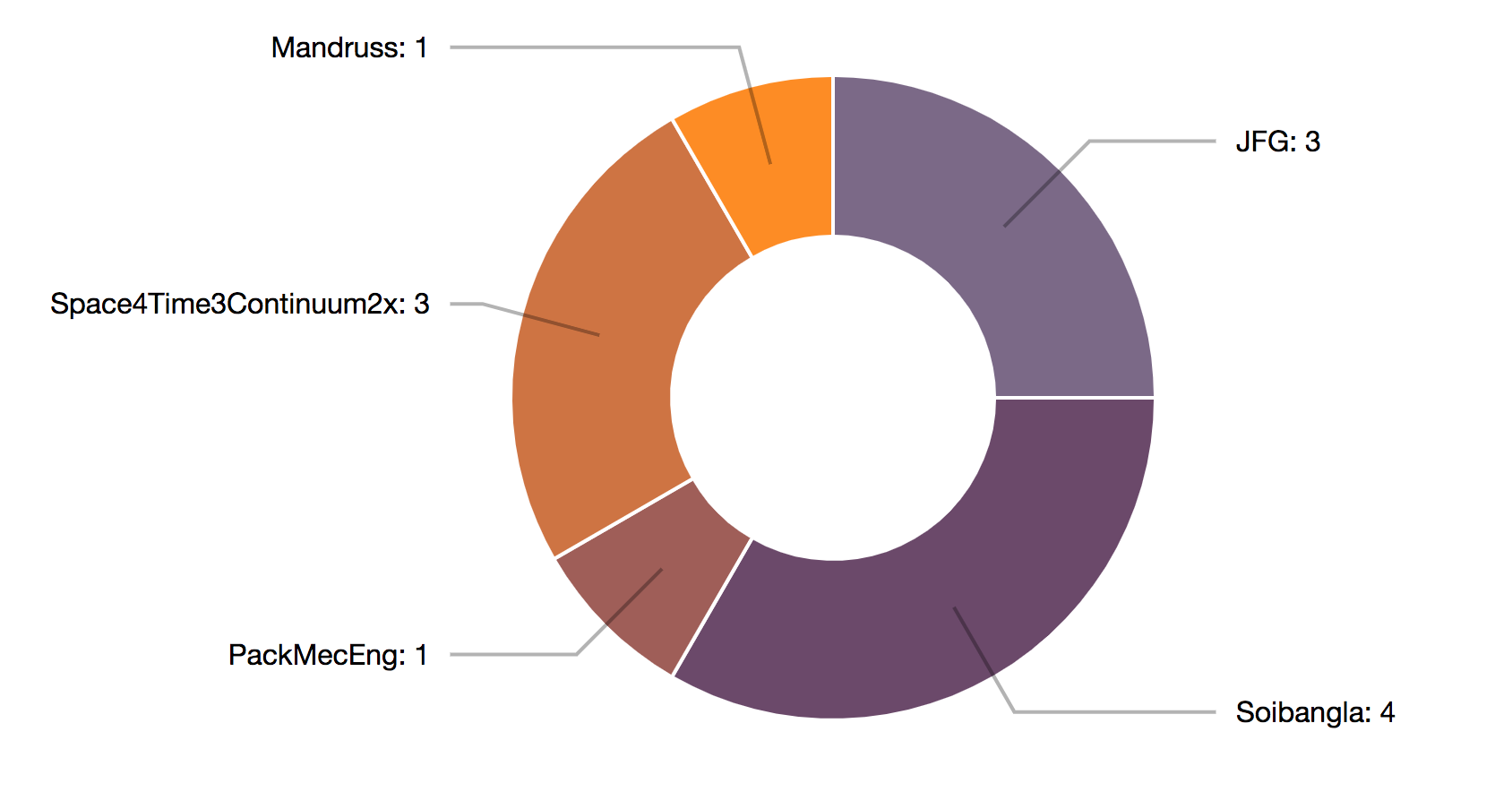
First, we’ve updated the bar chart view to be horizontal to include the titles of each edited section to eliminate the text list that we were previously using. Hovering over a given section links to a pie chart which shows a breakdown of the editors of that section from the given start and end date that the user selected. The chart offers the names of the editors, as well as how many edits that user made. We also have the comments associated with each of those edits, though we have not yet decided on the way to display this information.
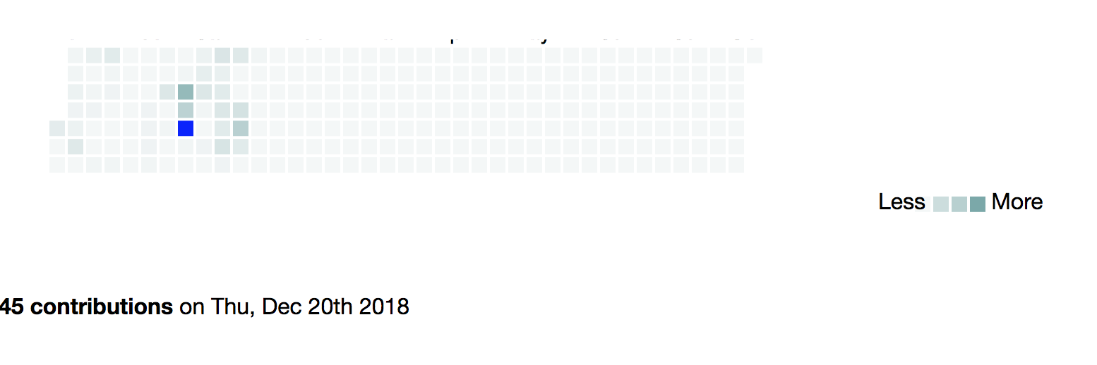
We have added a calendar heat map that shows the number of edits across the whole article between the dates selected. This simple view can allow users to refine their search down to specific dates, or even discover additional stories about why certain dates involved heavy editing. Additionally, if users find dates within a broad range that have been dramatically edited, they can narrow down their search date range and use the bar chart and pie chart to get a closer view on those dates. Though it is not shown, we also have the edit sections and relative section edit frequency available for each specific edit date. We are still deciding on how to best display this information.
We have also significantly updated the search function at the top to be able to easily search articles without needing proper casing or even spelling! It now uses Wikipedia’s internal search function and which draws out the first Wikipedia page result based on what comes up from the user’s search. In addition, we’ve added a language input so that users can quickly switch between different Wikipedia domains, to allow for more comparative research.
Design Questions
Our main challenges and next steps primarily come down to formatting, which neither of us are particularly expert in when it comes to the coding in javascript/html. How do we want to display these results, between the pie chart and the bar chart/calendar. It could work that having over the bar or the calendar makes the pie chart display more detailed information, but different kinds of information for each. Or there could be two pie charts.
We want to decide the best way to do comparative research with the tool. This could include comparing the same search between different dates, or the same search across languages. Do we want to have two searches in parallel that can display information side-by-side? Or should the user be able to keep searching which creates more graphs each time? We have been beginning to sketch out what some of these ideas would look like now that we have the tool mostly working.
We would appreciate feedback on each of these (or other) options for comparing searches, as both offer design challenges and coding challenges that we need to consider.
-
Text analysis excercise
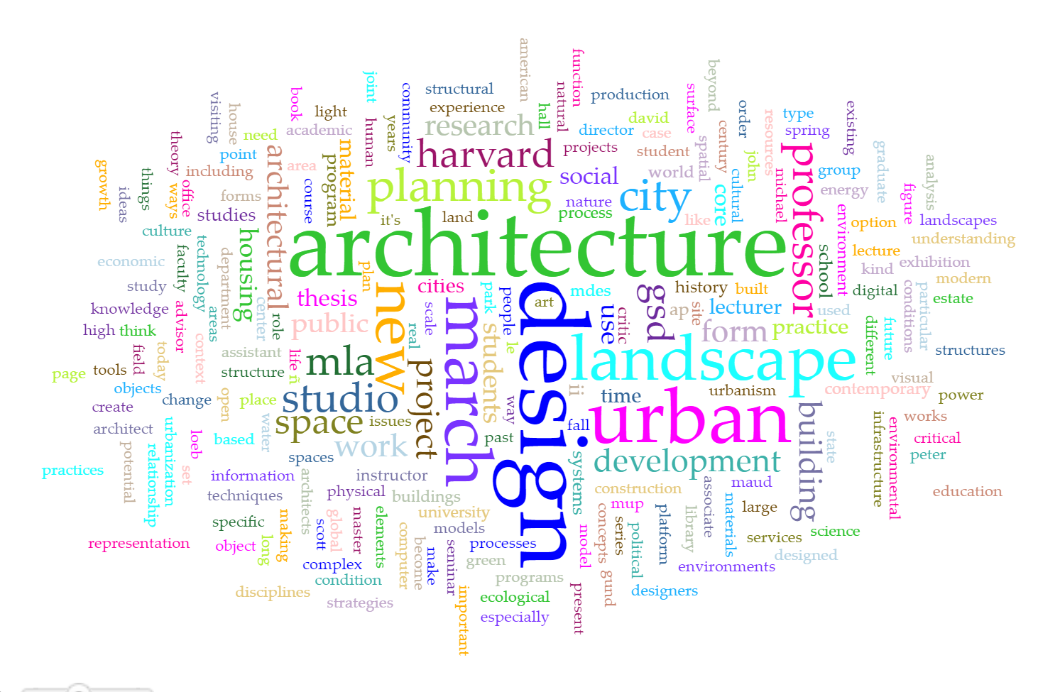
I tried the voyant tools with ten years of scanned Platform magazines from GSD, the statistics is one that you would expect with architecture-related terms.
The jstor text analyzer seems a little more informative than the first one with topics extracted. But it’s hard to verify what the algorithm is behind. It’s not very convincing that airports and border protection are among the most frequent in ten years.

The topicgraph tool makes most sense to me as it defines topic on a group of related terms rather than just one word or phrase. It didn’t work with the uploaded texts so I clicked on one of the examples.
-
MZucker_Assn 8
MZucker_A Text Exploration
I decided to analyze a paper from my undergraduate education where I analyzed how the design intent of park in New York City and the actualization of it were a reflection of one another. This paper was fundamental in my development as an academic and finding my critical voice in the field. Tear Drop Park in NYC, while beautiful and reminiscent of nature, failed to fulfill the design intent for improving child development through nature. The topic at hand is an important one as much research backs the need for children to access nature regularly, particularly when living in congested cities such as NYC. My desire to analyze the text is two fold; 1) to understand the developments in the topic since the paper was written in 2012 and 2) to find similar sources of information or arguments for why children need to live in close proximity to nature to aid in their psychological development. When using the JSTOR Text Tool, at first I was quite confused. While the results were populous, it didn’t appear to have pulled out key topics and concepts from the paper. Upon reading the relatively straightforward instructions, I added key priority topics to further refine the search as seen below.
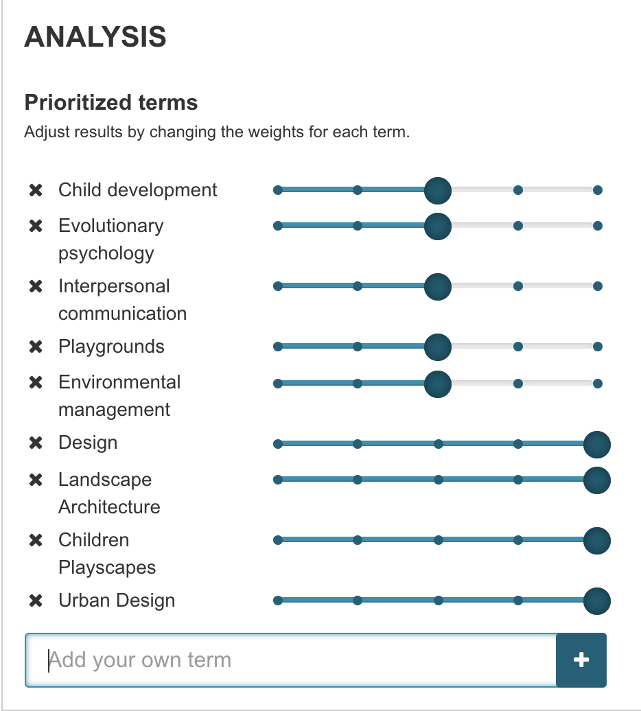
When looking at the relevant results based on the updated priority list, I was struck by the lack of contemporary or recent resources. The top result, while holding an interesting title “Urban Design Workshops: A Planning Tool”, was written in 1997. I browsed through the rest of the top results and noticed a similar trend in that most articles were written well before my paper, the closest being 2010, however the topic being quite different. The results got me thinking and opening up a larger critique of the field of urban design and planning. While we have case study after case study of various projects, especially in regards to children’s playscapes, the field doesn’t tend to look inward as often as it should. The disconnect between design intent and actualization can be felt when looking at the statistics of how children have historically used Teardrop Park. Similar to an observation I’ve made when attending most public spaces. Looking at grassy areas, desire lines or informal paths can often be found carved out of the landscape. This serves as a key indicator that the frequent users of the park may not be using the path system or park features as intended. While this argument is a bit of a digression from the assignment, I think it is important to note that this observation, reflection and analysis are only made possible when applying both text analysis and human interpretation. I believe that text analyzing tools have the ability to cut down on processing and research time but will always need to be consulted with and supplemented by experts in the field.
As noted by JSTOR in the Frequently Asked Questions section,”Text Analyzer is still in beta and is, frankly, a machine. It’s not perfect. When it recommends strange topics, this can be because there wasn’t as much text for it to analyze or because the text contains language (such as an extended metaphor) that “fools” Text Analyzer into thinking it’s about something it’s not.”
-
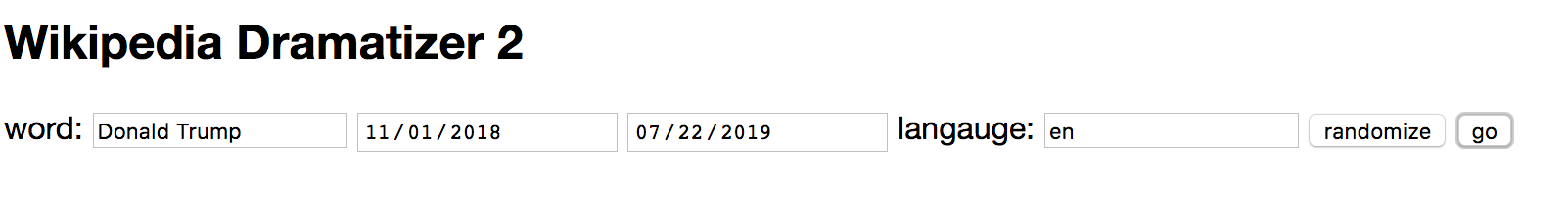
Wikipedia Dramatizer 11-12 Update
New updates to the Wikipedia Dramatizer include much of the details mentioned as the next steps in class last week. The main updates that are visible are that the user can choose start and end dates for the range of edits that will be pulled from wikipedia, rather than automatically pulling the most recent ones.
Entering a new search will automatically clear the previous search details and build a new list, while keeping the previous graph on screen. Once the graph is slightly more legible with the titles this will be much more useful for doing quick comparisons. I was already able to do some interesting edit comparisons already, even looking at the same page but in different time ranges– just looking at the Global warming page at different years shows a spread of different areas that people were working.
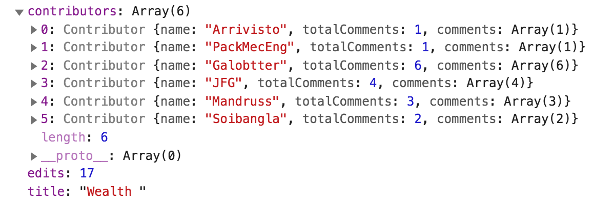
I also added much more detail to the section class, such that each section contains a list of the number of editors, and each editor contains both a number value for the number of edits they made to that section, as well as a list of what their comments were along with each edit. This isn’t implemented visually in the code yet, but the design is there, which you can see in the console. Our main next step is displaying this more granular information graphically when someone clicks on one of the bars on the bar chart. Here is an example of the output of the six people who edited Donald Trump’s section on wealth in the past year, which includes the number of edits that each person worked on and the content of each edit.
One challenge that I’m not totally sure how to deal with is the case sensitivity with Wikipedia. The casing is not universal, where for proper nouns like names they expect all of the words to start with a capital letter (ie Donald Trump) but for other words generally, the first word should be capitalized, but the rest remain in lower case (ie Global warming). I don’t see any way of automatically detecting how to fix casing issues when someone is entering their information, given that I won’t be able to tell what kind of thing it is they’re searching for. But perhaps there is some lookup I can do using the Wikipedia search with their terms, and pull from the resulting URL. Will need to do some more research here.
-
Text Mining Exercise
For this exercise, I picked Wild Kindred by Jean M. Thompson at random to process - I wanted to see what I can gather about the text solely from the output of the text mining tool.
Text Analyzer
From Text Analyzer, I was given key words that are used in the text, which all seemed to do with animals and nature. I gathered from this, and inferred from the title, that the text was most likely a narrative about nature. I thought it was interesting that Text Analyzer recommends other texts based on the results of the processed text. It seemed to find connections with more informational, rather than narrative, texts about species of animals due to the key words. This seems to show the limitation of text mining using bodies of text as “bags of words” since deeper analysis is needed to uncover the genre of the text and make more relevant recommendations.
Voyant Tools
I also tried using Voyant Tools, which has a very different output than Text Analyzer. It seems like Text Analyzer has a more sophisticated word filtering algorithm that focuses on nouns, while Voyant Tools appears to have less filtering and thus considers adjectives, adverbs, and articles as well. However, Voyant Tools does a deeper investigation into factors such as where along the text words are used. It seems like Text Analyzer is better at finding the topic of the text, but combined with the results of Voyant Tools perhaps a deeper understanding of the text can be uncovered, such as sentiment or genre.
-
Text Mining Exercise - Will
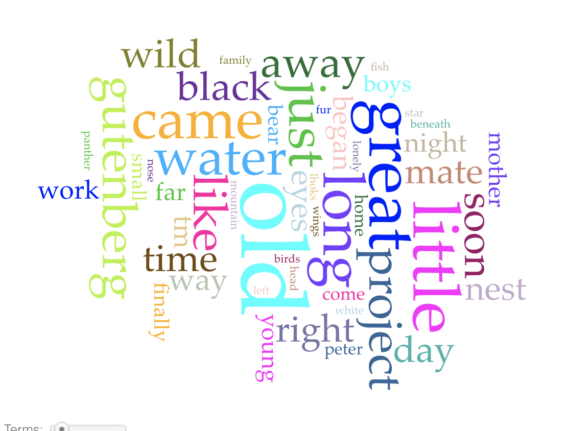
I experimented with looking at my personal canon for the text mining exercise, as I was curious if I would be able to note any common overlap between the common phrases that I use I use in my writing across a number of years. To begin, I compiled all of the essays and response papers from my Junior year of high school, and pasted all of them into a single text file, which I then entered into Voyant.
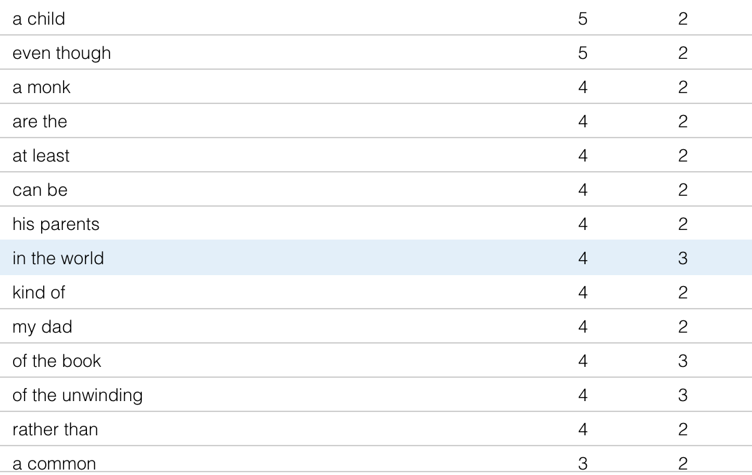
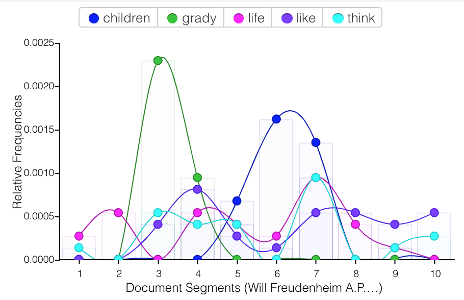
The results looked like this. There are clearly some words that I use in specific response papers that end up popping up enough to overtake the common phrases throughout my writing. With more texts these results would be smoothed out. I do say a horrifying amount of “even though” and “kind of” at this point, which I would have hoped might have been ironed out of my writing by that point! You can see in the chart how certain words like “children” and “grady” have quite high peaks, because they are the related to an essay topic from that area of the total corpus from this era.
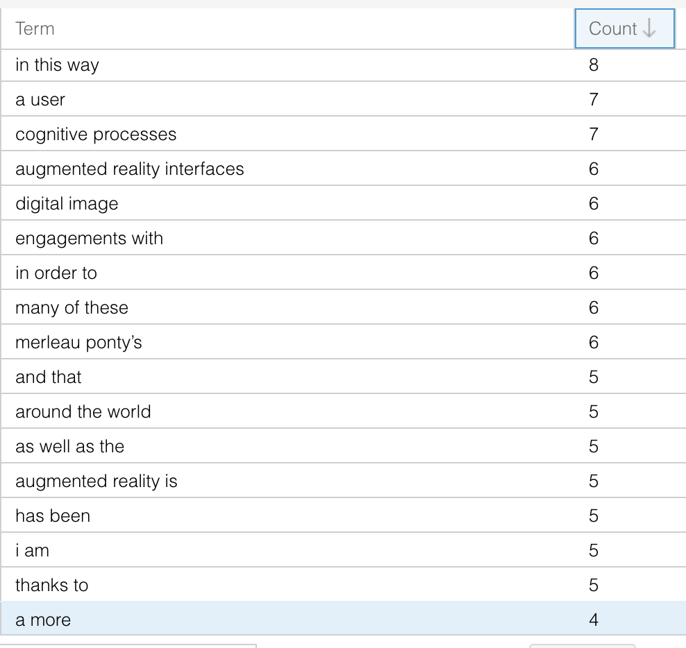
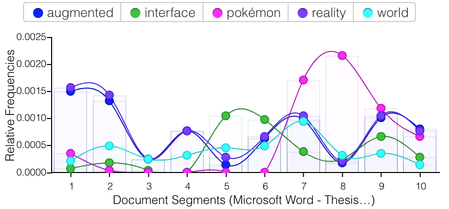
I compared these writings to my college thesis, which was a much longer single file that I could drop right into Voyant. Similarly, the specificity of the subject led to certain unique phrases appearing at a far higher rate than they would across my imagined full corpus of this time. However, there were more general phrases that I use repeatedly that do not appear in my older writings, the main ones being “in this way,” “engagements with,” and “in order to”. Given the examples of my top five words (augmented, interface, pokémon, reality, and world) this sample does not feel representative of my general writing style of this moment, even though it is the majority of writing that I have from the time.
For future projects of this kind it would be quite interesting to do this style of text mining on the entirety of someone’s text messages, or to split a person’s messages into time periods of their life or by who they are speaking to. I often wonder how the way that I communicate over text has changed over time, and how much that is a circumstance of my own language changing, or where I am living and who I am surrounded by. Relatedly, I wonder how much these changes in place and time affect my language over-all or if I still have very specific patterns of communicating with certain people, like the friends that I’ve been texting with since I first had a phone. I think tools like Voyant are useful in answering these preliminary questions, though I think they would be far more valuable if you could more clearly specify examining changes over time. The graph area attempts this by looking at word usage through “document segments,” (I am not completely sure what this means) but it would be useful to be able to more granularly study these changes over time via groups of texts.
-
diMAPspora Update #3
Over the long weekend, we examined the material we found on the Philippine diaspora to include as a deep dive into Tagalog. A screenshot of bullet notes on relevant information we found and may want to include is included below. This information includes statistics about the Filipino community in the US which would help set the context for examining any trends, as well as interesting facts regarding the diaspora specifically, such as the level of effort that the Philippines has committed to supporting the diaspora to the US.
We are also in the process of exploring QGIS more to see what kind of trends can be found using the tool.
-
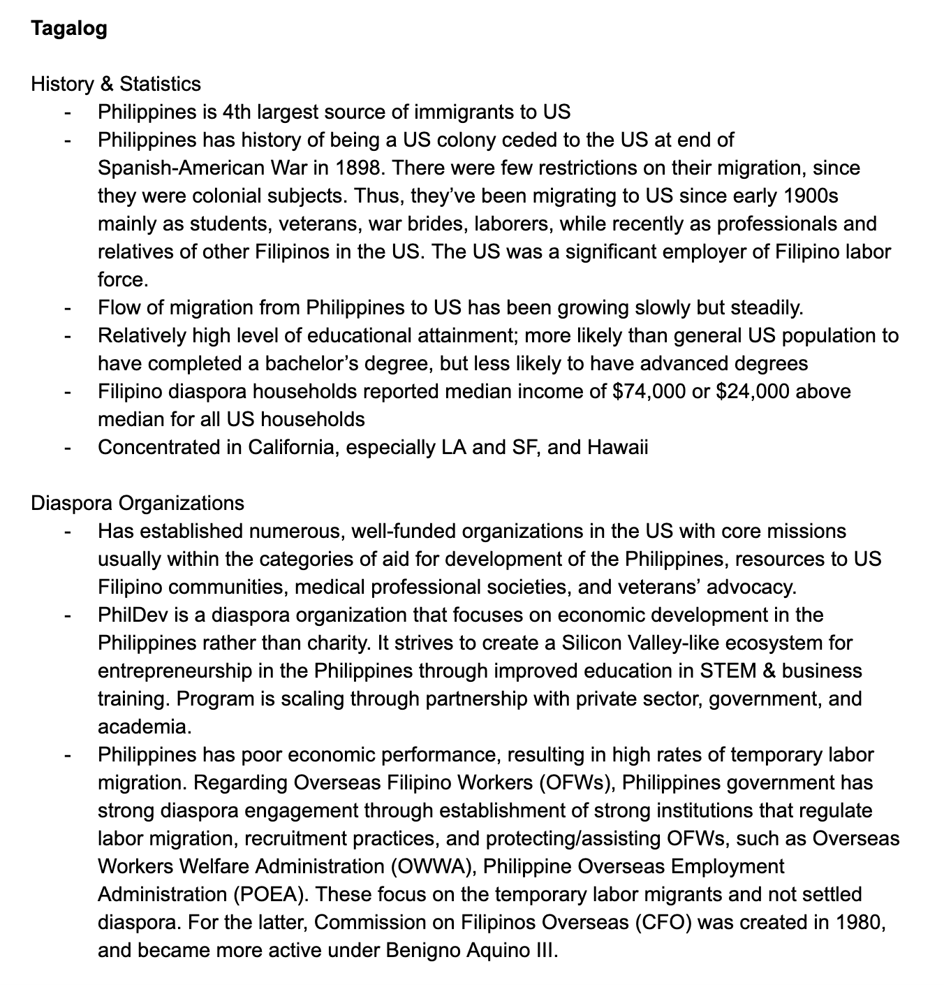
Text Mining- Anna
For the text mining exercise, I spent some time looking at the canon of my favorite Russian poet, Anna Akhmatova, as well as that of Russia’s most favorite poet, Pushkin. I added Pushkin mostly due to the fact that we have a more concrete idea of what his canon entails, and with the Voyant tools, I was really interested in development of lexicon over time. It was clear for both poets how topics changed over time- for example, their use of “love” and “heart”:
Pushkin

Akhmatova
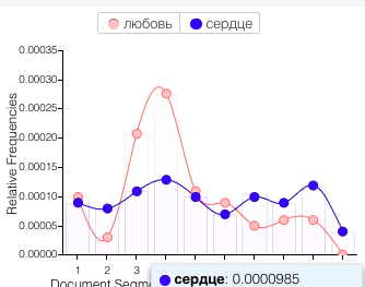
Although I was using these tools in a simple, exploratory way, I think they could still serve argumentative purposes. For example, scholarship on Akhmatova often (and in my opinion, incorrectly) posits that she was a “love poet” in her early writing and a “serious” poet in her later work. Using terms over time, such as the ones above, larger patterns are clear. Or, for example, illustrating her use of the word “muse” or “people” (as in ‘my people, the Russian people’) shows that she considered “serious” topics throughout her career:

Something I did not fully consider was the point raised (by way of Lisa Marie Rhody) in Binder’s piece, that “topic models of poetry must be read in a different way from those based on scientific journals.” This makes sense to me, and I think I’ve been doing that previously, but it was important for me to stop and think about it. For example, with Akhmatova, I never thought that all the instances of words like “water” and “wind” were from poems ‘only’ about nature; I assumed they were part of reoccurring metaphors. That said, to truly represent Akhmatova’s work, or at least her usage of these words, I think you’d have to separate the ‘figurative’ uses of “water” and “wind” (or any other words) from the more ‘literal’ ones, which is essentially impossible. This definitely became clear as I tried the other tools.
The Topicgraph didn’t work for me- on English or Russian texts. The JSTOR text analyzer was surprisingly accurate at suggesting topics for English-language pieces, although the suggested articles were surprisingly inaccurate! It also worked okay for Russian texts. The topics for poetry were pretty funny and reminded me of Rhody’s point about figurative language. For example, for Pushkin, the top 5 suggested topics were coniferous forests, blood, heart, psalmody, and sleep patterns. At least for the forests, blood, heart, and sleep, I’m certain that most of the time, Pushkin used these topics figuratively! For Akhmatova, JSTOR gave mercy, muses, graves, blood composition, and solar atmosphere, with the following full set of topics:
This seemed pretty accurate in terms of her symbolic usage, with some notable (and funny) exceptions; for example, AA lava was suggested because she often signed poems with the initials of her first name and patronymic- A.A. Obviously the scholarship recommended based on both of these was completely unrelated, so I tried a few papers I’d written in English and the recommendations seemed okay.
-
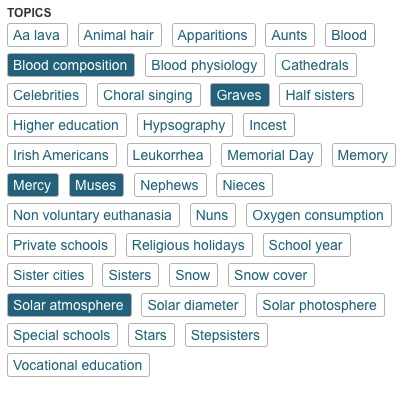
Speculative Timeline: Learning Languages
My speculative timeline depicts my level of comfort speaking the languages I have learned so far.
A traditional timeline lacks in illustrating this because of various reasons, including that it is biased towards homogenous information (about one language rather than for multiple languages, in this case), information that is structured into specific points or nodes in time (rather than a spectrum throughout the full timeline), and concrete precise information (rather than relative and subjective).
The information I want to represent accounts for multiple “tracks”, is a spectrum throughout the full length of time I am considering, and is subjective to my perspective. Therefore, I created a sort of hybrid density + bar graph to show how my comfort level for each language has changed over time, with relevant points in time marked.
-
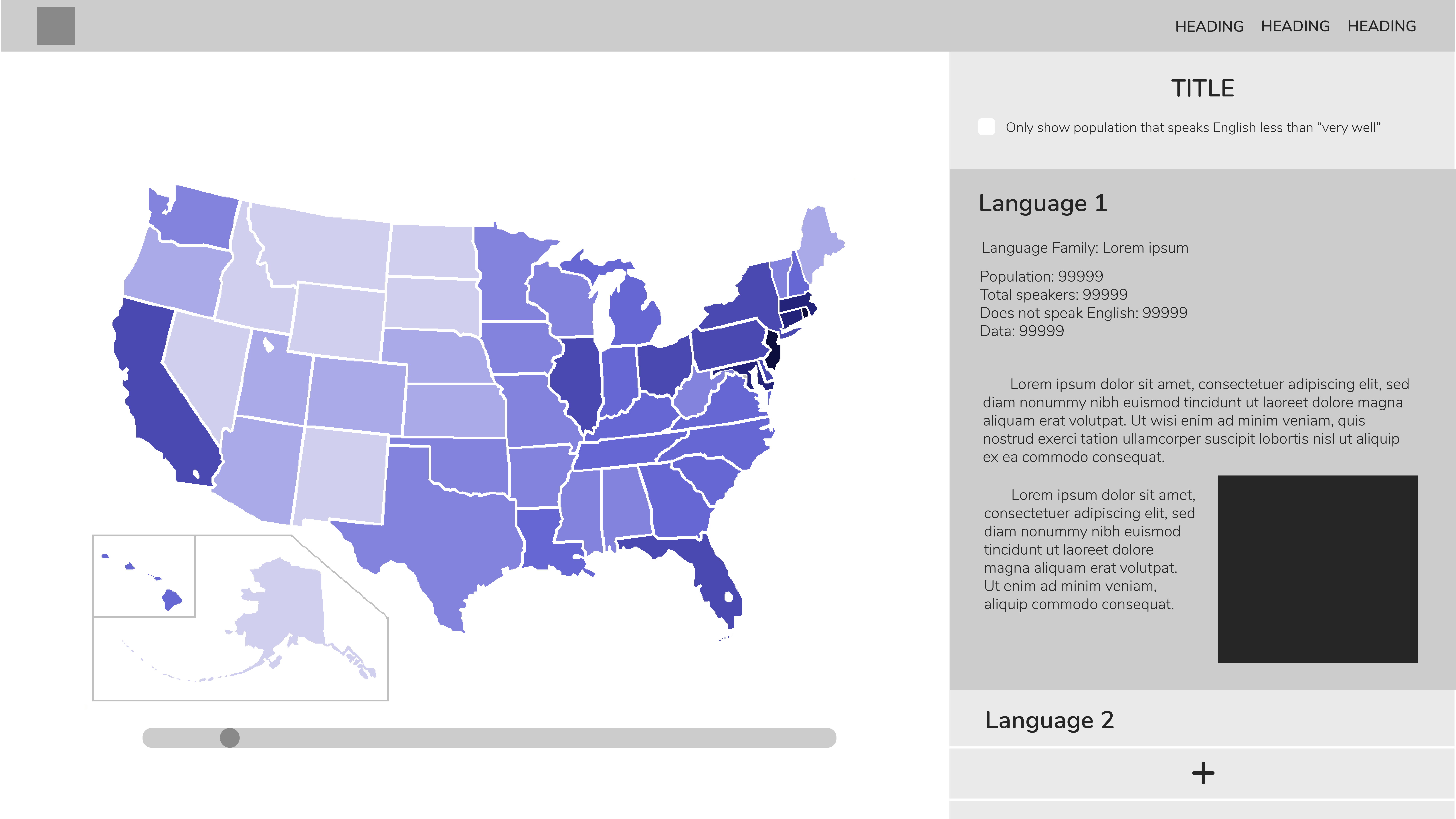
diMAPspora Update #2
Since last week, we spent time creating a prototype of the visualizations we would like out tool to display with the tool QGIS. Using state boundary files provided by the US Census Bureau, as well as information about languages spoken in each household from the 2000 Census, we created the following visulization. This map should the concentration of Spanish speaking households by state in the US, where darker colors states are those with a high concentration.

The above image shows the concentration of households that speak a given language, but in our final tool, we plan to use density which we can calculate using the state populations again provided by the US Census bureau for an appropriate year. Currently, we are able to manually change the language displayed by using QGIS, but through the us of the web plugin, qgis2web, this is something a user would be able to change with ease to update the map with the time and language of interest.

Here is a rough design of the format of our tool.
-
Updates on Wikipedia Dramatizer
**Some updates after exploring the functions provided by Wikipedia API
How to get content by revision:
-> Get data with content for the last revision of titles API and Main Page. action=query, prop=revisions https://i.imgur.com/3kUD5AM.png
results: https://i.imgur.com/3zcD1Cr.png
other examples: https://www.mediawiki.org/w/api.php?action=help&modules=query%2Brevisions
-> Compare two revisions from the same page action=compare, prop=diff,diffsize https://www.mediawiki.org/wiki/API:Compare
results: https://i.imgur.com/nS7XhwY.png
-
diMAPspora Update
Since last week, we have made significant progress in identifying sources for data about how many residents speak various languages at home, distinguished by state. This data is available for 1990, 2000, and 2009-2013, which we believe is enough variation in time that interesting patterns can be observed.
For select languages, we plan on providing detailed information about the diaspora of the community that uses the languages in order to give context to the patterns found using our tool and illustrate a way that researchers can use our tool to deepen their research into diasporas. Currently, we identified Tagalog as one of the promising languages for this deeper dive, because there appears to be enough research about Filipino immigrants in the United States that we can incorporate.
.jpg)
.jpg)
.jpg)
.jpg)
.jpg)
-
Updates to Wikipedia Dramatizer
Slightly new format using the Wikipedia API
- Type in a Wikipedia page name
- Set in two dates, it’ll generate a JSON that includes comments, timestamps, and users, amount of data that was deleted or added per edit 3.Processing script builds a query to Wikipedia API from this info.
- Script parses this JSON for /* Section */ - will tell you when someone is editing a distinct section of an article and add those items to a new list.
From this new list we can build a dashboard that gives different metrics of “controversy” that describe each section of a wikipedia page.
- look at distinct sections and which areas had the most individual edits
- look at which sections were edited by the most people
- look at sections based on how much actual content was added or erased in this time: which could be a valuable measure of controversy. Sections that have nearly a 1:1 ratio of adds:erases while also having the most total number of characters added or erased means that they were more rapidly edited
This will involve some simple data manipulation based on the lists generated to find these values. Using MediaWiki’s API Sandbox tool has been incredibly useful in figuring out what’s possible with their API and easily experimenting with parameters.
Here’s a sample of a single element from the JSON.

Additionally, this could allow for comparing multiple pages! We could compile the metrics for each section to have an aggregate metric for each page, and use this to compare multiple pages with the same three main metrics for controversy.
-
Monuments Project Update 10/22
https://docs.google.com/presentation/d/1Zhxl12CVlPzAjmPxw0D8birZWtdKY5VHiSnjywLJH5o/edit#slide=id.p
-
Homework assignment
https://docs.google.com/presentation/d/1dRPMs7NT33wjpEYFVJ17HRDHDbyOQQF1TQ4Zj1PwINs/edit#slide=id.g6412ca3f16_0_55
.jpg)
.jpg)
.jpg)
-
Project update- 2 potential ideas
I have two ideas to pitch. Both these potential project ideas sprung out of the speed-dating and so I need to put forth the disclaimer that neither are wholly my own.
-
Anna had talked about her interest in artifacts and memory, which brought us both to think about monuments. Whether it is contemplating the removal the Robert E Lee Statue that sparked a deadly white nationalist rally in Charlottesville in 2017, or the removal of the statue of Halifax founder Edward Cornwallis who was otherwise known for attempting genocide on the Mi’kmaq people of Nova Scotia, the understanding of these monuments, the addition of news ones, removal of others, are changing the physical representation of memory and history. The idea would be to create a virtual map (probably concentrated on a smaller geographic area) that tracks the changing views on existing monuments, where applicable their removal, or if they have been updated to better reflect our modern interpretation of the past. The map would include an image, a general decription, a time line of chnages where applicatble, and may even link to video, news items or other images relevant to protests or changes. Google maps, Ingress and (subsequently, because it’s the same map) Pokemon Go already players collected data about the whereabouts of monuments and historic sites to work from. This project would likely be of interest to social activists, historians, those in a field where human rights are studied, and perhaps artists.
-
A second idea comes from the memory box project. There have been a number of clashes between Indigenous protestors and the crown, where police and the army are called in. In the past documentation including notes on what is occurring, video and images were limited and shot by the press, and held in archives. Media reporters’ video and pictures are to a large extent shared online. As well, with cell phones people involved in the protest add to the public record primarily on Youtube and Twitter but also on Facebook. The media for these events however is not in any order. The idea would be to take an event like the fracking protest at Elsipogtog which began as a peaceful protest in the summer of 2013, growing into a blockade, and ending with a face-off with the Royal Canadian Mounted Police in October 17, 2013. The idea is to scrape images video and text from social media and put it into a chronological order. This would be of interest to those in the field of history, Indigenous studies, film, and other fields related to the environment or human rights studies.
-
-
Project Idea
Project Idea
My main idea is to create a platform for spatializing histories of marginalized identity groups/communities around Boston. First and foremost, the platform would be an interactive map where various historic events, people, places, etc. would be on display. Users can toggle the map via a timeline function to see how things have changed over time. It would also allow users to filter categories of histories by topic. Secondly, the platform would serve as a means to connect community activists to local resources and share ideas. Lastly, the platform would allow individuals to archive their histories via an input field, with geolocation and option to add attachments.
Secondary idea would be to create an online, mobile archiving machine that again would spatialize histories but would be less complex than the idea suggested above.
-
Project Idea: Removed Monuments Garden
Based on the idea of Muzeon’s Fallen Monuments Park in Moscow, I’d like to create a virtual statue garden of Boston. In this garden would be statues that people have wanted to take down, such as statues of Columbus. They’d be somehow accompanied by information- who is portrayed, why people want to remove it, and where it currently is located, for example. I think having all them together would demonstrate a lot about Boston’s history, while also showing that it is possible to acknowledge history without celebrating figures with monuments in prominent locations. In this way, it would be of interest to people with differing opinions on whether monuments should be removed in the first place. I also talked to people in class some about what it would like to then reimagine the original spaces without the monuments there. Obviously, this is an idea in progress, and I’m happy to do other things as well, but this one is something I’ve been thinking about!
-
Wikipedia Dramatizer
Wikipedia reads as a neutral territory. As readers we know that humans are continually editing Wikipedia, that facts change, that it’s a so-called “living” encyclopedia. Yet when we look at Wikipedia, we only see a static moment, frozen in time. What happens to these edits? Despite the static quality of its appearance, having multiple contributors to documents which report the truth naturally implies that people will disagree on truths!
Indeed, Wikipedia articles are secretly the battlegrounds for ideological debates in all fields, from details about pop stars to contested facts the natural sciences. One professor recently told me a strategy that I thought was brilliant; by logging into Wikipedia and viewing the edit history of a page, you can see where the contested debates in a field are happening. However, this “edit history” view is distinct from the article itself and laden with detailed information.
What if we could see qualities of these debates overlaid on the article itself? What could this tell us about all kinds of fields and objects of study, as well as the community that works on wikipedia?
I would like to develop a simple tool that looks like a heat map overlay on top of a wikipedia article that can show the frequency of edits on the article. In a full version of this tool, a user could click on the heat map to look at the specific information that was changed. Users could set the timeline range (i.e. look at the edit heat map of the article over the past week, over the past five years, etc.) to build understandings of these changing debates.
-
Rachel: Project Update #1
Project Idea 1: History of Alphabets
One project idea is to develop an interface that allows people to learn about the history and information behind different alphabets. This project would require an API that returns information about specified alphabets (such as this one), which can also be combined with other kinds of data such as images that can add more enriching information. The intended audience is academics interested in linguistics, and the main purpose of the project would be to support research and/or study in written language. The core question being addressed is: what can we learn about the history of written languages?
Miscellaneous Ideas
Another concept I am interested in is how languages intertwine with one another. For example, a project idea is to map how different languages have influenced one another and thus create a web of languages. However, I’m not sure how this can be technically implemented…
There are many other general themes such as music, dance, fashion, and art that I would like to brainstorm about more in order to develop viable project ideas.
-
Project Idea
Project Idea
My main idea is to create a platform for spatializing histories of marginalized identity groups/communities around Boston. First and foremost, the platform would be an interactive map where various historic events, people, places, etc. would be on display. Users can toggle the map via a timeline function to see how things have changed over time. It would also allow users to filter categories of histories by topic. Secondly, the platform would serve as a means to connect community activists to local resources and share ideas. Lastly, the platform would allow individuals to archive their histories via an input field, with geolocation and option to add attachments.
Secondary idea would be to create an online, mobile archiving machine that again would spatialize histories but would be less complex than the idea suggested above.
-
Project Interest Paragraph: Anna
Week of 9/23 I’m honestly less sure now than I was before last week, as what everyone said in class was really intriguing. I’m definitely interested in the ideas of place-based or object-oriented memory that people discussed, which I think would both be useful for my own work but also totally new to me! I think it would be really fascinating to develop those ideas with a team. I also used to study Linguistics, so all of the ideas involving language caught my eye. In terms of my own work, I think both veins would be useful, so it’s hard to narrow it down in that sense. I’d be happy to think more about either as we narrow down further, but for now those are the two threads that appealed!
-
Project ideas
I am interested in a number of the projects that were proposed. I am not sure I have my own. Overall my year at Harvard is its own project. I am asking what the role of journalism should be in post-conflict societies and reconciliation. In this respect I am interested in how ideas spread, how empathy is built from images, and artifacts and if virtual experiences can be a useful tool. Briefly when I attended an intro to MIT by Ethan Zuckerman he had been tracing the spread of ideas regarding the last US election on twitter, (and singled out journalists.) The idea that you can trace and evolution of thought and visualize them (at least for a segment of an online population) was intriguing. As well when we visited the HR lab the way some people have used virtual reality to create empathy was interesting. So I don’t have a project in mind yet. But I am interested in learning skills that (hopefully) will inspire an answer down the road.
-
Thematic Tarot
Motivation
The MIT Libraries/Archives is gathering a collection of Tarots, specifically those being purposefully designed to make a statement artistically, or social commentary. The question that must be addressed is how to best organize the collection to make it available to an audience who will access it online.
The Idea
The Thematic Tarot allows answers this question by categorizing tarot cards by the themes they represent. This allows for users to explore reinterpretations of the tarot based on thematic elements.
Cards are scanned, put into a searchable database, along with the text that represents the artists expression and interpretation of the cards when available. The cards can be displayed to both view the entire deck as a collection or to make individual cards viewable and comparable across collections.
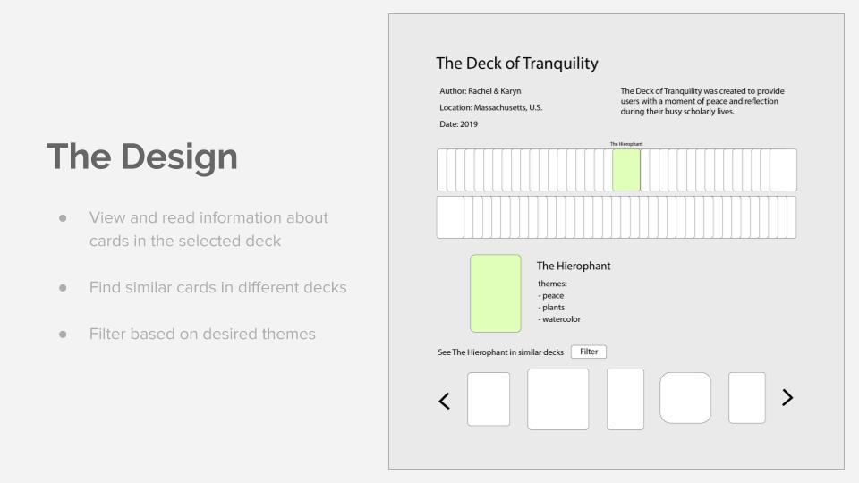
Prototype Design
The front pages allows the researcher to search tarot card themes by keyword. And advanced search is possible to allow more specific searches using deck name, artist, date or geographical location.
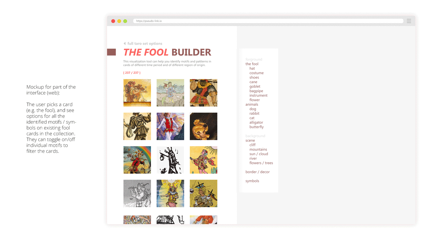
By default, the user is displayed the full deck. Information such as the year of creation, artist, name of deck, country, and the artist’s interpretation of the deck is shown with the deck. A second view allows the user to pull up an individual card from the deck. Information such as the name, how that card should be interpreted, and themes it encompasses are displayed. Below in the scrolling window are similar cards, which are cards of the same name (2 of cups, the Hermit) from other decks. They are ordered based on level of similarity based on shared themes, which includes artistic aspects (eg. black and white, animal motifs), similarities in the intended themes of the artist (eg. gender exploration, spirituality).
Tools
In order to categorize the cards by theme, a tool must be used to reliably extract the themes from the information available in the database about the cards. A key component of the Thematic Tarot is the ability to suggest similar cards, which means a sorting algorithm must also be used that takes the themes present in each card as parameters.
Primary Audience
This tarot library is intended for scholars interested in exploring modern artists who are purposefully reinterpreting the tarot. However, the intuitive design of the library would allow anyone interested in browsing the cards to use it.
Questions Addressed
- How are people re-interpreting the same card?
- What are common themes in tarot?
- What patterns can be found across various decks?
-
Tarot Card Prototype
Overview:
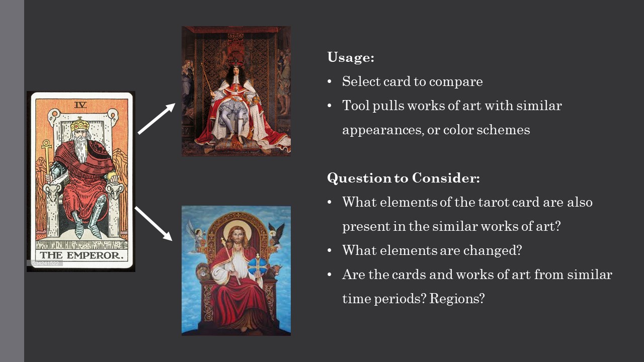
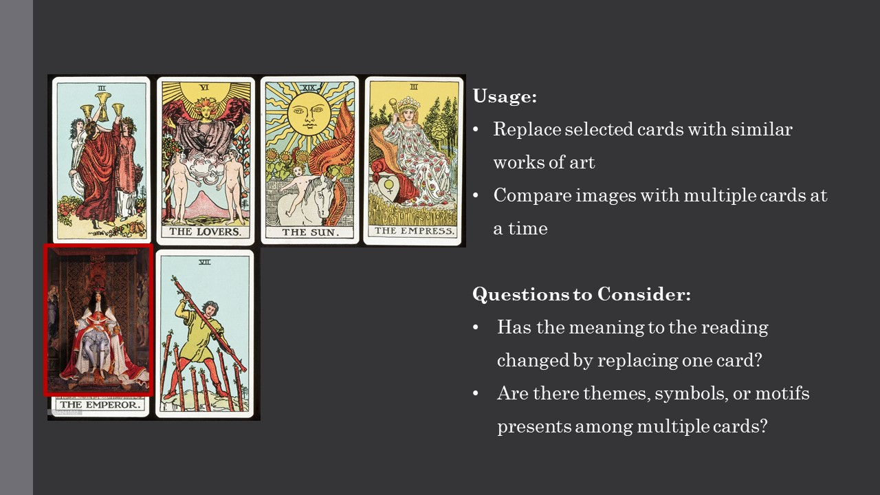
The goal of my prototype is to create a tool that provides an opportunity to develop a deeper understanding of the themes and motifs present in a tarot deck through comparison with other works of art. After selecting a card from a chosen tarot deck, the user would be presented with several works of art that appear related because they have similar, or color schemes. Since one’s understanding of a tarot card is also altered in relation to other cards which are draw with it in a reading, it is important this tool would also allow the user the opportunity to replace a give card in the deck with a similar work of art, and view that art work in conjunction with several other cards. In doing so, the user would be able to analyze if there are similarities about color usage, poses, or symbols across multiple cards that would give insight into the cards’ meanings. Additionally, by incorporating an images which is also in some ones be different from the rest of the deck, some of the features which remain the same across multiple cards might be further highlighted.
Approach:
To begin, all the decks of tarot cards that would be available in this tool, would need to be scanned into a database. Additional works of art would need also need to be added to this data base so that comparisons can be drawn between this artwork and the tarot cards. Meta data about the cards and works of art may be used to link cards and works of art which are quite similar.
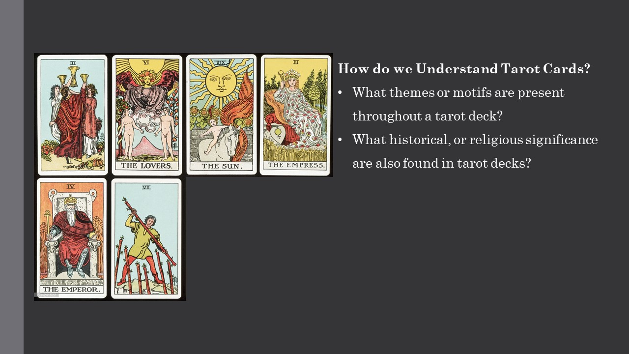
Research Questions:
As mentioned above, this tool would be important when trying to understand the symbols and themes present in a tarot card deck. However, this is something that could be use to analyze how certain themes or usage of certain symbols have shifted, or stayed the same though different time periods. Looking at a card like the emperor, for example, one may insert a work of art from a very different time periods. Though the image at the foreground, and king sitting on a throne, may seem very similar in a lot of works of art, there may be some value in analyzing how the background and color schemes may have changed in different artistic periods. Were there certain symbols that at one point were always present, but became less common?
Audience:
• Art historians
• Tarot users
-
Digital Tarot: Deconstruct + Reconstruct
.jpg)
.jpg)
.jpg)
-
Tear-ot
Background
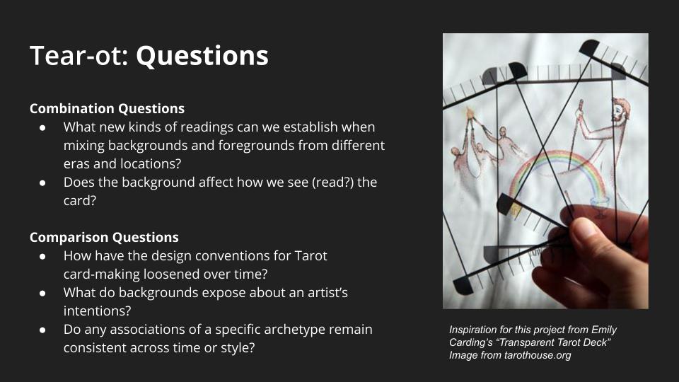
Our goal is to isolate the subject of each tarot card from the corresponding background, which was inspired by Emily Carding’s Transparent Tarot set, allowing users to layer cards in order to create different types of narratives and see the cards in a new light. By enacting this separation, we will be able to create two versions of each card: one displaying only the subject and one consisting of its surroundings. These foregrounds and backgrounds could be later combined in new ways, creating new cards from across the collection. Isolating these aspects of the cards will illustrate the various associations that tarot artists have associated with each of the archetypes, as well as the way those associations have changed over time and across the collection. For each card, a user would be able to examine all the existing associations with a specific archetype, allowing for a better understanding of those specific cards and the collection more generally.
Combination Questions
- What new kinds of readings can we establish when mixing backgrounds and foregrounds from different eras and locations?
- Does the background affect how we see (read?) the card
Comparison Questions
- How have the design conventions for Tarot card-making loosened over time?
- What do backgrounds expose about an artist’s intentions?
- Do any associations of a specific archetype remain consistent across time or style? Do any cards have especially consistent or inconsistent associations?
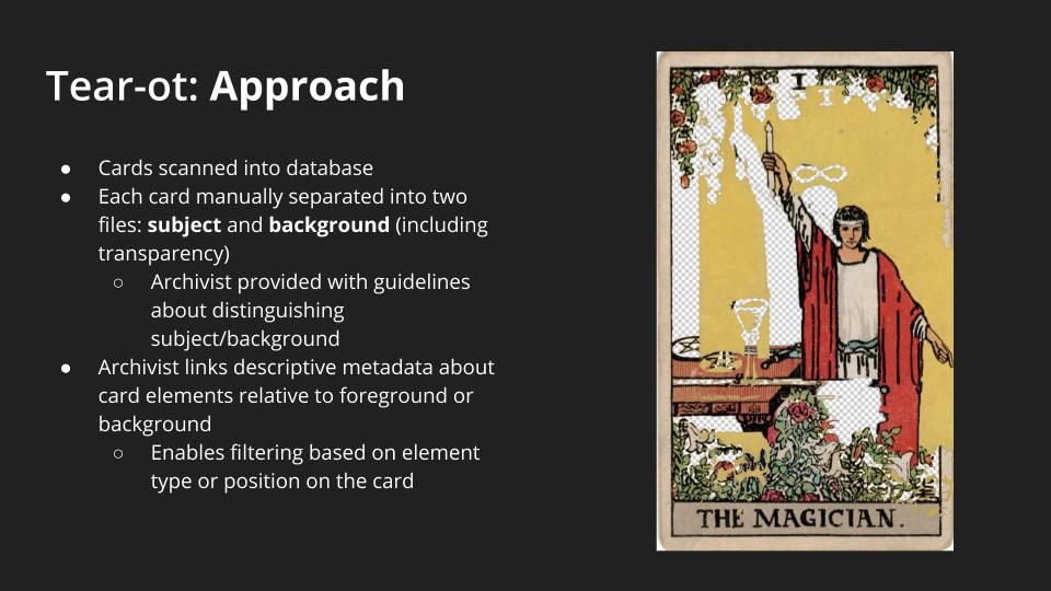
Approach
The documentation process would first involve scanning all of the cards into a database. Each card would need to be then manually separated into two files, using a tool like Photoshop. An archivist would be separating the subject from the background elements, exporting two separate image files, which would need to be formatted to include transparency (rather than filling in the blank space with white or some other neutral color).
Deciding how one separates the background from the subject is ultimately a subjective decision. However, our guidelines suggest that one should remove the central figure from the image if the card typically describes a human (eg Page or Jack), or form which the card’s name describes (four of cups). This system would include a guide for typical separation systems that would apply to each card.
MIT’s contemporary collection of cards revealed that many cards do not follow this format exactly, so this system would give additional leeway for archivists who contribute more experimental decks to the database.
Archivists would then link the descriptive metadata about card elements relative to the foreground or background. This would enable users to filter based on both the element type and whether the element was found in the foreground or background of the card.
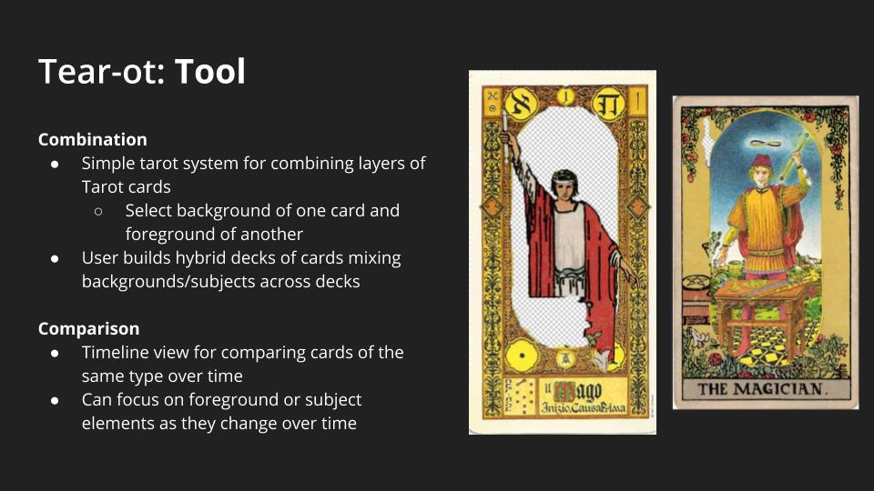
Tool
The tool for navigating this database would include two primary elements. First, it would offer a simple system for combining layers of Tarot cards, allowing a user to select the background of one card and the foreground of another. One version of this system could include the constraint that the cards to be combined would need to be of the same suit, or a more flexible system would allow card elements to be mixed across any suit. Users would then be able to build hybrid decks of cards that mix backgrounds and foregrounds across multiple card decks. One could easily select two entire decks to hybridize or instead could customize their deck and combine elements per-card. This viewing system would help users interrogate our combination questions. Furthermore, the tool would incorporate a simple system for comparing cards of the same type over time. This would take the form of a simple chronological timeline view which would allow the user to view either background or foreground elements spread horizontally. This viewing system would help users interrogate our comparison questions.
Audience
- Historians or other researchers interested in the development of tarot stylistics over time
- Tarot users or scholars interested in new readings of the cards
- Artists looking to create cards that either conform to or divert from existing norms in tarot
- Historians/scholars interested in tarot archetypes and their associations