Wikipedia Dramatizer 11-26-19 Update
We have made a number of significant updates to the Wikipedia Dramatizer in the past few weeks that add substantial depth to the interactions that we offer.
Functional Updates
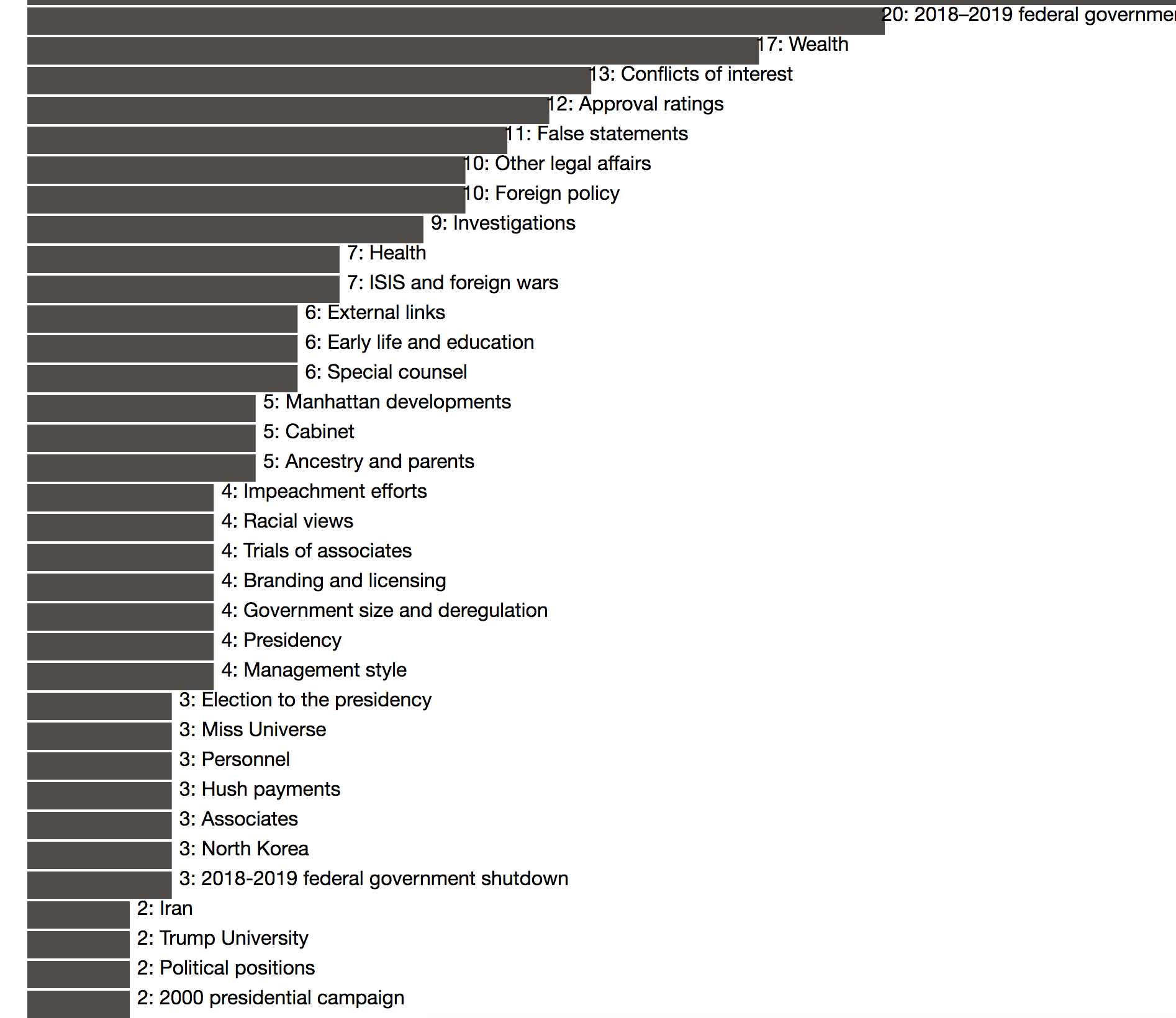
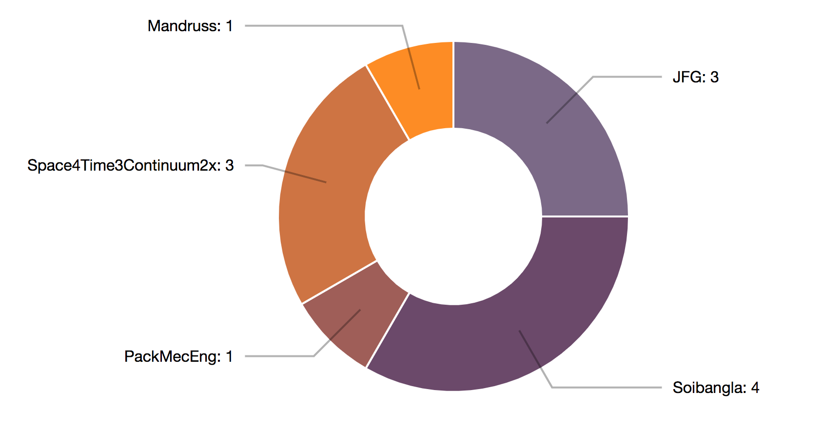
First, we’ve updated the bar chart view to be horizontal to include the titles of each edited section to eliminate the text list that we were previously using. Hovering over a given section links to a pie chart which shows a breakdown of the editors of that section from the given start and end date that the user selected. The chart offers the names of the editors, as well as how many edits that user made. We also have the comments associated with each of those edits, though we have not yet decided on the way to display this information.


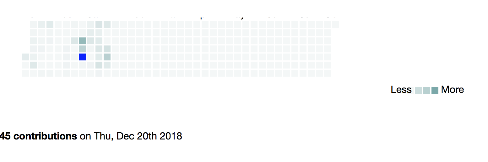
We have added a calendar heat map that shows the number of edits across the whole article between the dates selected. This simple view can allow users to refine their search down to specific dates, or even discover additional stories about why certain dates involved heavy editing. Additionally, if users find dates within a broad range that have been dramatically edited, they can narrow down their search date range and use the bar chart and pie chart to get a closer view on those dates. Though it is not shown, we also have the edit sections and relative section edit frequency available for each specific edit date. We are still deciding on how to best display this information.

We have also significantly updated the search function at the top to be able to easily search articles without needing proper casing or even spelling! It now uses Wikipedia’s internal search function and which draws out the first Wikipedia page result based on what comes up from the user’s search. In addition, we’ve added a language input so that users can quickly switch between different Wikipedia domains, to allow for more comparative research.

Design Questions
Our main challenges and next steps primarily come down to formatting, which neither of us are particularly expert in when it comes to the coding in javascript/html. How do we want to display these results, between the pie chart and the bar chart/calendar. It could work that having over the bar or the calendar makes the pie chart display more detailed information, but different kinds of information for each. Or there could be two pie charts.
We want to decide the best way to do comparative research with the tool. This could include comparing the same search between different dates, or the same search across languages. Do we want to have two searches in parallel that can display information side-by-side? Or should the user be able to keep searching which creates more graphs each time? We have been beginning to sketch out what some of these ideas would look like now that we have the tool mostly working.
We would appreciate feedback on each of these (or other) options for comparing searches, as both offer design challenges and coding challenges that we need to consider.