diMAPspora Update #2
Since last week, we spent time creating a prototype of the visualizations we would like out tool to display with the tool QGIS. Using state boundary files provided by the US Census Bureau, as well as information about languages spoken in each household from the 2000 Census, we created the following visulization. This map should the concentration of Spanish speaking households by state in the US, where darker colors states are those with a high concentration.
The above image shows the concentration of households that speak a given language, but in our final tool, we plan to use density which we can calculate using the state populations again provided by the US Census bureau for an appropriate year. Currently, we are able to manually change the language displayed by using QGIS, but through the us of the web plugin, qgis2web, this is something a user would be able to change with ease to update the map with the time and language of interest.

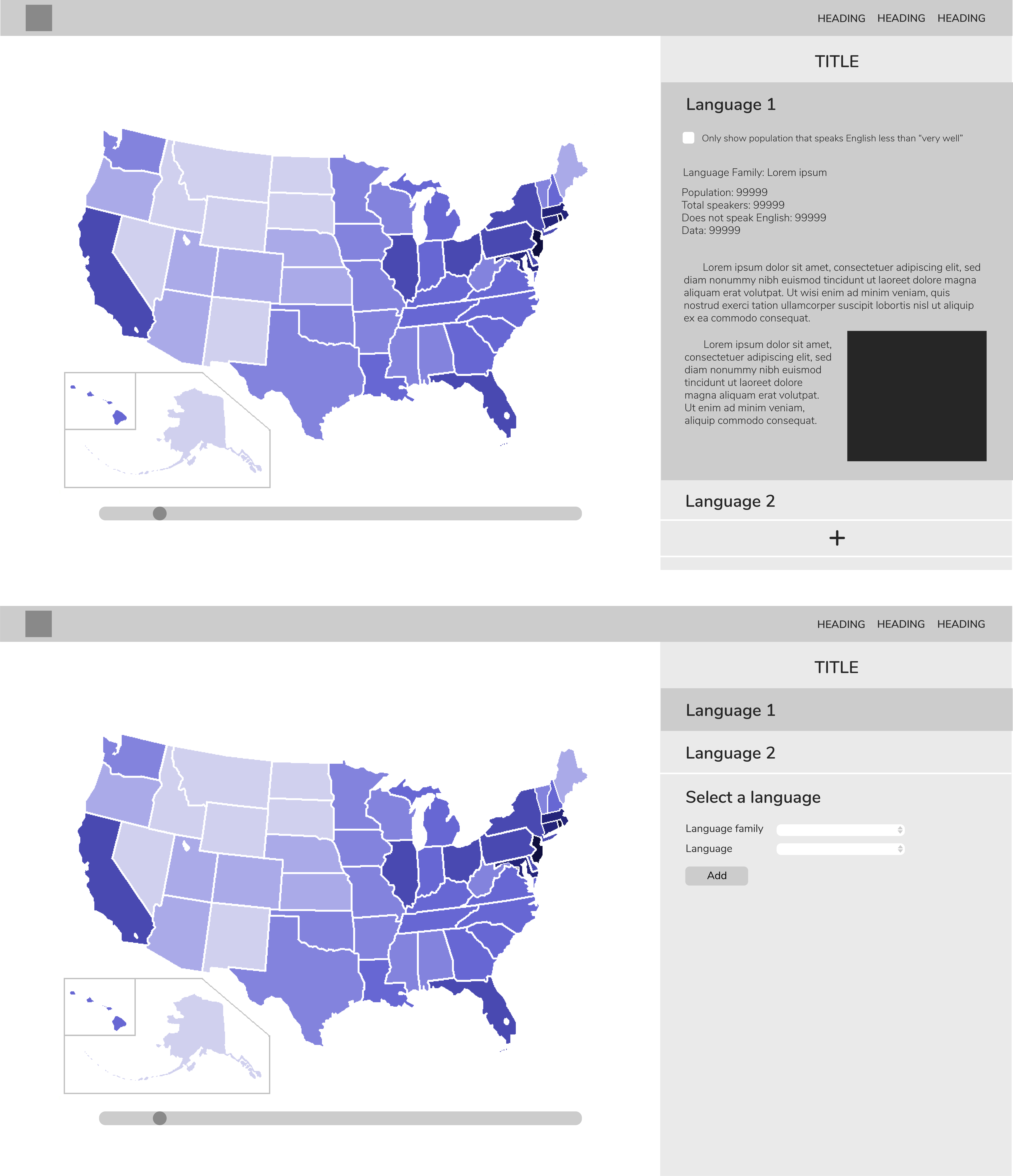
Here is a rough design of the format of our tool.
