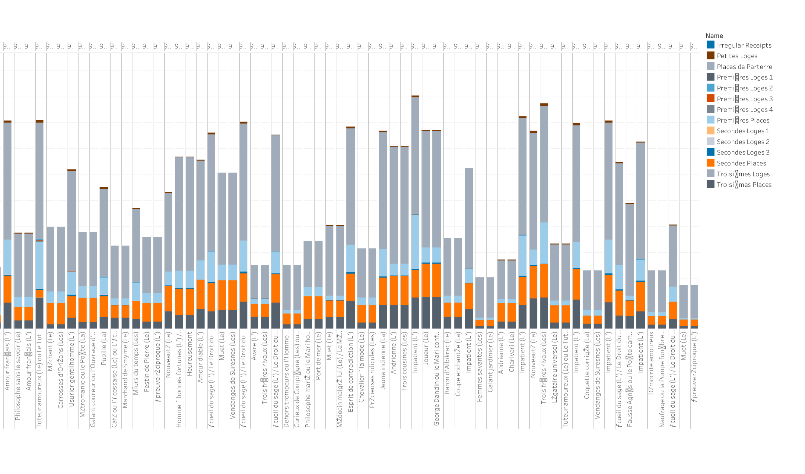
Visualizing Ticket Sales by Seating Section, Over Time
The core idea of our initial project design was to visualize ticket sales over time by seating section of the theater, as an overall gauge of the popularity of theater entertainment in the 18th century. In our initial plan we wanted to have a side-by-side laydown of the facsimile next to the according theater floorplan, so that one could see the direct relationship between the portion of the facsimile and its corresponding spatial representation. We could then allow the user to customize his/her query so that they could observe ticket sales for a specific year or drag a slider to view changes over time.
With no programming experience, we used the approach of working directly with .csv data in a spreadsheet rather than JSON/API. However, the specific dataset we needed was not available from the site’s raw .csv files, only in their JSON files - the “/play_ticket_sales” endpoint (“Ticket sales by seating category for each play/performance”). Therefore, we had to first use a converter to convert this JSON file into .csv, which worked almost seamlessly except for some of the numerical data converting over as text and needing to be converted back to numerical format. Then, we needed to find a means to visualize the data without programming, so we tried different charting methods in Excel and searched for others online, but the problem was that our visualization relied on the spatial plan of the theater and automatic charting could not allow for custom shape-drawing. After playing around with many options to no avail, we explored Tableau visualizations and found a compromising solution.


As seen in the screenshot above, we were able to use a stacked bar chart to visualize the same information on ticket sales by seating section by play, which was our focus of the original idea, but just not laid out on a spatial floorplan since we were unable to do that. Additionally, the idea of viewing these trends across time is still upheld with the schema of a horizontal timeline showing chronological trend, similar to our slider bar idea. Along the bottom you have each performance ID, so each bar represents a performance, and within each performance, you see the breakdown of each seating section. While this is a much more crude representation and not as compelling of a storytelling feeling, it still offers the same information and allows the viewer to see at a quick glance the ebb and flow of ticket sales by seating section varying across time.