Deceptive Climate Data


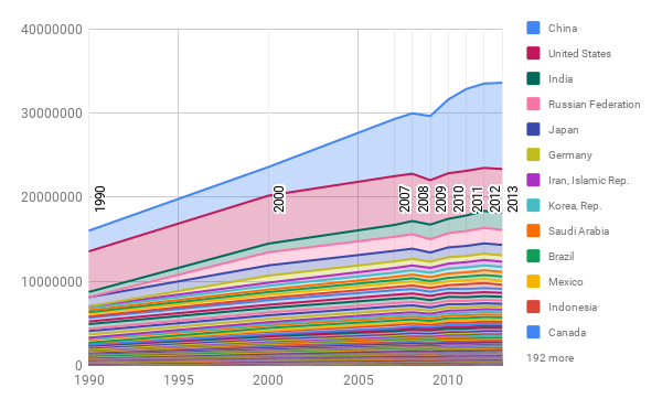
The story we decided to tell with our climate data was how the increasing CO2 emissions are an effect of the world as a whole, though there may be some countries that play a larger role. Both of our visualization do indeed communicate the role the world plays on CO2 emissions, but they tell slight twists of the story.
The first is simply a stacked line chart of all the CO2 data from different countries. The chart goes in order of largest emissions in 2013 to smallest. This makes it clear that it’s not just 1 or 2 countries that are making the difference-it’s many put together. Editting the data to be per capita may make the data even more honest, by suggesting the differences in lifestyles rather than the population.
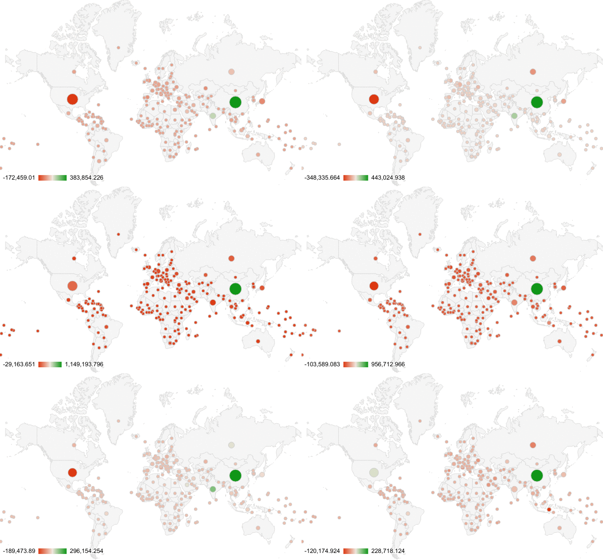
The second arguably has more visual appeal, but less actual meaning. It is an animation of the amount of CO2 from each country per year (each frame is 1 year from 2008 to 2013). The most deceptive thing about this visual is the color. The color indicates the change from the previous year BUT DOES NOT indicate positive or negative. Therefore, looking at the animation, one could say that the map is mostly red, so emissions are going down. This is clearly not true, looking at the first graph.
The intended audience is the general public reading a newspaper, whose habits we ideally would want to change. The first visualization is much more likely to convince people to change over the second one.