CO2 Graphs
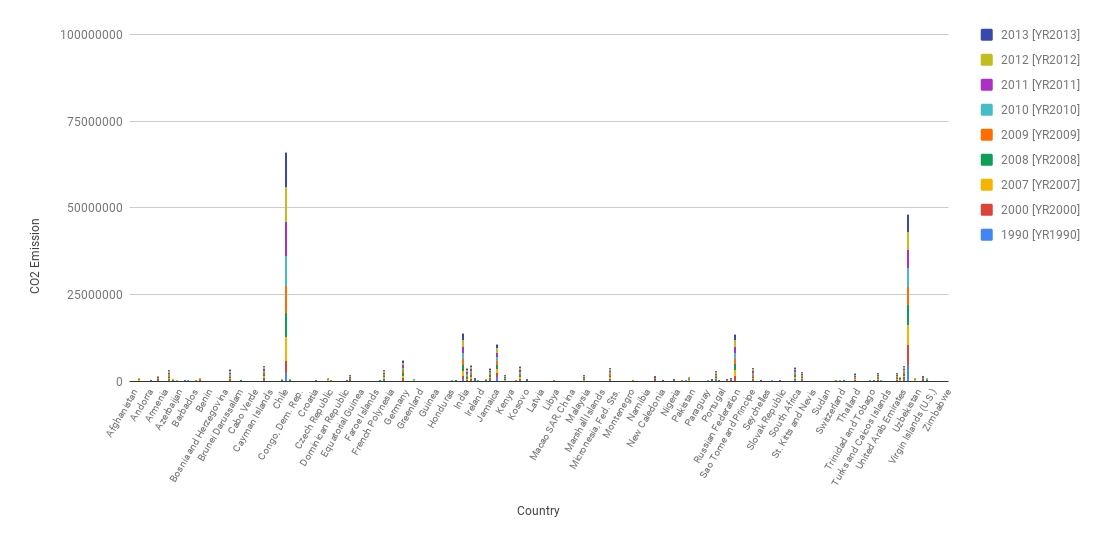
In the below chart, even though since there are so many countries so some of them got hidden, there are 2 countries that stand out from the rest. They are China and the U.S. and one can see that there is quite a difference between their CO2 emissions and that from other countries. Simple graphs like these are used since they are easy to read and do not require much technical background. This graph supports the claim that the U.S. and China release much more CO2 than every other country.

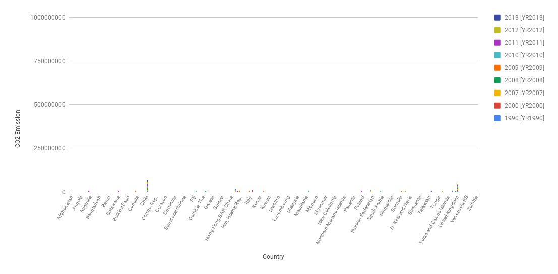
Often people will manipulate the y axis so that large differences will seem small to the average user.In this over exaggerated graph I increased the max value of the CO2 emissions axis, so now the differences in emissions from before look very small unless you pay attention to the axis value. This tricks people that just look at the visualizations for a trend and do not really read the data.
