CO2 Data Visualizations
CO2 Data Visualizations
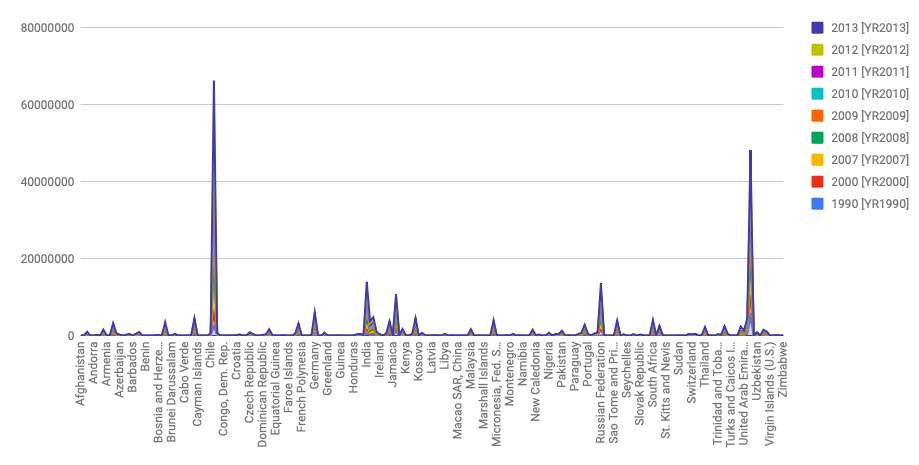
I used stack graphs to visualize how much CO2 each country produced over time. I assumed that there would be a few outliers–meaning that there would be countries that produced significantly greater amounts of CO2 than the average countries.
 This visual is for my argument. It is a stacked graph that shows that there are indeed two outlier countries (China and United States) that produce more CO2 than the average production amount.
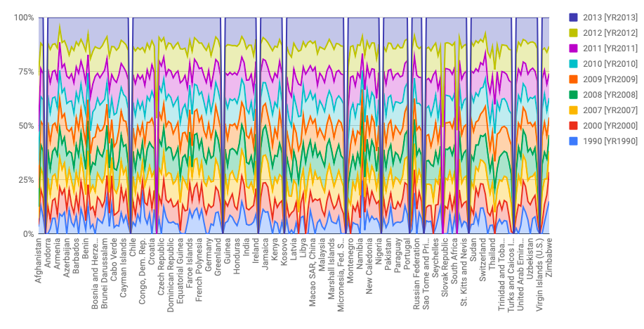
 This visual is against my argument. I used the truncated axes deception method here by using a 100% stacked graph that would spread the data out to not include outliers. Here one can conclude that every country averaged around the same CO2 production and there weren’t any outliers, especially in the Year 2013 (that account for the 100% basepoint).