CFRP Part 2: Real Data
Gathering data
First, we downloaded our data from the endpoint http://api.cfregisters.org/play_ticket_sales with params genre=genre=eq.comédie and play_performance_id=lt.1000, which essentially gave us all of the play ticket sales from each seating area for each play.
Visualization updates
Missing data
One of the first problems we realized was that we couldn’t show the data of each play throughout the year. Some plays were only shown for one or two months and the theaters didn’t show anything at all during some parts of the year. For example, in 1779, there are only sales data from December to July, leaving everything from September to November blank. In 1780, there was only sales data from January to March.
So instead of having our visualization show the sales data for one play through the year, we decided to take the total ticket sales from the most popular play each month.
Analysis
We created Jupyter notebook to analyze everything step by step and converted the JSON response we got into a Pandas dataframe. This allowed us to perform SQL-type operations on the data and organize it neatly for our vizualtion.
Eventually, our data took this form:
[Play name,Premières Places,Secondes Places,Troisièmes Places,Places de Parterre ]
Where each seating category had the total ticket sales for the most popular play that month.
3D Modeling Updates
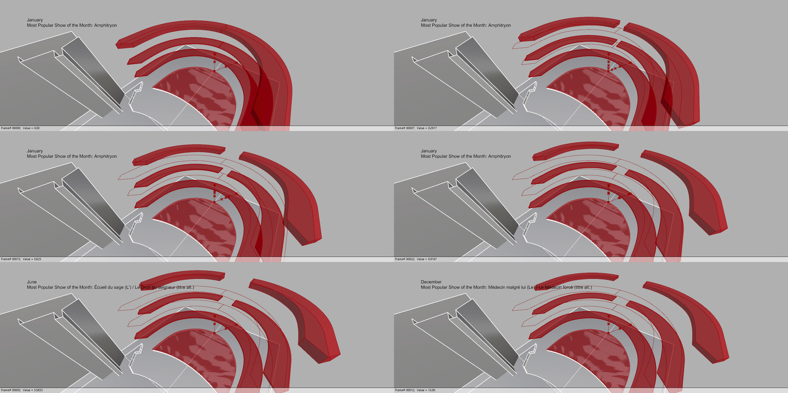
We also redesigned our 3D model to the actual theater from the data. However, beacuse the Odeon Theatre had each of its seating areas stacked vertically, we couldn’t use our traditional “bar graph” method of visualization because the actual 3D bars would intersect each other. So, we made the theater “expandable” to allow each of the seating areas to grow and shrink according to the ticket sales without overlapping with each other.
 ![aggregated.gif]
Implementation
In order to make the data interactive, we used the visual programming language Grasshopper to bind our CSV data to the different heights and labels in our model.
Grasshopper script overview:
Grasshopper script image_1:
Grasshopper script image_2:
Grasshopper script image_3:
Screen record of sliding through different months: Screen record
Implications
From a storytelling perspective, this approach to visualizing the data is more historically representative than just showing the data of one play over the year. By visualizing the most popular play each month, we get a clearer image of what theater-goers wanted to watch overall and how that influenced the theater’s business.