Assignment 3: US-Iran Relations
Attempting to Reinvent the Timeline
When approaching this project, our team decided we wanted to consider the nature of the timeline itself, and come up with a representation that was able to describe more than just the linear progression of time. We considered three different ways of approaching this:
- Conveying the Positivity or Negativity of the Event
- Indicating the Idea of Spiraling/Violent Cycles of Aggression
- Communicating How Events Build on Each Other
We developed these into a number of potential visualizations, each one focused on one or two of the concepts.
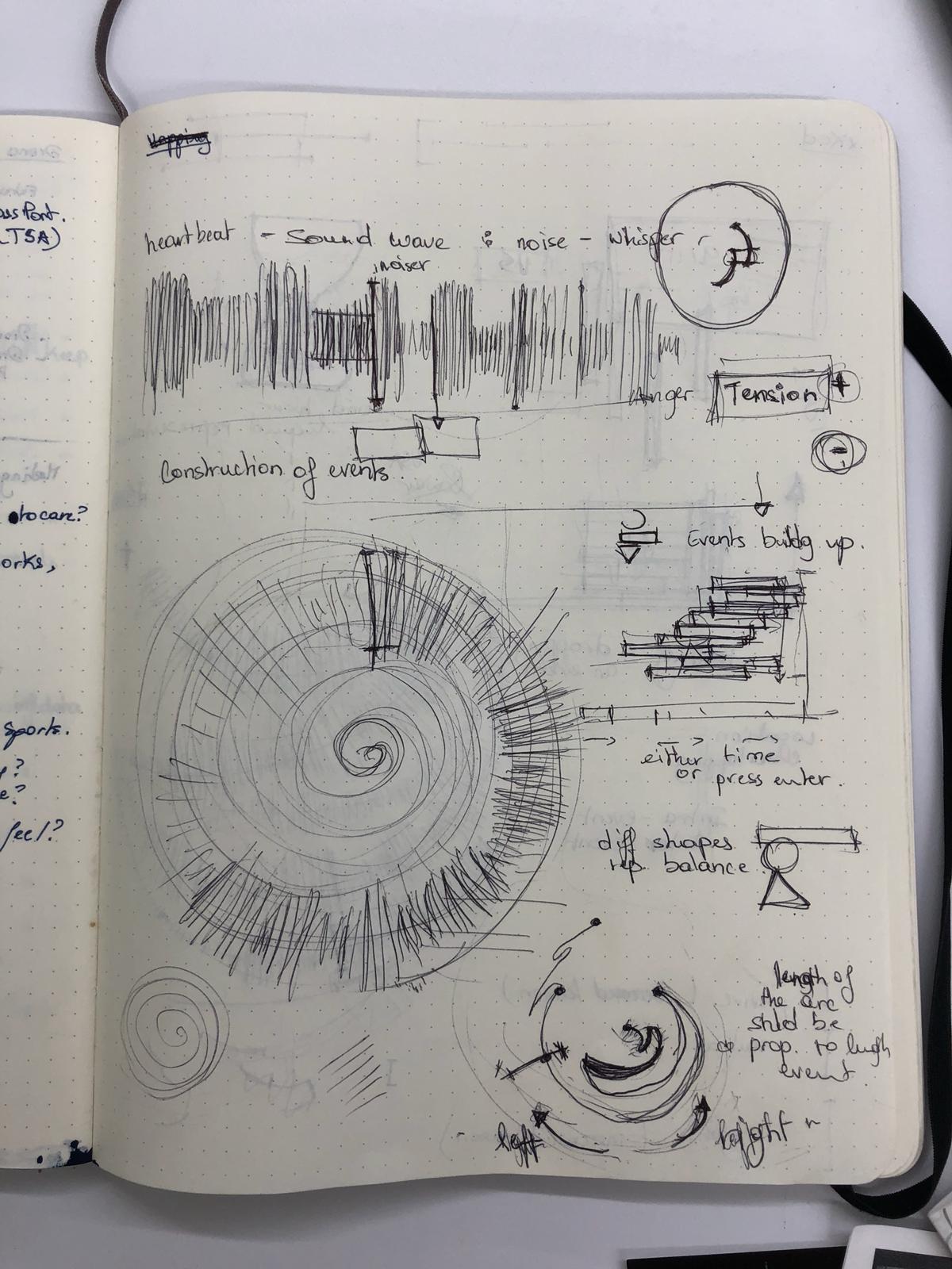
Sketches 1
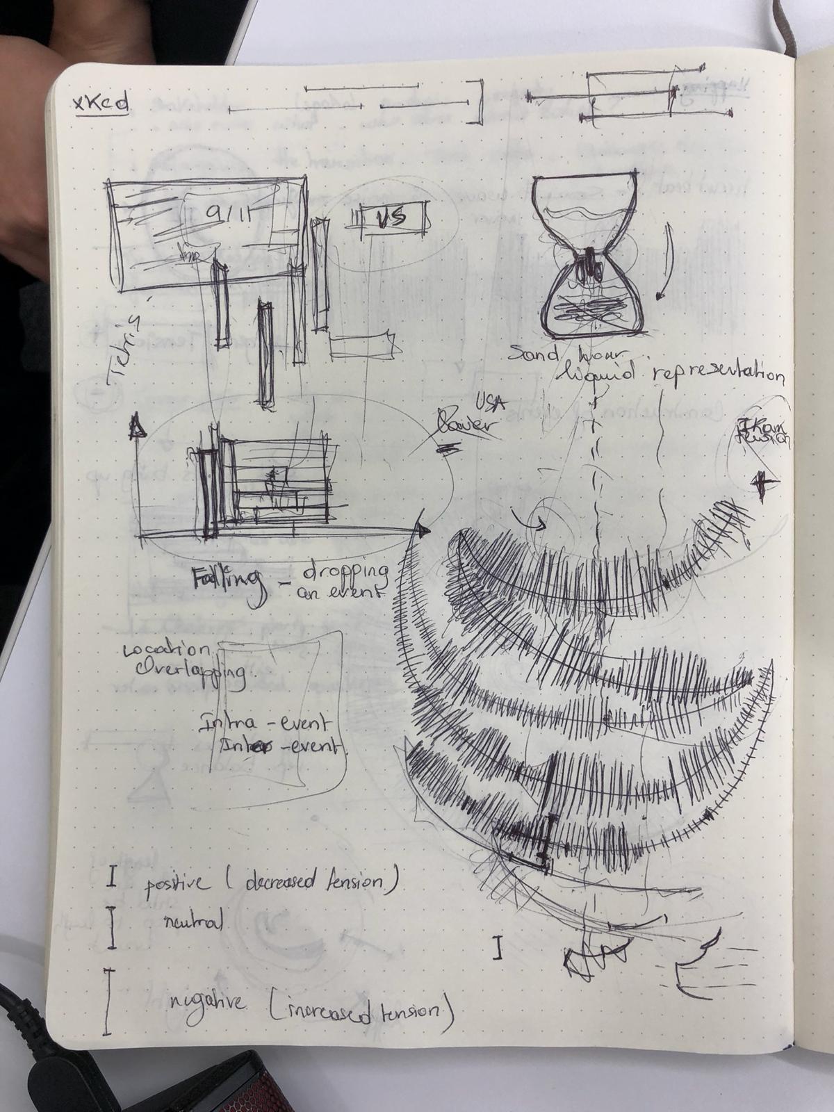
Sketches 2
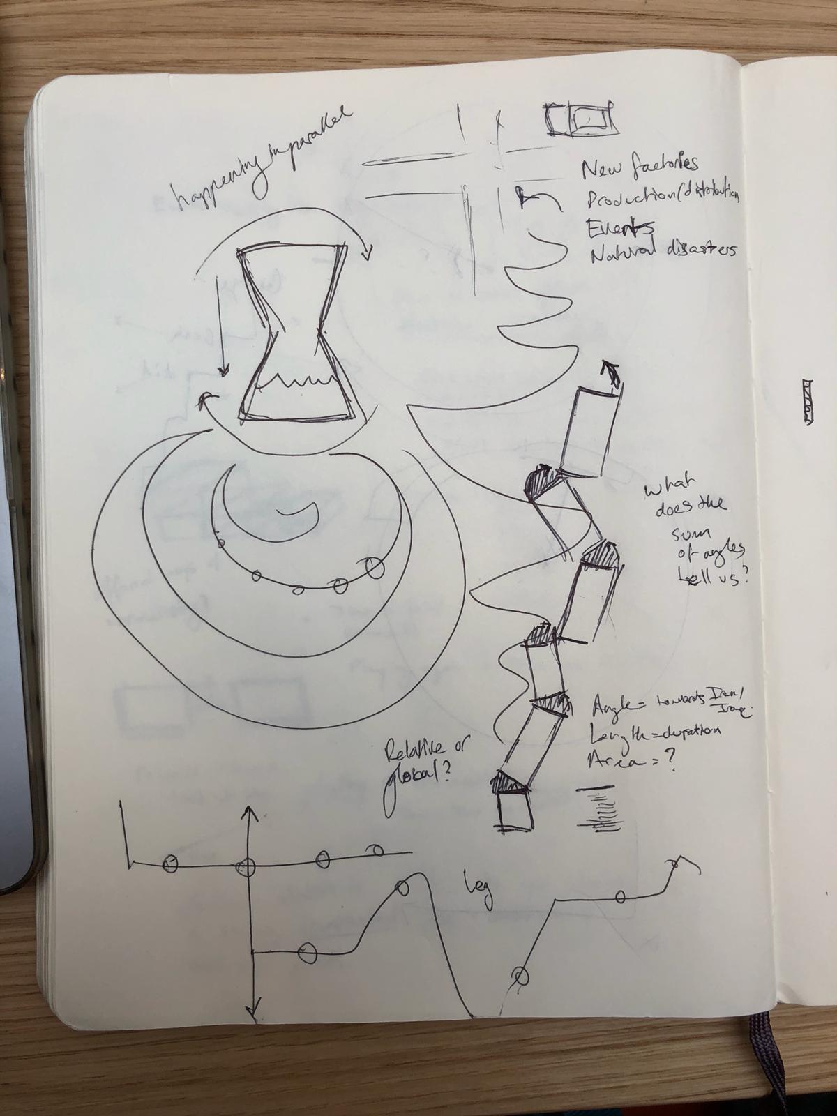
Sketches 3
Positivity or Negativity of the Event
The US-Iran relationship has been incredibly tension filled for both sides, and each event that happened on the timeline had an effect on how the US and Iran saw each other. In order to properly tell the story of the two countries, we needed a visualization that showed some sort of emotional impact. Our first instinct was to use NLP sentiment analysis to determine the positivity or negativity of the event based on tone. To represent the data, we wanted to create a visualization that would make you feel the increases/decreases in negativity. We started with a line that could looked like a sound wave, and would get “noiser” as tensions increased (see Sketches 1, top sketch). We also considered adding an audio component to the visualization, where, when users moused over specific areas of the timeline, they would hear a heart beat faster/slower depending on the amount of tension at that time. These ideas were also highly transferable to other concepts, and we attempted to combine this with a number of our other ones.
However, we ran into difficulty exactly defining what we meant by “positivity” and “negativity.” Are they decreases/increases in tensions? Moves towards/away from war? Simply the emotion conveyed by the briefing book? Because of our uncertainity of this definition, we decided to change the axis to how much the event was in favor of the US or its allies versus in favor of Iran or its allies.
Spiraling and Cycles of Aggression
We started with the spiral on a conceptual basis of moving away from a linear representation of time to a circular one. We also felt like it represented the US-Iran relationships in a way-the two countries, attempting to make peace, eventually take actions that spiral into conflict. We also felt that different sections of the spiral could indicate the same type of event happening-for example, the top left quadrant of the spiral could be events related to an attempt at reconciliation, followed by a betrayal by one country (Sketches 1, bottom left). We even attempted to subvert the shape of the spiral itself by bringing in the US/Iran axis of the event-the spiral would switch turning directions as events favored the US or Iran (Sketches 1, bottom right). We futhered this by undoing the spiral and changing it to more of a pendulum motion, swinging back and forth between the two sides (Sketches 2, bottom right and Sketches 3, middle left).
In the end, we had two main issues with this concept. One, the spiral limited us geometrically-if turning indicated positivity or negativity, then if we made the length of the line time, it could be confusingly interpreted as being more positive/negative with longer time, which was not necessarily true. Two, we worried that enforcing the image of spirals and cycles on the data could be artificially fitting a narrative onto the data that the data did not necessarily represent, and so we pivoted away from a literal spiral. We did keep the idea of changing angles to indicate benefits for/against the US or Iran, as we felt that literally moving to one side would be an impactful and meaningful visual.
Events Building
One important part of how time proceeds is the relationships between events. We wanted to create a visual way of representing this concept. Our first idea was having the events be rectangular blocks that stacked upon each other, but having their placement be dependent on the positivity/negativity axis, creating essentially a wobbly tower (Sketches 1, middle left). We considered emphasizing the wobble by using shapes other than rectangles, such as circles and triangles. However, we were concerned with making the tower too unstable and felt that it didn’t escape enough from the linearity of events. We then looked at having the events build on each other via sand in an hourglass timer, or building up the events from multiple angles (Sketches 2, top).
We ended up taking the idea of building and changing it to an unfolding, and we wanted to have each event “unfold” from the last. For our final visualization, we implemented a simplified version of this idea.
Final Visualization
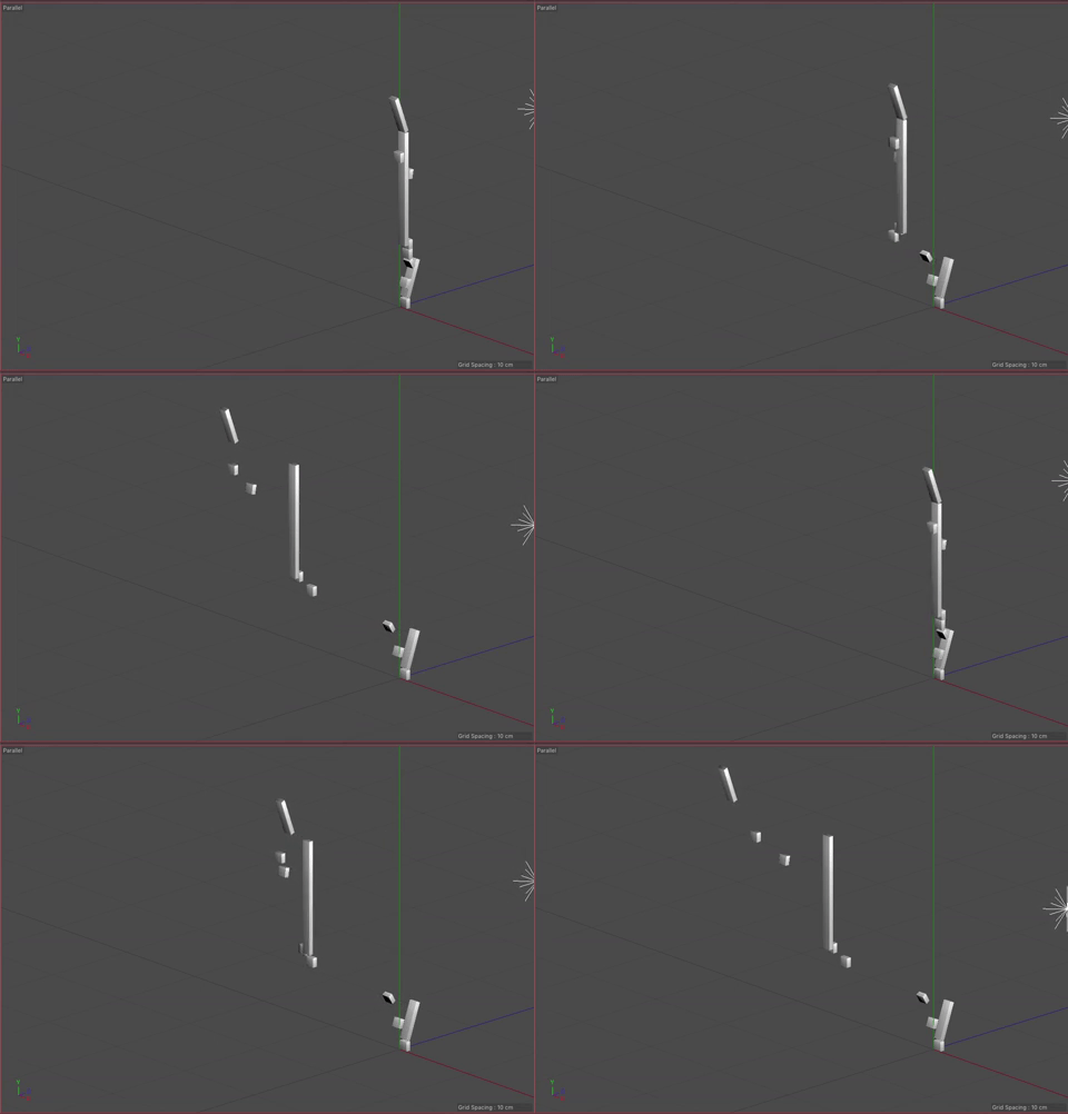
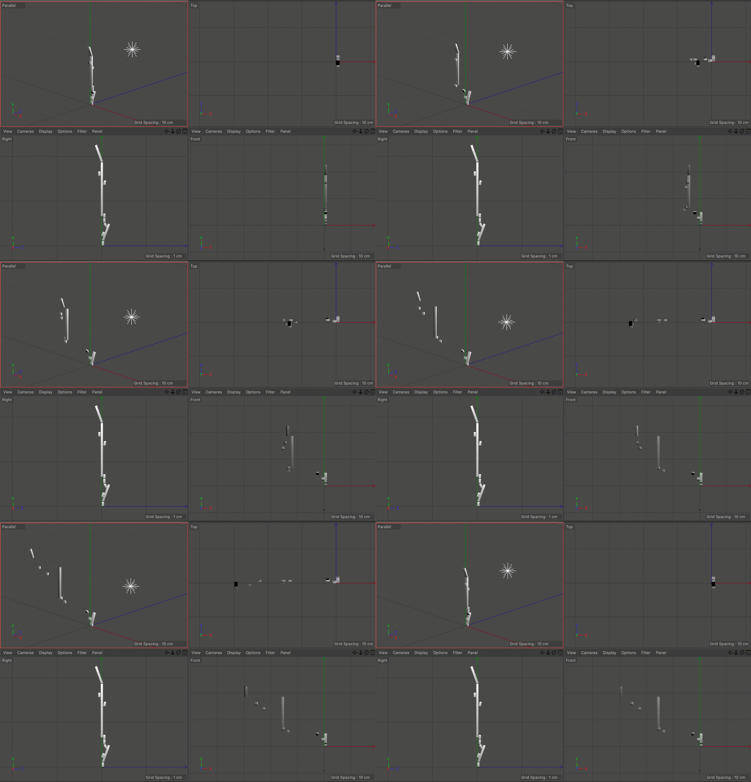
Our visualization implements our idea of using angles to indicate the direction of pro-US or pro-Iran events and our idea of the unfolding the events sequentially. We considered using the width of each rectangle to indicate time, but settled on using the length, as it was the most familiar and understandable method of communicating time passing. The angle, as previously mentioned, indicates how the event benefited the US versus Iran. We also added a third axis to indicate the time between events. This enabled us to keep the main representation as a continuous line while also giving viewers a way to determine the timing between events. It also makes the representation look more like a staircase, which we felt added to the idea of the events building up.