Assignment 3 - Experimenting with Timelines
Access our project here: https://amyshim.github.io/matrixtimeline/
In our first approach, we wanted to challenge our understanding of timelines by creating something that was non-linear. But we tried to avoid making something nonlinear just for the sake of making something nonlinear – we wanted a design that actually enhanced one’s understanding of the data in a way that a conventional timeline would not.
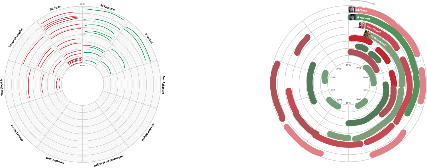
We brainstormed a few approaches, initially trying out a radial design.
Our idea was to make a timeline based on the key people in the US-Iran conflict as depicted in the dataset we were given (Spreadsheet 3). Using a word-counter software, we determined the top 6 most frequently mentioned people in the dataset: Bill Clinton, Mohammed Khatami, Kamal Kharrazi, Akbar Hashemi Rafsanjan, Ali Khamenei, and Ali Akbar Velayati.
We thought we could perhaps illustrate this like so (filler names and data):

Since the event descriptions were somewhat contentious, we took into account the source of the event data. If the source was based in the US, we would indicate so with a red marker. If the source was based in Iran, we indicated so with a blue marker. Grey referred to an international source. We hoped that this color-coding would take into account the varying perspectives regarding the US-Iran conflict.
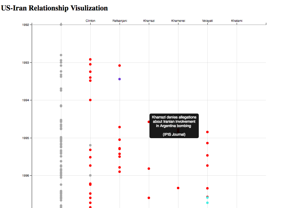
Yichen realized that this could be made even clearer as a matrix. The radial aspect was not really contributing to the readability, so we abandoned the radial design in favor of the matrix and ended up with something like this, made using JavaScript and d3.js:
Since the event descriptions were somewhat contentious, we took into account the source of the event data. If the source was based in the US, we would indicate so with a red marker. If the source was based in Iran, we would indicate so with a blue marker. Purple referred to an international source. We hoped that this color-coding would take into account the varying perspectives regarding the US-Iran conflict.
Yichen realized that this could be made even clearer as a matrix. The radial aspect was not really contributing to the readability, so we abandoned the radial design in favor of the matriz and ended up with something like this, made using JavaScript and d3.js:

Hovering over each dot gives you the event and source. The left-most column contains events that are not specific to the six most frequently-mentioned people.
Our visualization helps separate a dense timeline into the actions of six key people involved in the US-Iran conflict. For example, it is much easier now to focus on specifically Clinton’s actions, and compare his timing to the timing of the other events unfolding around his decisions. You can see, by looking at the entirety of the timeline, when certain people became prominent actors in the conflict and when they “laid low” politically; when leaders reached the height of their influence and how they overlapped with each other. Geopolitical relations and tensions are extremely complex, but perhaps breaking down the story by its major players can lead to insights on how and why the US-Iran conflict came about.
Some things we wanted to implement but didn’t have time this week:
- use lines instead of dots to convey times longer than a day
- include event description instead of just event title
- add more people
- closer vetting of sources