Assignment 2 Writeup
Most Popular Theater Seating in 18th Century France

Our initial approach to working with the CFRP data was to use a slider graph to measure the amount of tickets sold in each seating area and compare that data with household income during the same time period. Our reasoning for this was to be able to gauge leisure spending habits among French citizens across the 17th and 18th centuries, which could lead to insights about trends in class disparity at that time.
After actually viewing the data available to in the JSON files, we concluded that our initial approach was no longer feasible because the ticket prices were not documented as a separate category. However, we noticed that the quantity of tickets sold was documented. As a result, we looked for more creative ways to showcase the data given to us. One approach that we considered was to create a simulation game where participants would pretend that they were in the 17th and 18th centuries and using a chatbot to purchase tickets. Similar to Ticketmaster or StubHub, users would have the ability to interact with a chatbot to order tickets for a show based on popularity and ticket availability. We planned to use the JSON data and focus on the number of tickets sold per seating section to determine popularity and availability. After many failed attempts to connect the API (which contained the JSON data) to the chatbot, we decided to follow a different approach.
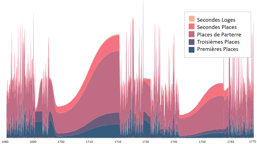
Our next approach was to display the plays by ticket sales and sort the data according to the quantity of tickets sold in each section. For this, we decided to display the data using a stream graph. Stream graphs display the changes in data over time of different categories through the use of flowing, organic shapes that somewhat resemble a river-like stream. Our reasoning for choosing this graph was to be able to display the changes in the amount of tickets sold in each seating section over time. Since there were missing gaps in the data in the time span we chose (1680 - 1770), a stream graph was preferable to a linear graph, because it demonstrated a more natural rise and fall in ticket sales, rather than the many jarring, jutting peaks a linear graph would show.
We thought displaying the changes in seating over time could help tell the story of who was attending the Comedie Francaise performances. By looking at the graph, one might notice that the most commonly purchased seating during the years depicted was in Places de Parterre, or “places on the ground”. This dispels the notion that 18th century French theater was for the only the elite of society. As evidenced by ticket sales, the French working class actively attended Comedie Francaise performances.
We could have chosen to tell a number of other stories by choosing different variables. Indeed, other scholars have made beautiful visualizations telling us which plays were most popular, how playwrights’ popularity changed over time, and even which days of the week had the most sales. However, we chose to focus on the theatergoers themselves, and help illuminate who those people might have been, and where and when they might have sat in the historical theaters of France.