When Maps Shouldn't Be Maps
When Maps Shouldn’t Be Maps
It’s easy to think that data that contains geographical information could be best displayed on a map. However, the problem lies in not whether or not the data can be displayed using a map, but rather should it be given the context that surrounds it? In the case of this reading the author focuses on the latter part of the aforementioned question. A focus that many more data visualization creators should take note of.
!
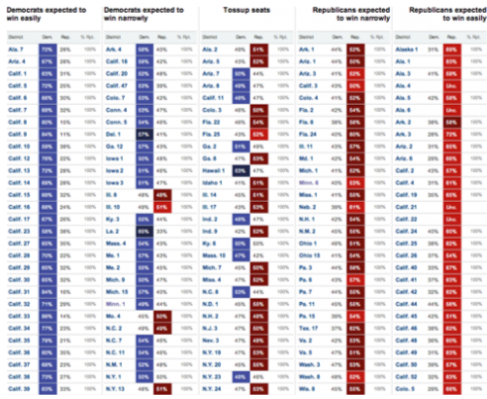
Visualizations like the one mentioned in the reading allow readers to gain deeper understanding of events based on additional context knowledge. Here the creator visualized which Congressional seats were most likely to go to Democrats vs. Republicans. The visualization therefore clearly shows the polarization of the parties and the juxtaposition of votes allocated in accordance with initial predictions. Now users can easily tell that Republicans gained majority of the congressional votes and disallows for the data to be easily distorted by graphing it on a map.