Comparisons of Timelines for Iran-US Data
We chose to display the data using both TimeMapper and Timeline Storyteller. We compared the two and identified the pros and cons of using them. We manually added a “location” category that was derived from the description, which was then utilized to get the locations in TimeMapper and category (color) in the Timeline Storyteller.
TimeMapper
The result is here: TimeMapper
Pros: This interface is great for understanding the events from a spatial perspective. The user can sequentially click the different events in the timeline window and see the map jump around to the location where they happened. The user can also get a good idea of where in the world a majority of the events are taking place, as they can see clusters of pinpoints on the map.
Timemapper is very easy to set up and use.
Cons: The default TimeMapper interface isn’t very customizable, and the creator is limited in the different types of views they want to display: map, timeline, or timemap. I wish there was some way of changing the colors of the events and map pins to correspond with each other.
Microsoft Timeline Storyteller
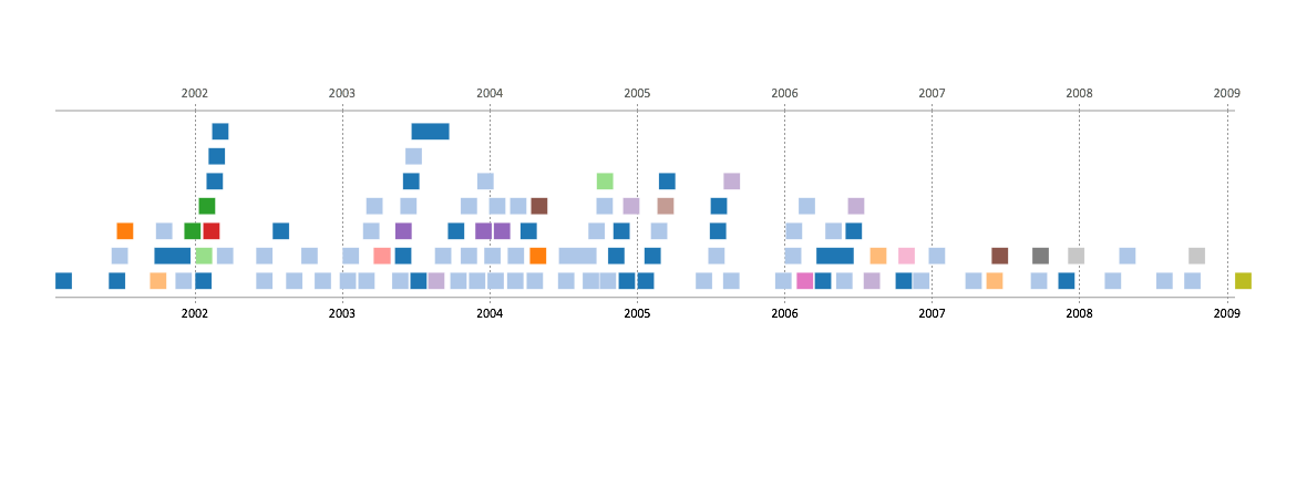
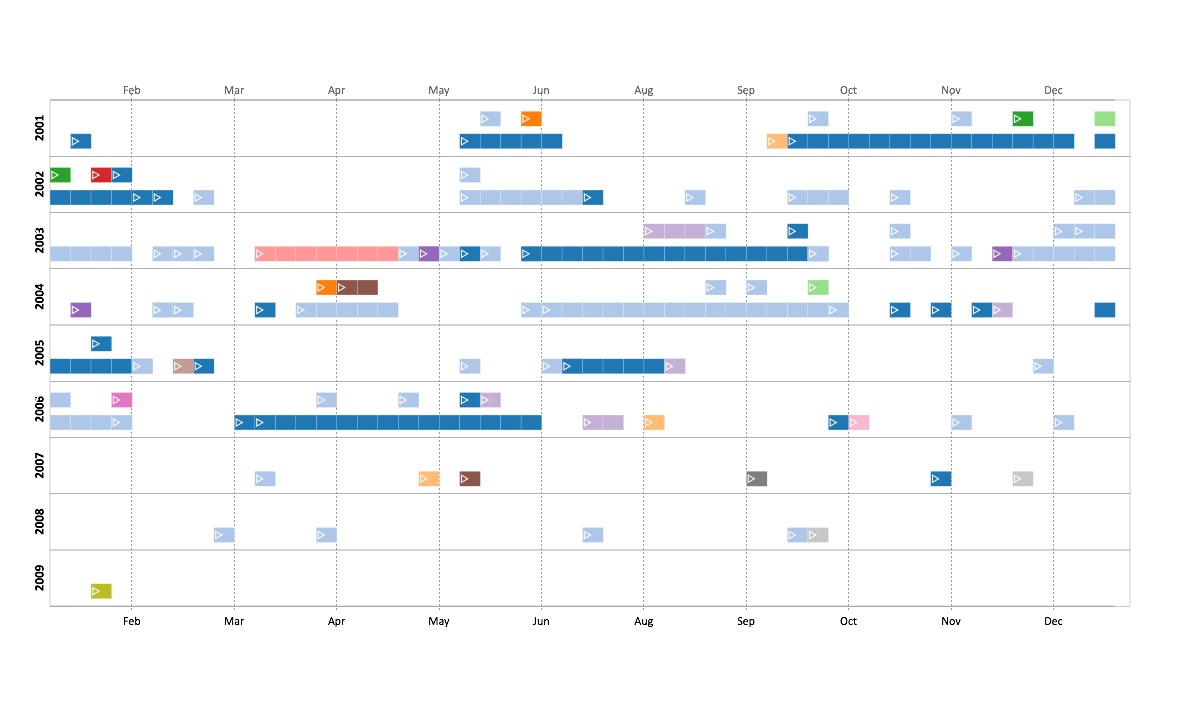
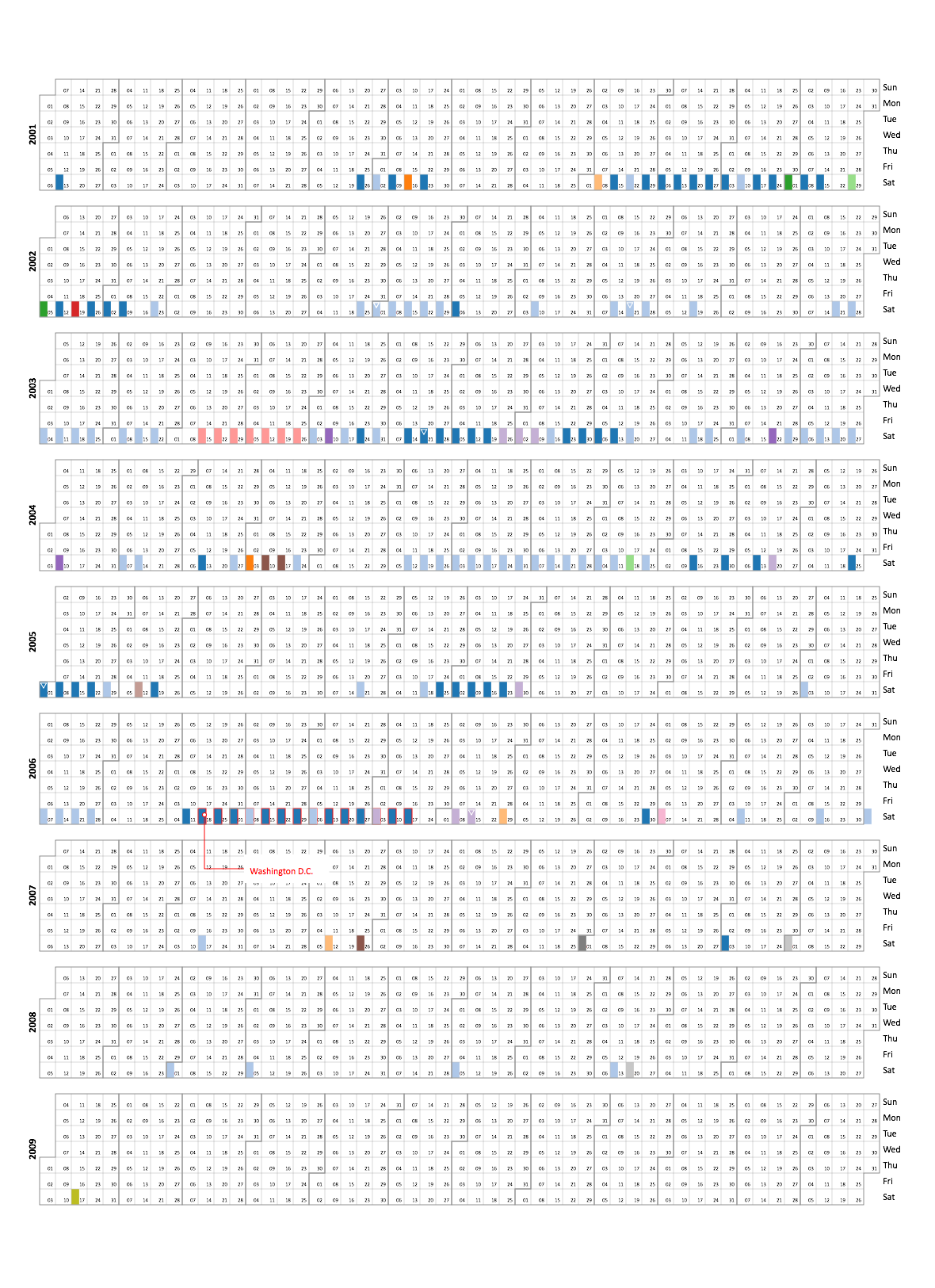
Here’s a couple results of the same set of events:
Linear, Chronological, Unified:
 Linear, Chronological, Segmented:
 Calendar, Chronological, Segmented:

The colors correspond to the location that the events took place.
Pros: Very customizable: the creator/user can choose a variety of different categories and mix-and-match them together (see above for three examples of the mix-and-match aspect, where chronological was always used since it best fit this kind of data). Its great for exploring different displays of the same data, as the user can choose to add or subtract details as they please. The last display above makes it very easy to see when the most concentration of events were.
Cons: There is no location aspect for any of the available display options, unfortunately. It would have been nice to get a sense of position in addition to time.